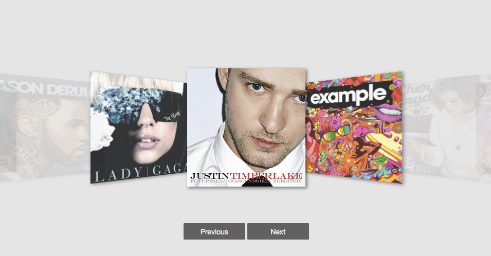
React Coverflow
React Coverflow is a React component for building cover flow style carousel in a convenient way.
Features of react-coverflow
- Flexbox styles of CSS 3.
- Support scroll in the component.
- Support navigation buttons optional
- Using css-module
- Support mobile
Getting started
Install react-coverflow using npm.
$ npm install react-coverflow
The required stylesheet using css-module and include in package(js file), so you don't need include other stylesheet.
Usage
import React from 'react';
import ReactDOM from 'react-dom';
import Coverflow from 'react-coverflow';

const fn = function () {
  /* do your action */
}

ReactDOM.render(
  <Coverflow width="960" height="500"
    displayQuantityOfSide={2}
    navigation={false}
    enableScroll={true}
    clickable={true}
    active={0}
  >
    <div
      onClick={() => fn()}
      onKeyDown={() => fn()}
      role="menuitem"
      tabIndex="0"
    >
      <img
        src='image/path'
        alt='title or description'
        style={{
          display: 'block',
          width: '100%',
        }}
      />
    </div>
    <img src='image/path' alt='title or description' data-action="http://andyyou.github.io/react-coverflow/"/>
    <img src='image/path' alt='title or description' data-action="http://andyyou.github.io/react-coverflow/"/>
  </Coverflow>,

  document.querySelector('.content')
);
In order to pass functions to the images, you can simply wrap the <img /> in a <div>. You should make sure to give your img specific styling properties to confine it to the parent div.
Properties
| Name | Type | Default | Description |
|---|---|---|---|
| children | node | should be <img /> nodes |
|
| infiniteScroll | boolean | false | Allows the carousel to scroll from the last image to the (upon clicking the next button) or from the first to the last (by clicking the previous button). infiniteScroll is not supported by mouse scrolling. |
| displayQuantityOfSide | number | The number of display image from center to the one side end. | |
| navigation | boolean | false | Enable navigation buttons (prev, next). |
| enableHeading | boolean | true | Shows the img alt as the label for the img. |
| enableScroll | boolean | true | Enable scrolling feature. |
| media | object | To support media query, if you want responsive with parent element you can ignore width and height props or set it to auto. |
|
| active | number | middle child node | The index of the image you want to be active. |
| clickable | boolean | true | Makes images clickable, setting to false will disable clickability of images. |
| currentFigureScale | number | 1.5 | The scale factor (float) to be applied on the active image. |
| otherFigureScale | number | .8 | The scale factor (float) to be applied on the inactive images. |
Responsive
Now, you can use media props to support responsive design. The syntax part is come form Radium
You can reference to this doc.
- 2016-09-13 If you need RWD you should add
<StyleRoot>
ReactDOM.render(
  <StyleRoot>
    <Coverflow
      displayQuantityOfSide={2}
      navigation={true}
      enableHeading={true}
      active={0}
      media={{
        '@media (max-width: 900px)': {
          width: '600px',
          height: '300px'
        },
        '@media (min-width: 900px)': {
          width: '960px',
          height: '600px'
        }
      }}
      >
      <img src='images/album-1.png' alt='Album one' data-action="https://facebook.github.io/react/"/>
      <img src='images/album-2.png' alt='Album two' data-action="http://passer.cc"/>
      <img src='images/album-3.png' alt='Album three' data-action="https://doce.cc/"/>
      <img src='images/album-4.png' alt='Album four' data-action="http://tw.yahoo.com"/>
    </Coverflow>
  </StyleRoot>
  ,
  document.querySelector('.example_2')
);