react-native-just-timeline
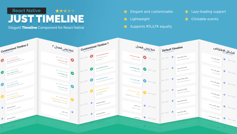
React Native's customizable, RTL-supported, elegant, lazy-loading-ready Timeline component.
React Native Just Timeline is a package intended to provide an elegant, highly flexible and customizable, performant solution to render a sequence of events, taking in mind the support for RTL orientation and the package was developed with that concern in mind.
So, this package has the following as its major concerns:
- Support for RTL
- Clean design
- Flexibility to customize that design
- Perfomance, by providing the ability to lazy-load
- Lightweight
Installation
The installation for the Timeline itself is pretty straightforward, just:
npm install react-native-just-timeline
However, react-native-vector-icons is internally used to provided the icons, so you'll have to make sure it's correctly installed in your project and properly linked, or otherwise, an error would pretty much occur, e.g. Unable to resolve 'FontAwesome'.
Usage
Basic
Actually, to get the Timeline up and running, all you need to do is to call the component Timeline and provide it with a data array of objects. Every object represents a timeline event or row. The basic data shape to get the default Timeline functionality and styling is:
const BasicTimeline = () => {
  const data = [
    // First row in the Timeline
    {
      title: {
        content: 'Event One Title',
      },
      description: {
        content: 'Event One Description',
      },
      time: {
        content: moment().format('ll'),
      },
    },

    // Second row in the Timeline
    {
      title: {
        content: 'Event Two Title',
      },
      description: {
        content: 'Event Two Description',
      },
      time: {
        content: moment().format('ll'),
      },
    },

    // You got the idea..
    {
      title: {
        content: 'Event Three Title',
      },
      description: {
        content: 'Event Three Description',
      },
      time: {
        content: moment().format('ll'),
      },
      icon: {
        content: 'pencil',
      },
    }
  ];

  return (
    <View style={styles.container}>
      <Timeline data={data} />
    </View>
  );
};
This code gets you the default basic Timeline, like below:
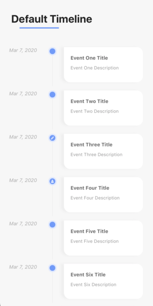
The title, description, time, and icon are objects because we can provide each of them with another property that is adjacent to content for styling style, and it accepts normal styling properties and is used to override the default styling of each of them, e.g.:
  const data = [
    {
      title: {
        content: 'Event One Title',
        style: {
          color: '#fff',
          backgroundColor: '#222',
        }
      },
      description: {
        content: 'Event One Description',
        style: {
          color: 'green',
        }
      },
      time: {
        content: moment().format('ll'),
        style: styles.time,
      },
    },
    ...
  ];
Check the /Examples/Example1 and /Examples/Example2 for clearer overlook and more tweaks ;)
Render props
Render props is always a great React.js/React Native pattern that embraces reusability and customizability.
If you felt like you are kind of limited with the previous structure of { content: "", style: {} } and need more control, you can send a function that returns a React Native component, whatsoever it is. And, we can do that on each part of the row individually without having to follow the same pattern on all of them, i.e. in the following code, we can mix up the render props in title with basic { content: "", style: {} } on the rest.
**You get the default style of title, description, icon, and time as a prop to the function```
const RenderPropsUsage = () => {
  const data = [
  // First row in Timeline
  {
    // Here we send a function that returns a component instead of object
    title: ({ styles }) => (
      <View>
        <Text style={{fontSize: 10, color: '#999', marginBottom: 7}}>
          {moment().format('lll')}
        </Text>
        <Text style={[styles, {marginBottom: 0, color: '#d2584b'}]}>
          Item Deleted Event
        </Text>
      </View>
    ),
    description: {
      content: 'Item Deleted Event Description',
    },
    time: {
      content: moment().format('ll'),
      style: {
        paddingTop: 8,
      },
    },
    icon: {
      content: 'trash',
      style: {
        width: 35,
        height: 35,
        backgroundColor: '#d2584b',
        color: '#FFF',
        borderColor: '#FFF',
        fontSize: 16,
        paddingTop: 6,
        borderRadius: 18,
      },
    },
  },

  // Second row in Timeline
  {
    title: ({styles}) => (
      <View>
        <Text style={{fontSize: 10, color: '#999', marginBottom: 7}}>
          {moment().format('lll')}
        </Text>
        <Text style={[styles, {marginBottom: 0, color: '#00b48b'}]}>
          Item Added Event
        </Text>
      </View>
    ),
    description: {
      content: 'Item Added Event Description',
    },
    time: {
      content: moment().format('ll'),
      style: {
        paddingTop: 8,
      },
    },
    icon: {
      content: 'check',
      style: {
        width: 35,
        height: 35,
        backgroundColor: '#00b48b',
        color: '#FFF',
        borderColor: '#FFF',
        fontSize: 16,
        paddingTop: 6,
        borderRadius: 18,
      },
    },
  }];

  return (
    <View style={styles.container}>
      <Timeline data={data} />
    </View>
  );
};
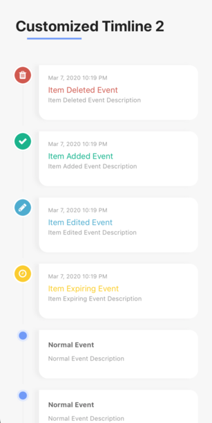
This code gets you something like:
Check the /Examples/Example3 and /Examples/Example4 for more.
Clickable Rows
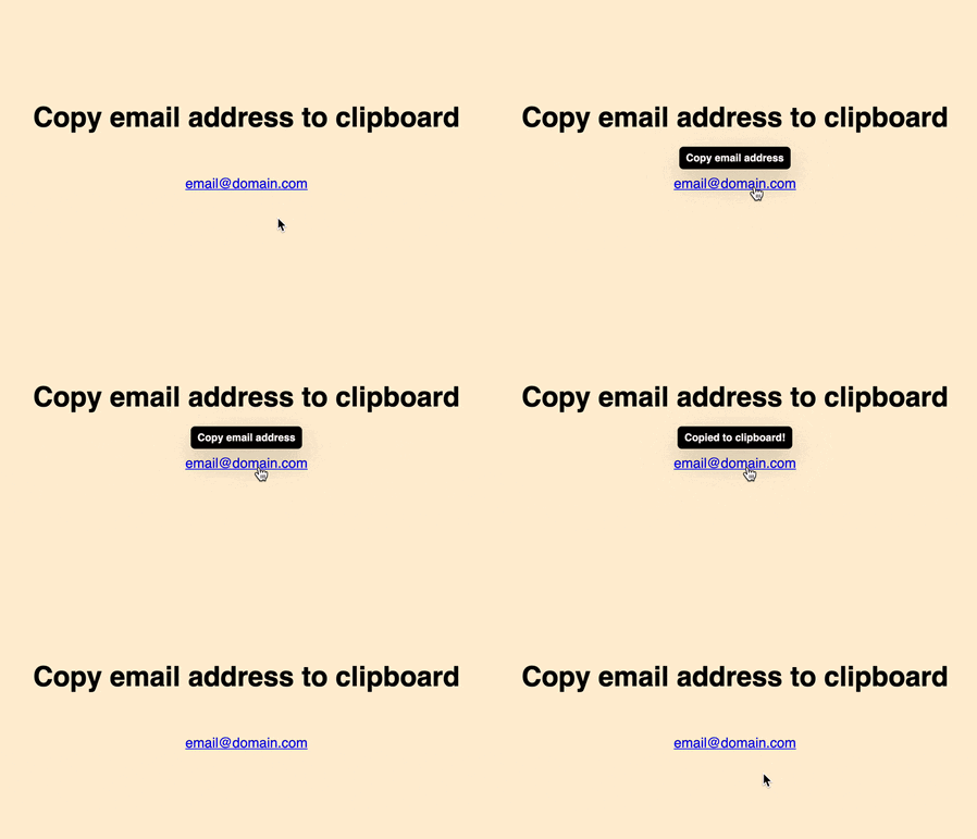
Well, you may face that case in which you need to perform an action on a certain event/row in the Timeline when pressing. This functionality is available, you control it on each event/row's object individually by sending a pressAction function which gets executed onPress.
const Example5 = () => {
  const [isModalOpen, setModalStatus] = useState(false);
  const data = [
    // First row in Timeline
    {
      pressAction: () => setModalStatus(true), // Gets triggered on row's press
      title: {
        content: 'Bakr',
      },
      description: {
        content: 'Comment goes right here',
      },
      time: {
        content: moment().format('ll'),
        style: {
          paddingTop: 8,
        },
      },
      icon: () => (
        <View>
          <Image
            source={require('../assets/images/1.jpg')}
            style={{
              width: 45,
              height: 45,
              borderRadius: 25,
              borderWidth: 3,
              borderColor: '#fff',
            }}
          />
        </View>
      ),
    },

    // Second row in Timelind
    {
      pressAction: () => setModalStatus(true), // Gets triggered on row's press
      title: {
        content: 'Nancy',
      },
      description: {
        content: 'Comment goes right here',
      },
      time: {
        content: moment().format('ll'),
        style: {
          paddingTop: 8,
        },
      },
      icon: () => (
        <View>
          <Image
            source={require('../assets/images/2.jpg')}
            style={{
              width: 35,
              height: 35,
              borderRadius: 20,
              borderWidth: 3,
              borderColor: '#FFF',
            }}
          />
        </View>
      ),
    }
  ];

  return (
    <View style={styles.exampleContainer}>

      {/* Toggle this modal on event/row's press */}
      <CustomDialog
        isVisible={isModalOpen}
        dismissAction={() => setModalStatus(false)}>
        <PopupContent pressAction={() => setModalStatus(false)} />
      </CustomDialog>


      <Timeline data={data} />
    </View>
  );
};
This code gets you something like:
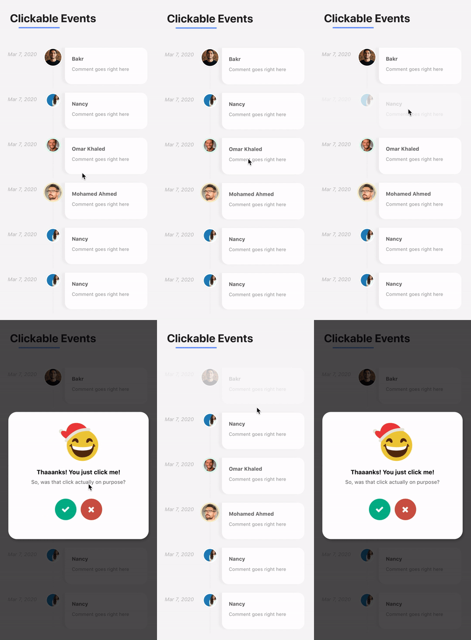
Check the /Examples/Example5 for more.
Lazy-loading, Infinite Scrolling
Internally, the package utilizes React Native's FlatList to manage the list of rows in a performant way. That brings us to an important hint: you can send any props that you usually send to FlatList to JustTimeline. However, some props are renamed, refer to the props table to know about that
So, with FlatList in mind, we can create a lazy-loadable Timeline using the exact same functionality as we might do in a normal FlatList, using onEndReached function.
onEndReached will be a function that creates an async call and then appends the new data to our state.
TimelineFooter a prop that accepts a React Native component to display at the end/bottom of the Timeline, we use it to render a loading spinner at the end of the Timeline while fetching the data.
const LazyLoadableTimeline = () => {
  const [{loading, data}, setState] = useReducer(
    (base, next) => ({...base, ...next}),
    {
      loading: false,
      data: defaultData, // The already-existing data that were, for instance, fetched on component mounting
    },
  );

  return (
    <View style={styles.container}>
      <Timeline
        data={data}
        TimelineFooter={() => (loading ? <ActivityIndicator /> : null)} // Loader component
        onEndReached={() => {
          // When the user reaches the end of the Timeline, set a loader
          setState({loading: true});

          // Your asyncronous behavious, e.g. AJAX call
          setTimeout(() => {
            // Append the new data to the state's array
            setState({
              data: data.concat([
                {
                  title: {
                    content: 'New Event 1',
                  },
                  description: {
                    content: 'New Event 1 description',
                  },
                  time: {
                    content: moment().format('ll'),
                  },
                },
                {
                  title: {
                    content: 'New Event 2',
                  },
                  description: {
                    content: 'New Event 2 description',
                  },
                  time: {
                    content: moment().format('ll'),
                  },
                }
              ]),

              // Turn off the loader
              loading: false,
            });
          }, 2500);
        }}
      />
    </View>
  );
};
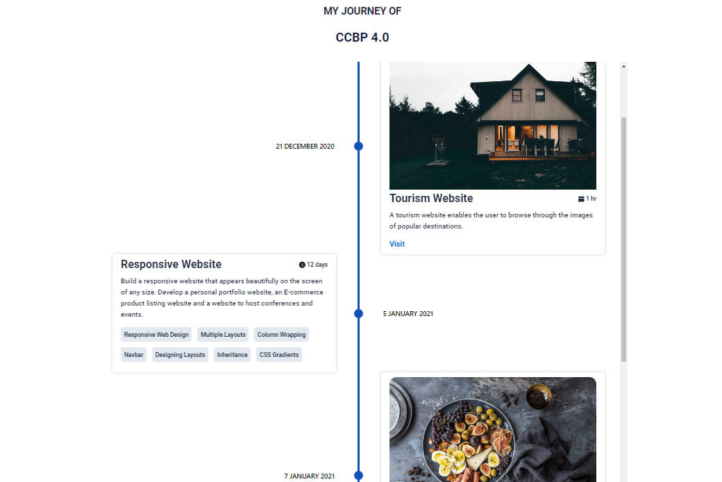
The previous code gets you the following behavior:
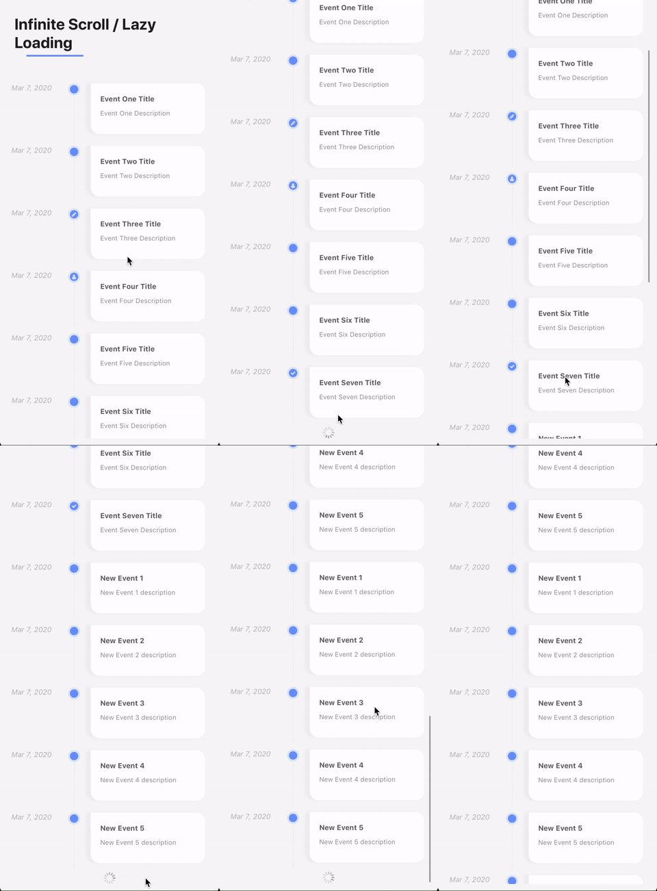
Check the /Examples/Example6 for more.
Props
| Prop | Description | Type | Default |
|---|---|---|---|
| data | Contains the events/rows data as an array of object. Each object represents an event | Array |
Array |
| eventStyle | Style object used to override the row's container's styles | Object |
Object |
| timeContainerStyle | Style object used to override the time's container block's styles | Object |
Object |
| iconContainerStyle | Style object used to override the icon's container block's styles | Object |
Object |
| lineStyle | Style object used to override the vertical line style | Object |
Object |
| contentContainerStyle | Style object used to override the content's container block's styles, i.e. that contains title and description |
Object |
Object |
| TimelineFooter | A React Native component to be rendered at the end of the Timeline | React Native Component |
Undefined |
| TimelineHeader | A React Native component to be rendered at the heading of the Timeline | React Native Component |
Undefined |
| onEndReached | A function that gets executed when user reaches the end of the Timeline | Function |
Undefined |
| onEndReachedThreshold | Defines the distance in pixels far from the Timeline's bottom at which the onEndReached function gets called |
Number |
0 |
