React Datepicker
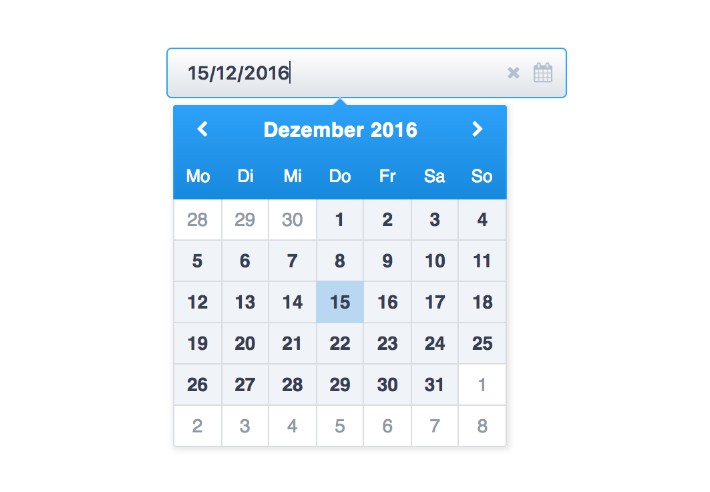
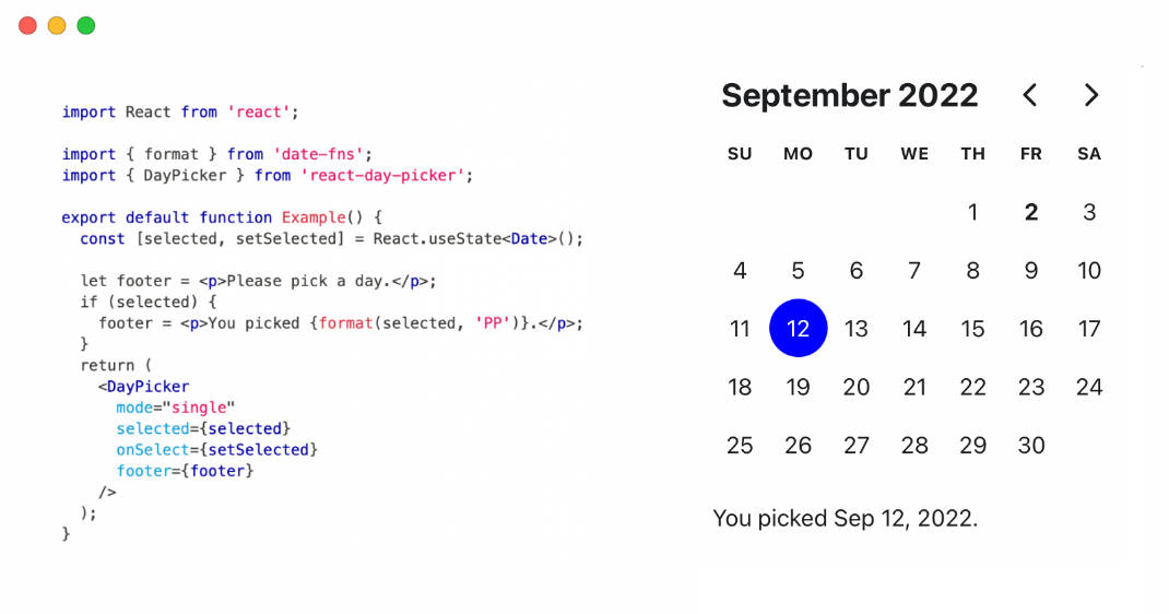
A decent and pretty date picker to be used with React.
import 'moment/locale/it.js';
import { DatePicker, DatePickerInput } from 'rc-datepicker';

const date = '2015-06-26' // or Date or Moment.js

onChange = (jsDate, dateString) => {
  // ...
}

React.renderComponent(
  <div>
    // this renders the full component (input and datepicker)
    <DatePickerInput
      onChange={onChange}
      value={date}
      className='my-custom-datepicker-component'
      {...anyReactInputProps}
    />

    // this renders only a fixed datepicker
    <DatePicker onChange={onChange} value={date} />
  </div>,
  document.body
);
or check the full examples here
FOR WEBPACK USERS: webpack by default imports every locale. Please take a look at this question on Stack Overflow for possible solutions.
Install
npm install --save rc-datepicker
The npm package is compiled in JavaScript 5
DatePickerInput API
See this readme
Locales
DatePicker and DatePickerInput use Moment.js, therefore they support any locale inside "moment/locale".
To select a locale you need to require it before requiring the datepicker or moment anywhere in your app: this way it will be automatically selected as current locale.
import 'moment/locale/fr.js' // or 'rc-datepicker/node_modules/moment/locale/fr.js' if you don't have it in your node_modules folder

import { DatePickerInput } from 'rc-datepicker';
DatePickerInput will now use French locale by default.
Switch between locales
You can switch between locales by passing the prop "locale" to DatePickerInput or DatePicker.
WATCH OUT this method requires the wanted locale to be already available in your bundle which is only true if you had already imported it or if you're using moment-with-locales.min.js
import 'moment/locale/fr.js'
import 'moment/locale/es.js'

<DatePicker locale='es' />
Style
DatePickerInput and DatePicker come with their own default style. In order to use it you should import it in your project as follows:
import 'rc-datepicker/lib/style.css';
Examples
$ npm install
$ npm start
$ open http://localhost:8080
