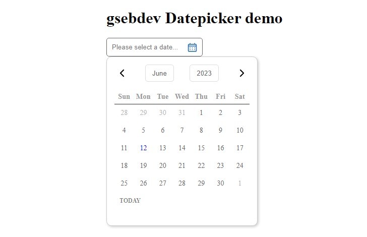
React DayPicker
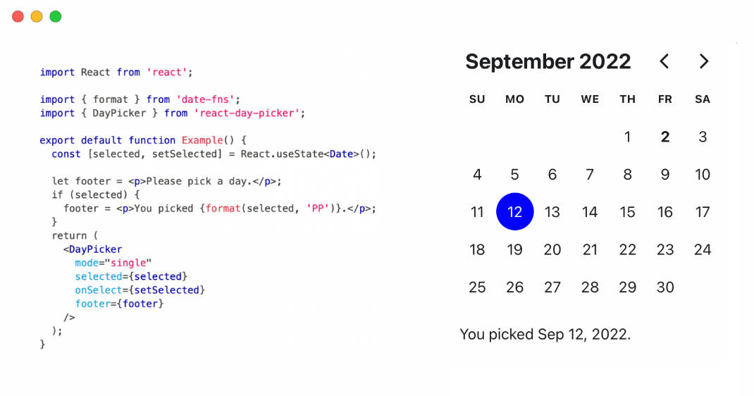
React DayPicker is a versatile and highly customizable date picker component designed specifically for React applications. It renders a monthly calendar interface, allowing users to conveniently select individual days or date ranges from the displayed calendar.
features
-
Flexible Selection: Users can select single days, date ranges, or customize the selection behavior to suit their specific requirements.
-
Date Library Integration: React DayPicker leverages the powerful date-fns library for efficient date handling and manipulation.
-
Localization Support: The component can be localized into any language, ensuring a seamless user experience across different regions and cultures.
-
Keyboard Navigation: React DayPicker supports keyboard navigation, making it accessible and easy to use for users who prefer keyboard interactions.
-
WAI-ARIA Compliance: The component adheres to the Web Accessibility Initiative's Accessible Rich Internet Applications (WAI-ARIA) guidelines, ensuring compatibility with assistive technologies.
-
TypeScript Support: React DayPicker is written in TypeScript, providing developers with better tooling, improved code quality, and easier maintenance.
-
Customizable Styling: The component offers extensive styling and customization options, allowing developers to seamlessly integrate it into their application's design and theming.
-
Multiple Calendars: React DayPicker supports the rendering of multiple calendar instances, enabling users to navigate and select dates across different calendar views simultaneously.
-
Input Field Integration: The component can be easily integrated with input fields, providing a seamless user experience for date selection and input.
With its comprehensive feature set, React DayPicker aims to simplify the process of incorporating intuitive and accessible date selection functionality into React applications, while offering a high degree of flexibility and customization options to meet diverse project requirements.