Storybook
Storybook is a development environment for UI components. It allows you to browse a component library, view the different states of each component, and interactively develop and test components.
Storybook runs outside of your app. This allows you to develop UI components in isolation, which can improve component reuse, testability, and development speed. You can build quickly without having to worry about application-specific dependencies.
Here are some featured examples that you can reference to see how Storybook works: https://storybook.js.org/examples/
Storybook comes with a lot of addons for component design, documentation, testing, interactivity, and so on. Storybook's easy-to-use API makes it easy to configure and extend in various ways. It has even been extended to support React Native development for mobile.
Getting Started
First install storybook:
npm i -g @storybook/cli
cd my-react-app
getstorybook
The -g global install is used to run our cli tool in your project directory to generate templates for your existing projects. To avoid the global install and start your project manually, take a look at our Slow Start Guide.
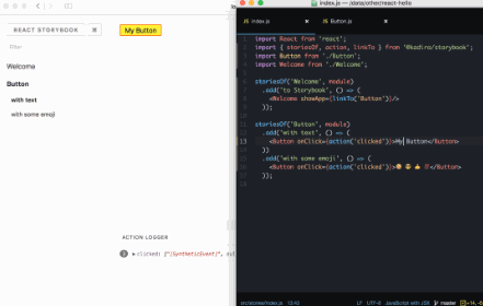
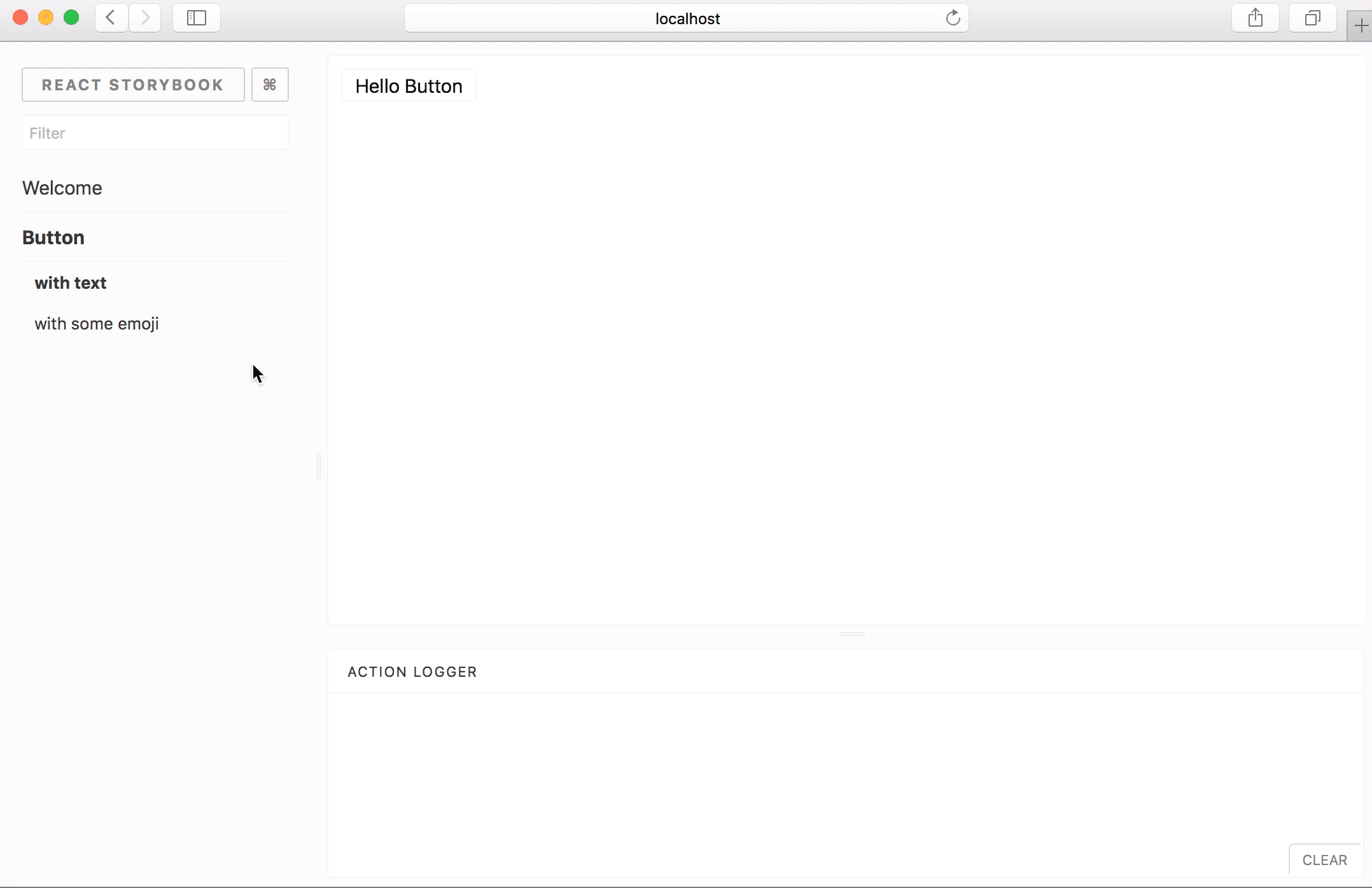
Once it's installed, you can npm run storybook and it will run the development server on your local machine, and give you a URL to browse some sample stories.
Storybook v2.x migration note: If you're using Storybook v2.x and want to shift to 3.x version the easiest way is:
npm i -g @storybook/cli
cd my-storybook-v2-app
getstorybook
It runs a codemod to update all package names. Read all migration details in our Migration Guide
For full documentation on using Storybook visit: storybook.js.org
For additional help, join us in our Slack