cp-react-tree-table
A fast, efficient tree table component for ReactJS.
Installation
[Method A] Using npm:
npm install --save cp-react-tree-table
[Method B] Using yarn:
yarn add cp-react-tree-table
Usage
Import the cp-react-tree-table module:
import TreeDataTable from 'cp-react-tree-table';
Example
Example Live Demo (JSFiddle)
import React, { Component } from 'react';
import TreeDataTable from 'cp-react-tree-table';
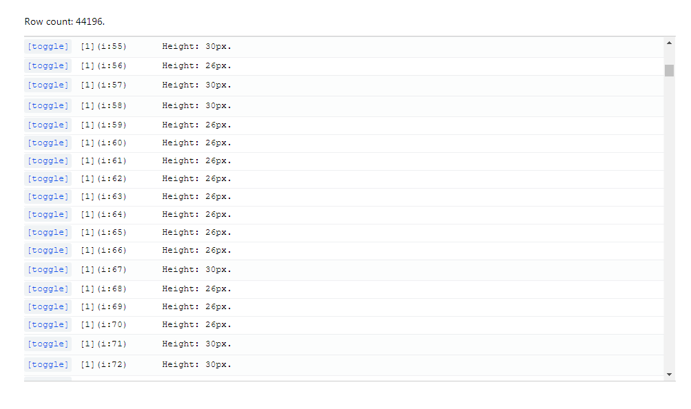
const mockData = [
{
data: { name: '[1](1) Height: 25px.' },
height: 25,
children: [
{
data: { name: '[2](1)' },
children: [
{
data: { name: '[3](1)' },
},
{
data: { name: '[3](2)' },
},
{
data: { name: '[3](3)' },
}
],
},
{
data: { name: '[2](2) Height: 40px.' },
height: 40,
}
],
},
{
data: { name: '[1](2) Height: 30px.' },
height: 30,
},
{
data: { name: '[1](3) Height: 30px.' },
height: 30,
},
];
export default class DemoApp extends Component {
render () {
return (
<TreeDataTable data={mockData} height={100} className="demo-tree-table">
<TreeDataTable.Column grow={0} basis="300px" renderCell={this.renderIndexColumn} />
<TreeDataTable.Column grow={1} renderCell={this.renderColumn} />
</TreeDataTable>
);
}
renderIndexColumn = (data, metadata, toggleChildren) => {
return (
<div style={{ paddingLeft: (metadata.depth * 25) + 'px'}}>
<span className="toggle-button-wrapper" style={{ width: '80px'}}>
{(metadata.hasChildren)
? (
<span onClick={toggleChildren}>[toggle]</span>
)
: ''
}
</span>
<span>{data.name}</span>
</div>
);
}
renderColumn = (data, metadata, toggleChildren) => {
return (
<span>Column 2: {data.name}</span>
);
}
}
Props
Props for TreeDataTable:
| Prop | Type | Required | Description |
|---|---|---|---|
data |
Array<TreeDataRow> |
yes |
List of data items |
height |
Number | no | Table height (px) * |
rowHeight |
Number | no | Default row height (px) ** |
onScroll |
Function | no | Callback for scroll event *** |
className |
String | no | Table custom class **** |
* Table height: default 200.
** Default row height: will be used for items (TreeDataRow) that don't specify their height property.
*** onScroll(scrollTop):
scrollTop: (number) The number of pixels that the table's content is scrolled vertically.
**** Table custom class: will be appended to the classList of TreeDataTable's root element.
Props for TreeDataTable.Column:
| Prop | Type | Required | Description |
|---|---|---|---|
grow |
Number | no | flexGrow CSS property |
basis |
String | no | flexBasis CSS property |
renderCell |
Function | yes |
Renders a single cell * |
* renderCell(rowData, rowMetadata, toggleChildren) => Node:
rowData: The item data object.rowMetadata: Metadata object describing the item state:depth: (number) Starts from 0, indicates the depth level of the item inside the tree.hasChildren: (boolean)
toggleChildren: Callback function that will toggle direct descendants of the item.
TreeDataRow Object type
Properties:
| Type | Required | Description | |
|---|---|---|---|
data |
any | yes |
The item data object |
height |
Number | no | Row height (px) * |
children |
Array<TreeDataRow> |
no | List of children data items |
* Row height: defaults to 26px if TreeDataTable's property rowHeight is not set.