react-dual-listbox
A feature-rich dual listbox for React.
Usage
Installation
Install the library using your favorite dependency manager:
yarn add react-dual-listbox
Using npm:
npm install react-dual-listbox --save
Note – This library makes use of Font Awesome styles and expects them to be loaded in the browser.
Include CSS
For your convenience, the library's styles can be consumed utilizing one of the following files:
node_modules/react-dual-listbox/lib/react-dual-listbox.cssnode_modules/react-dual-listbox/src/less/react-dual-listbox.lessnode_modules/react-dual-listbox/src/scss/react-dual-listbox.scss
Either include one of these files in your stylesheets or utilize a CSS loader:
import 'react-dual-listbox/lib/react-dual-listbox.css';
Render Component
The DualListBox is a [controlled] component, so you have to update the selected property in conjunction with the onChange handler if you want the selected values to change.
Here is a minimal rendering of the component:
import React from 'react';
import DualListBox from 'react-dual-listbox';

const options = [
    { value: 'one', label: 'Option One' },
    { value: 'two', label: 'Option Two' },
];

class Widget extends React.Component {
    constructor() {
        super();

        this.state = {
            selected: ['one'],
        };
    }

    render() {
        return (
            <DualListBox
                options={options}
                selected={this.state.selected}
                onChange={(selected) => {
                    this.setState({ selected });
                }}
            />
        );
    }
}
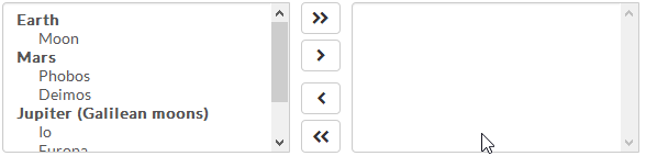
Optgroups
Traditional <optgroup>'s are also supported:
render() {
    const options = [
        {
            label: 'Earth',
            options: [
                { value: 'luna', label: 'Moon' },
            ],
        },
        {
            label: 'Mars',
            options: [
                { value: 'phobos', label: 'Phobos' },
                { value: 'deimos', label: 'Deimos' },
            ],
        },
        {
            label: 'Jupiter',
            options: [
                { value: 'io', label: 'Io' },
                { value: 'europa', label: 'Europa' },
                { value: 'ganymede', label: 'Ganymede' },
                { value: 'callisto', label: 'Callisto' },
            ],
        },
    ];

    return <DualListBox options={options} />;
}
Filtering
You can enable filtering of available and selected options by merely passing in the canFilter property:
render() {
    ...

    return <DualListBox canFilter options={options} />;
}
Optionally, you can also override the default filter placeholder text and the filtering function:
render() {
    ...

    return (
        <DualListBox
            canFilter
            filterCallback={(option, filterInput) => {
                if (filterInput === '') {
                    return true;
                }

                return (new RegExp(filterInput, 'i')).test(option.label);
            }}
            filterPlaceholder="Filter..."
            options={options}
        />
    );
}
In addition, you can control the filter search text, rather than leaving it up to the component:
render() {
    ...

    return (
        <DualListBox
            canFilter
            filter={{
                available: 'europa',
                selected: '',
            }}
            options={options}
            onFilterChange={(filter) => {
                console.log(filter;
            }}
        />
    );
}
Action/Button Alignment
By default, the movement buttons are aligned to the center of the component. Another option is to align these actions to be above their respective lists:
render() {
    ...

    return (
        <DualListBox alignActions="top" options={options} />
    );
}
Preserve Select Ordering
By default, react-dual-listbox will order any selected items according to the order of the options property. There may be times in which you wish to preserve the selection order instead. In this case, you can add the preserveSelectOrder property.
Note – Any
<optgroup>'s supplied will not be surfaced when preserving the selection order.
render() {
    ...

    return <DualListBox options={options} preserveSelectOrder />;
}
To allow users to re-arrange their selections after moving items to the right, you may also pass in the showOrderButtons property.
Restrict Available Options
Sometimes, it may be desirable to restrict what options are available for selection. For example, you may have a control above the dual listbox that allows a user to search for a planet in the solar system. Once a planet is selected, you want to restrict the available options to the moons of that planet. Use the available property in that case.
render() {
    ...

    // Let's restrict ourselves to the Jovian moons
    const available = ['io', 'europa', 'ganymede', 'callisto'];

    return <DualListBox options={options} available={available} />;
}
Changing the Default Icons
By default, react-dual-listbox uses Font Awesome for the various icons that appear in the component. To change the defaults, simply pass in the icons property and override the defaults:
<DualListBox
    ...
    icons={{
        moveLeft: <span className="fa fa-chevron-left" />,
        moveAllLeft: [
            <span key={0} className="fa fa-chevron-left" />,
            <span key={1} className="fa fa-chevron-left" />,
        ],
        moveRight: <span className="fa fa-chevron-right" />,
        moveAllRight: [
            <span key={0} className="fa fa-chevron-right" />,
            <span key={1} className="fa fa-chevron-right" />,
        ],
        moveDown: <span className="fa fa-chevron-down" />,
        moveUp: <span className="fa fa-chevron-up" />,
    }}
/>
Other Properties
| Property | Type | Description | Default |
|---|---|---|---|
| availableLabel | string | The display name for the hidden label for the available options control group. | "Available" |
| disabled | bool | If true, both "available" and "selected" list boxes will be disabled. | false |
| icons | object | The key-value pairing of action icons and their React nodes. See Changing the Default Icons for further info. | { ... } |
| id | string | The HTML ID prefix for the various sub elements. | null |
| lang | object | The key-value pairing of localized text. See src/js/lang/default.js for a list of keys. |
{ ... } |
| moveKeyCodes | array | The key codes that will trigger a toggle of the selected options. | [13, 32] |
| selectedLabel | string | The display name for the hidden label for the selected options control group. | "Selected" |
| simpleValue | bool | If true, the selected value passed in onChange is an array of string values. Otherwise, it is an array of options. |
true |
| showNoOptionsText | bool | If true, text will appear in place of the available/selected list boxes when no options are present. | false |