timescape
A powerful, headless library that elegantly fills the void left by HTML’s native <input type="time"> and <input type="date">.
Crafted in TypeScript, timescape is your toolkit to build custom date and time input components, masterfully managing the complexities of date and time data. The design and presentation are entirely in your hands, with timescape offering extensive support for a variety of libraries.
Key features such as accessibility and keyboard navigation are at the core of timescape, allowing you to focus on creating user-centric date and time inputs that integrate seamlessly into your projects.
Features
- ? Headless Architecture: You control the UI –
timescapehandles the logic. - ? Framework Compatibility: Adapters for React, Preact, Vue, Svelte, and Solid.
- ⚙️ Flexible API️: Hooks (or equivalents) return getters for seamless component integration. Order of inputs (i.e. format) is completely up to you by just rendering in the order you prefer.
- ? Accessibility: Full A11y compliance, keyboard navigation and manual input.
- ⏰ Date and time flexibility: Supports min/max dates and 24/12 hour clock formats.
- ? Lightweight: No external dependencies.
- ? Enhanced input fields: A supercharged
<input type="date/time">, offering additional flexibility. - ? Touch device support: Use it on any device, including touch devices.
Installation
# pnpm
pnpm add timescape

# yarn
yarn add timescape

# npm
npm install --save timescape
Examples
React
import { useTimescape } from 'timescape/react'

function App() {
  const { getRootProps, getInputProps } = useTimescape({
    date: new Date(),
    onChangeDate: (nextDate) => {
      console.log('Date changed to', nextDate)
    },
  })

  return (
    <div className="timescape" {...getRootProps()}>
      <input {...getInputProps('days')} />
      <span>/</span>
      <input {...getInputProps('months')} />
      <span>/</span>
      <input {...getInputProps('years')} />
      <span> </span>
      <input {...getInputProps('hours')} />
      <span>:</span>
      <input {...getInputProps('minutes')} />
      <span>:</span>
      <input {...getInputProps('seconds')} />
    </div>
  )
}
Preact
This package uses Preact signals, if you want to use it without just use the React implementation in compat mode.
import { useTimescape } from 'timescape/preact'

import { effect, useComputed, useSignal } from '@preact/signals'
import { useTimescape } from 'timescape/preact'

function App() {
  const options = useSignal({
    date: new Date(),
  })

  const { getRootProps, getInputProps } = useTimescape(options)

  effect(() => {
    console.log('Date changed to', options.value.date)
  })

  return (
    <div className="timescape" {...getRootProps()}>
      <input {...getInputProps('days')} />
      <span>/</span>
      <input {...getInputProps('months')} />
      <span>/</span>
      <input {...getInputProps('years')} />
    </div>
  )
}
Vue
<template>
  <div class="timescape" :ref="registerRoot()">
    <input :ref="registerElement('days')" />
    <span>/</span>
    <input :ref="registerElement('months')" />
    <span>/</span>
    <input :ref="registerElement('years')" />
  </div>
</template>

<script lang="ts" setup>
import { useTimescape, type UseTimescapeOptions } from 'timescape/vue'
import { ref, computed, watchEffect, reactive } from 'vue'

const date = ref(new Date())

watchEffect(() => {
  console.log('Date changed to', date.value)
})

const options = reactive({
  date,
  minDate: new Date(),
} as UseTimescapeOptions)

const { registerElement, registerRoot } = useTimescape(options)
</script>
Svelte
<script lang="ts">
  import { createTimescape } from 'timescape/svelte'
  import { derived, writable } from 'svelte/store'

  const options = writable({
    date: new Date(),
  })

  const { inputProps, rootProps } = createTimescape(options)

  date.subscribe((nextDate) => {
    console.log('Date changed to', nextDate)
  })
</script>

<div class="timescape" use:rootProps>
  <input use:inputProps={'days'} />
  <span>/</span>
  <input use:inputProps={'months'} />
  <span>/</span>
  <input use:inputProps={'years'} />
</div>
Solid
import { useTimescape } from 'timescape/solid'
import { createEffect, createMemo, createSignal } from 'solid-js'

function App() {
  const options = createSignal({
    date: new Date(),
  })

  const { getInputProps, getRootProps } = useTimescape(options)

  const nextDate = createMemo(() => options[0]().date)

  createEffect(() => {
    console.log('Date changed to', nextDate())
  })

  return (
    <div class="timescape" {...getRootProps()}>
      <input {...getInputProps('days')} />
      <span>/</span>
      <input {...getInputProps('months')} />
      <span>/</span>
      <input {...getInputProps('years')} />
    </div>
  )
}
Vanilla JS
import { TimescapeManager } from 'timescape'

const container = document.createElement('div')
document.body.appendChild(container)

container.innerHTML = `
  <div class="timescape" id="timescape-root">
    <input data-type="days" placeholder="dd" />
    <span>/</span>
    <input data-type="months" placeholder="mm" />
    <span>/</span>
    <input data-type="years" placeholder="yyyy" />
  </div>
`

const timeManager = new TimescapeManager()

timeManager.date = new Date()

timeManager.subscribe((nextDate) => {
  console.log('Date changed to', nextDate)
})

timeManager.registerRoot(document.getElementById('timescape-root')!)

timeManager.registerElement(
  container.querySelector('[data-type="days"]')!,
  'days',
)
timeManager.registerElement(
  container.querySelector('[data-type="months"]')!,
  'months',
)
timeManager.registerElement(
  container.querySelector('[data-type="years"]')!,
  'years',
)
Options
type Options = {
  minDate?: Date | $NOW // see more about $NOW below
  maxDate?: Date | $NOW
  hour12?: boolean
  wrapAround?: boolean
  digits?: 'numeric' | '2-digit'
}
| Option | Default | Description |
|---|---|---|
minDate |
undefined |
The minimum date that the user can select. $NOW is a special value that represents the current date and time. See more below |
maxDate |
undefined |
The maximum date that the user can select. $NOW is a special value that represents the current date and time. See more below |
hour12 |
false |
If set to true, the time input will use a 12-hour format (with AM/PM). If set to false, it will use a 24-hour format. |
digits |
'2-digit' |
Controls the display of the day and month in the date input. 'numeric' displays as 1-12 for month and 1-31 for day, while '2-digit' displays as 01-12 for month and 01-31 for day. This follows Intl.DateTimeFormat convention. |
wrapAround |
false |
If set to true, the time input will wrap around from the end of one period (AM/PM or day) to the beginning of the next. |
$NOW value
$NOW is a convenience value you can use for minDate and maxDate. It represents the current date and time at the moment of the user’s interaction, dynamically adjusting to always reflect the current datetime value. This means you don’t need to manually update it, as it always keeps itself current.
$NOW is exported as a constant for better type safety. By doing so, it eliminates the need for casting it as const, which would be required if $NOW were simply a string.”
It can be imported from the package like so:
import { $NOW } from 'timescape'

// or from a specific module
import { $NOW } from 'timescape/react'

// Svelte import names prohibit a $ prefix, so it's renamed to NOW there
import { NOW } from 'timescape/svelte'
Anatomy & styling
The component is designed to be as un-opinionated as possible, so it doesn’t come with any styling out of the box. You can style it however you want, but here are some tips to get you started.
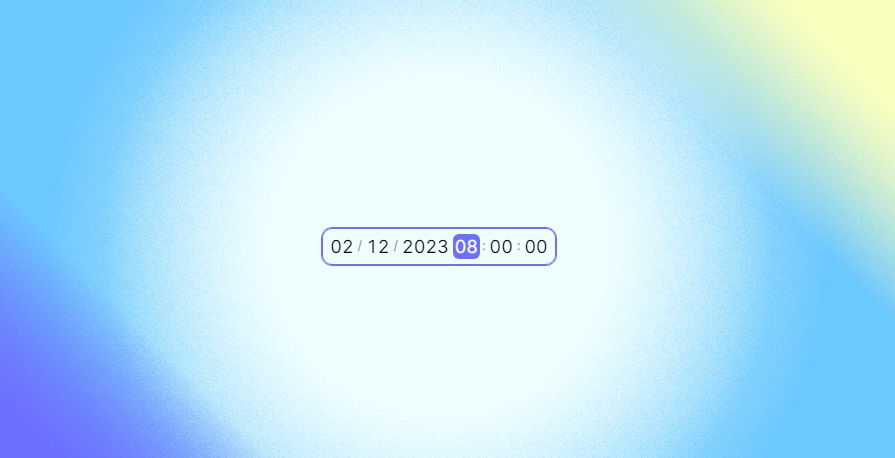
This is how it could look like:
A typical anatomy of a timescape component may look like this:
HTML
<div class="timescape">
<!-- Date inputs -->
<input />
<span class="separator">/</span>
<input />
<span class="separator">/</span>
<input />
<span class="separator"> </span>
<!-- Time inputs -->
<input />
<span class="separator">:</span>
<input />
<span class="separator">:</span>
<input />
</div>
CSS
/**
 * Root element
 */
.timescape {
  display: flex;
  align-items: center;
  gap: 1px;
  width: fit-content;
  border: 1px solid #b2b2b2;
  padding: 5px;
  user-select: none;
  border-radius: 10px;
}

.timescape:focus-within {
  outline: 1px solid #8f47d4;
  border-color: #8f47d4;
}

/**
 * Date and time input elements
 */
.timescape input {
  /* This is an important style, as it ensures that the inputs have
  the same width regardless of the number of characters they contain. */
  font-variant-numeric: tabular-nums;
  height: fit-content;
  /* These are handled by the `:focus` selector */
  border: none;
  outline: none;
  cursor: default;
  user-select: none;
  box-sizing: content-box;
  /* For touch devices where input fields are not set to readonly */
  caret-color: transparent;

  /* For the calculation of the input width these are important */
  font-family: inherit;
  font-size: inherit;
  line-height: inherit;
}

.timescape input:focus {
  background-color: #8f47d4;
  color: #fff;
  border-radius: 6px;
  padding: 2px;
}

/**
 * Separator elements
 */
.timescape .separator {
  font-size: 80%;
  color: #8c8c8c;
  margin: 0;
}


