phosphor-react
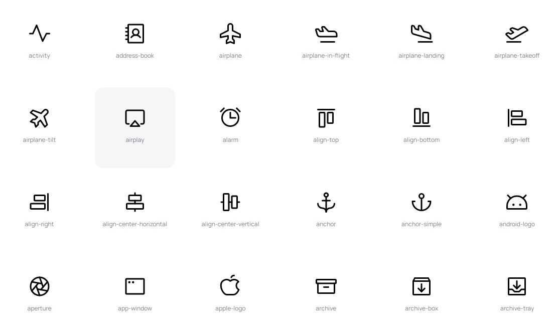
Phosphor is a flexible icon family for interfaces, diagrams, presentations — whatever, really. Explore all our icons at phosphoricons.com.
Installation
yarn add phosphor-react
or
npm install --save phosphor-react
Usage
Simply import the icons you need, and add them anywhere in your render method. Phosphor supports tree-shaking, so your bundle only includes code for the icons you use.
import React from "react";
import ReactDOM from "react-dom";
import { Horse, Heart, Cube } from "phosphor-react";

const App = () => {
  return (
    <div>
      <Horse />
      <Heart color="#AE2983" weight="fill" size={32} />
      <Cube color="teal" weight="duotone" />
    </div>
  );
};

ReactDOM.render(<App />, document.getElementById("root"));
Props
Icon components accept all props that you can pass to a normal SVG element, including inline style objects, onClick handlers, and more. The main way of styling them will usually be with the following props:
- color?:
string– Icon stroke/fill color. Can be any CSS color string, includinghex,rgb,rgba,hsl,hsla, named colors, or the specialcurrentColorvariable. - size?:
number | string– Icon height & width. As with standard React elements, this can be a number, or a string with units inpx,%,em,rem,pt,cm,mm,in. - weight?:
"thin" | "light" | "regular" | "bold" | "fill" | "duotone"– Icon weight/style. Can also be used, for example, to "toggle" an icon's state: a rating component could use Stars withweight="regular"to denote an empty star, andweight="fill"to denote a filled star. - mirrored?:
boolean– Flip the icon horizontally. Can be useful in RTL languages where normal icon orientation is not appropriate.
Context
Phosphor takes advantage of React Context to make applying a default style to all icons simple. Create an IconContext.Provider at the root of the app (or anywhere above the icons in the tree) and pass in a configuration object with props to be applied by default to all icons:
import React from "react";
import ReactDOM from "react-dom";
import { IconContext, Horse, Heart, Cube } from "phosphor-react";

const App = () => {
  return (
    <IconContext.Provider
      value={{
        color: "limegreen",
        size: 32,
        weight: "bold",
        mirrored: false,
      }}
    >
      <div>
        <Horse /> {/* I'm lime-green, 32px, and bold! */}
        <Heart /> {/* Me too! */}
        <Cube />  {/* Me three :) */}
      </div>
    </IconContext.Provider>
  );
};

ReactDOM.render(<App />, document.getElementById("root"));
You may create multiple Contexts for styling icons differently in separate regions of an application; icons use the nearest Context above them to determine their style.
Note: The context will also pass any provided SVG props down to icon instances, which can be useful E.G. in adding accessible
aria-labels,classNames, etc.
Composability
Components can accept arbitrary SVG elements as children, so long as they are valid children of the <svg> element. This can be used to modify an icon with background layers or shapes, filters, animations and more. The children will be placed below the normal icon contents.
The following will cause the Cube icon to rotate and pulse:
const RotatingCube = () => {
  return (
    <Cube color="darkorchid" weight="duotone">
      <animate
        attributeName="opacity"
        values="0;1;0"
        dur="4s"
        repeatCount="indefinite"
      ></animate>
      <animateTransform
        attributeName="transform"
        attributeType="XML"
        type="rotate"
        dur="5s"
        from="0 0 0"
        to="360 0 0"
        repeatCount="indefinite"
      ></animateTransform>
    </Cube>
  );
};
Note: The coordinate space of slotted elements is relative to the contents of the icon
viewBox, which is a 256x256 square. Only valid SVG elements will be rendered.
Imports
You may wish to import all icons at once for use in your project, though depending on your bundler this could prevent tree-shaking and make your app's bundle larger.
import * as Icon from "phosphor-react";
...
<Icon.Smiley />
<Icon.Folder weight="thin" />
<Icon.BatteryHalf size="24px" />
