react-img-carousel
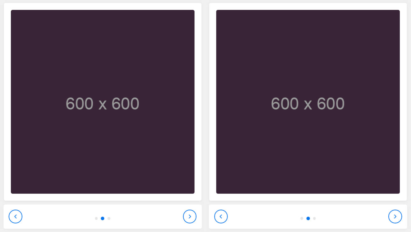
This component renders a carousel with support for lazy loading, autoplay, infinite scrolling, touch events and more.
Usage:
Render a carousel instance passing the necessary props (Note: In order to load the required CSS file with the below syntax,
you will need to use some kind of module loader/bundler like Webpack or Browserify):
import React from 'react';
import { render } from 'react-dom';
import Carousel from 'react-carousel';

require('react-carousel/lib/carousel.css');

render(
  <Carousel viewportWidth="400px" cellPadding={ 5 }>
    <img src='https://placekitten.com/200/300'/>
    <img src='https://placekitten.com/300/300'/>
    <img src='https://placekitten.com/400/300'/>
  </Carousel>,
  document.body
);
Running test page:
Clone the repository, run npm i and then run npm start and point your browser to
localhost:8080/webpack-dev-server/
Available props:
initialSlide
PropTypes.number
Determines the first visible slide when the carousel loads, defaults to 0.
width
PropTypes.string
Determines the width of the outermost carousel div. Defaults to 100%.
height
PropTypes.string
Determines the height of the outermost carousel div. Defaults to auto.
viewportWidth
PropTypes.string
Determines the width of the viewport which will show the images. If you don't want the previous/next images to be
visible, this width should match the slideWidth prop or the width of the child images. Defaults to 100%.
viewportHeight
PropTypes.string
Determines the height of the viewport which will show the images. Defaults to auto.
className
PropTypes.string
Optional class which will be added to the carousel class.
dots
PropTypes.bool
If false, the dots below the carousel will not be rendered.
arrows
PropTypes.bool
If false, the arrow buttons will not be rendered.
infinite
PropTypes.bool
If true, clicking next/previous when at the end/beginning of the slideshow will wrap around.
lazyLoad
PropTypes.bool
If false, the carousel will render all children at mount time and will not attempt to lazy load images. Note that
lazy loading will only work if the slides are img tags or if both slideWidth and slideHeight are specified.
imagesToPrefetch
PropTypes.number
If lazyLoad is set to true, this value will be used to determine how many images to fetch at mount time. Defaults
to 5.
cellPadding
PropTypes.number
Number of pixels to render between slides.
slideWidth
PropTypes.string
Used to specify a fixed width for all slides. Without specifying this, slides will simply be the width of their content.
slideHeight
PropTypes.string
Used to specify a fixed height for all slides. Without specifying this, slides will simply be the height of their
content.
beforeChange
PropTypes.func
Optional callback which will be invoked before a slide change occurs. Should have method signature
function(newIndex, prevIndex)
afterChange
PropTypes.func
Optional callback which will be invoked after a slide change occurs. Should have method signature
function(newIndex)
style
PropTypes.shape({
  container: PropTypes.object,
  containerInner: PropTypes.object,
  viewport: PropTypes.object,
  track: PropTypes.object,
  slide: PropTypes.object,
  selectedSlide: PropTypes.object
})
If your app is using inline styles, you can use this property to specify inline styling for the individual carousel
elements. The properties correspond to the DOM elements with class names carousel, carousel-container-inner,
carousel-viewport, carousel-track, carousel-slide, and carousel-slide-selected respectively. If both slide
and selectedSlide are specified, both will be applied with the latter overriding the former.
Example:
<Carousel
  ...
  style={{
    slide: {
      opacity: 0.2
    },
    selectedSlide: {
      opacity: 1
    }
  }}
>
...
</Carousel>
transition
PropTypes.oneOf(['fade', 'slide'])
The type of transition to use between slides, defaults to slide.
transitionDuration
PropTypes.oneOfType([PropTypes.number, PropTypes.string])
Time for the transition effect between slides, defaults to 500. If a number is specified, it indicates the number of
milliseconds. Strings are parsed using ms.
easing
PropTypes.oneOf(['ease', 'linear', 'ease-in', 'ease-out', 'ease-in-out'])
The easing function to use for the transition. Defaults to ease-in-out.
clickToNavigate
PropTypes.bool
Controls whether or not clicking slides other than the currently selected one should navigate to the clicked slide.
Defaults to true.
autoplay
PropTypes.bool
If true, the slideshow will automatically advance.
autoplaySpeed
PropTypes.oneOfType([PropTypes.number, PropTypes.string])
Time to wait before advancing to the next slide when autoplay is true. Defaults to 4000. If a number is specified,
it indicates the number of milliseconds. Strings are parsed using ms.
draggable
PropTypes.bool
Controls whether mouse/touch swiping is enabled, defaults to true.
pauseOnHover
PropTypes.bool
Controls whether autoplay will pause when the user hovers the mouse cursor over the image, defaults to true.
controls
PropTypes.arrayOf(PropTypes.shape({
  component: PropTypes.func.isRequired,
  props: PropTypes.object,
  position: PropTypes.oneOf(['top', 'bottom'])
}))
Optional array of controls to be rendered in the carousel container. Each control's component property should be a React
component constructor, and will be passed callback props nextSlide, prevSlide and goToSlide for controlling
navigation, and numSlides, selectedIndex and infinite for rendering the state of the carousel.
Tests:
npm install && npm test