react-mosaic
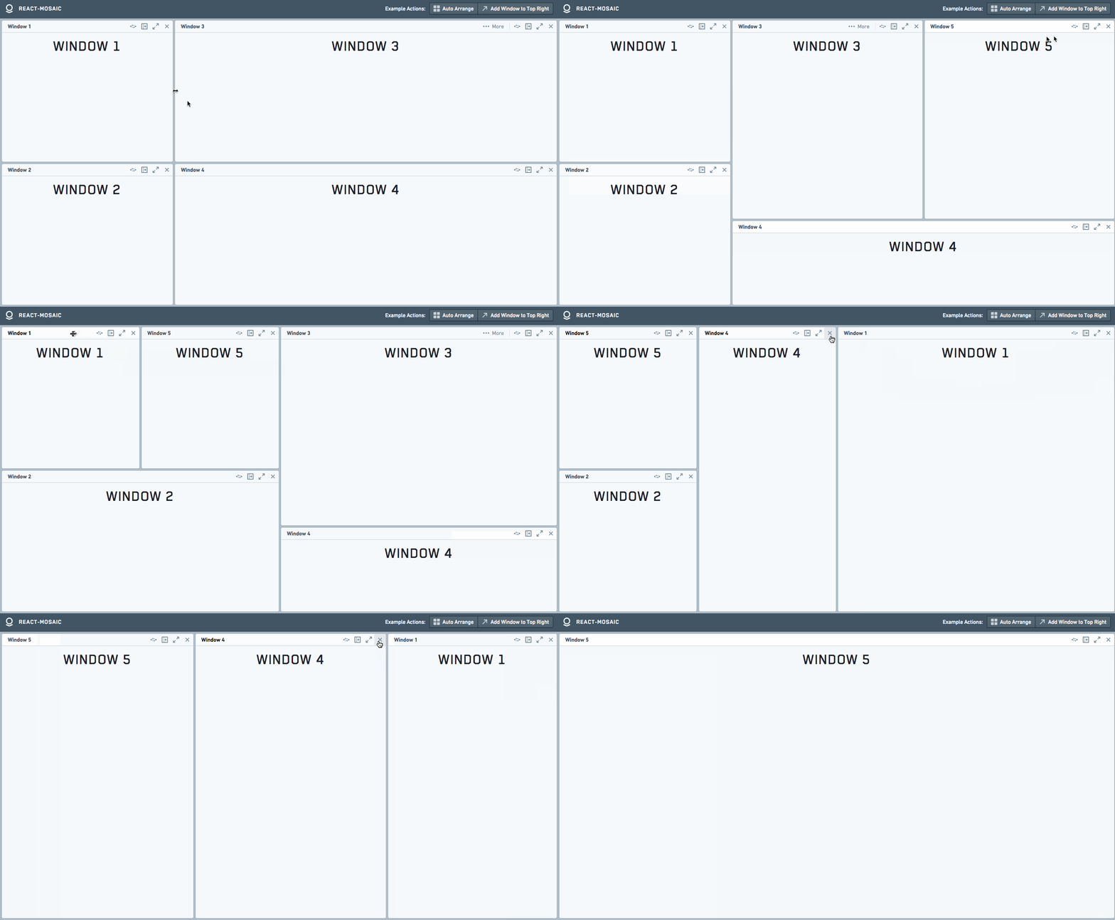
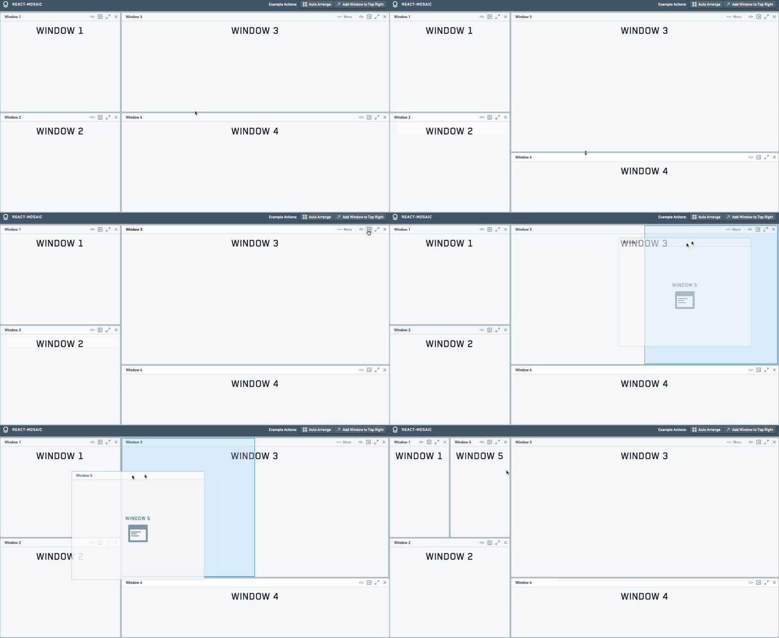
react-mosaic is a full-featured React Tiling Window Manager meant to give a user complete control over their workspace. It provides a simple and flexible API to tile arbitrarily complex react components across a user's view. react-mosaic is written in TypeScript and provides typings but can be used in JavaScript as well.

Usage
The core of react-mosaic's operations revolve around the simple binary tree specified by MosaicNode<T>.
T is the type of the leaves of the tree and is a string or a number that can be resolved to a JSX.Element for display.
Installation
yarn add react-mosaic-component- Make sure
react-mosaic-component.cssis included on your page. - Import the
Mosaiccomponent and use it in your app. - (Optional) Install Blueprint
Blueprint Theme
Without a theme, Mosaic only loads the styles necessary for it to function -
making it easier for the consumer to style it to match their own app.
By default, Mosaic renders with the mosaic-blueprint-theme class.
This uses the excellent Blueprint React UI Toolkit to provide a good starting state.
It is recommended to at least start developing with this theme.
To use it install Blueprint yarn add @blueprintjs/core and add its CSS to your page.
See blueprint-theme.less for an example of creating a theme.
Blueprint Dark Theme
Mosaic supports the Blueprint Dark Theme out of the box when rendered with the mosaic-blueprint-theme pt-dark class.
Examples
Simple Tiling
import { Mosaic } from 'react-mosaic-component';

const ELEMENT_MAP: { [viewId: string]: JSX.Element } = {
  a: <div>Left Window</div>,
  b: <div>Top Right Window</div>,
  c: <div>Bottom Right Window</div>,
};

export const app = (
  <Mosaic
    renderTile={(id) => ELEMENT_MAP[id]}
    initialValue={{
      direction: 'row',
      first: 'a',
      second: {
        direction: 'column',
        first: 'b',
        second: 'c',
      },
      splitPercentage: 40,
    }}
  />
);
renderTile is a stateless lookup function to convert T into a displayable JSX.Element.
By default T is string (so to render one element initialValue="ID" works).
Ts must be unique within an instance of Mosaic, they are used as keys for React list management.
initialValue is a MosaicNode<T>.
The user can resize these panes but there is no other advanced functionality.
This example renders a simple tiled interface with one element on the left half, and two stacked elements on the right half.
The user can resize these panes but there is no other advanced functionality.
Drag, Drop, and other advanced functionality with MosaicWindow
MosaicWindow is a component that renders a toolbar and controls around its children for a tile as well as providing full featured drag and drop functionality.
export type ViewId = 'a' | 'b' | 'c' | 'new';

// Make type alias for generic checking in TSX until https://github.com/Microsoft/TypeScript/issues/6395 is fixed

const ViewIdMosaic = Mosaic.ofType<ViewId>();
const ViewIdMosaicWindow = MosaicWindow.ofType<ViewId>();

const TITLE_MAP: Record<ViewId, string> = {
  a: 'Left Window',
  b: 'Top Right Window',
  c: 'Bottom Right Window',
  new: 'New Window',
};

export const app = (
  <ViewIdMosaic
    renderTile={(id, path) => (
      <ViewIdMosaicWindow path={path} createNode={() => 'new'} title={TITLE_MAP[id]}>
        <h1>{TITLE_MAP[id]}</h1>
      </ViewIdMosaicWindow>
    )}
    initialValue={{
      direction: 'row',
      first: 'a',
      second: {
        direction: 'column',
        first: 'b',
        second: 'c',
      },
    }}
  />
);
Here T is a ViewId that can be used to look elements up in TITLE_MAP.
This allows for easy view state specification and serialization.
This will render a view that looks very similar to the previous examples, but now each of the windows will have a toolbar with buttons.
These toolbars can be dragged around by a user to rearrange their workspace.
MosaicWindow API docs here.
Controlled vs. Uncontrolled
Mosaic views have two modes, similar to React.DOM input elements:
- Controlled, where the consumer manages Mosaic's state through callbacks.
Using this API, the consumer can perform any operation upon the tree to change the the view as desired. - Uncontrolled, where Mosaic manages all of its state internally.
All of the previous examples show use of Mosaic in an Uncontrolled fashion.
TS/JS vs. TSX/JSX
Components export both factories and component classes.
If you are using TS/JS then use the factories;
if you are using TSX/JSX then use the exported class but know that you will lose the generics if you aren't careful.
The exported classes are named as the base name of the component (e.g. MosaicWindow) while the exported factories
have 'Factory' appended (e.g. MosaicWindowFactory).
Example Application
See ExampleApp (the application used in the Demo)
for a more interesting example that shows the usage of Mosaic as a controlled component and modifications of the tree structure.
API
Mosaic Props
export interface MosaicBaseProps<T extends MosaicKey> {
  /**
   * Lookup function to convert `T` to a displayable `JSX.Element`
   */
  renderTile: TileRenderer<T>;
  /**
   * Called when a user initiates any change to the tree (removing, adding, moving, resizing, etc.)
   */
  onChange?: (newNode: MosaicNode<T> | null) => void;
  /**
   * Additional classes to affix to the root element
   * Default: 'mosaic-blueprint-theme'
   */
  className?: string;
  /**
   * Options that control resizing
   * @see: [[ResizeOptions]]
   */
  resize?: ResizeOptions;
  /**
   * View to display when the current value is `null`
   * default: Simple NonIdealState view
   */
  zeroStateView?: JSX.Element;
}

export interface MosaicControlledProps<T extends MosaicKey> extends MosaicBaseProps<T> {
  /**
   * The tree to render
   */
  value: MosaicNode<T> | null;
  onChange: (newNode: MosaicNode<T> | null) => void;
}

export interface MosaicUncontrolledProps<T extends MosaicKey> extends MosaicBaseProps<T> {
  /**
   * The initial tree to render, can be modified by the user
   */
  initialValue: MosaicNode<T> | null;
}

export type MosaicProps<T extends MosaicKey> = MosaicControlledProps<T> | MosaicUncontrolledProps<T>;
MosaicWindow
export interface MosaicWindowProps<T extends MosaicKey> {
  title: string;
  /**
   * Current path to this window, provided by `renderTile`
   */
  path: MosaicBranch[];
  className?: string;
  /**
   * Controls in the top right of the toolbar
   * default: [Replace, Split, Expand, Remove] if createNode is defined and [Expand, Remove] otherwise
   */
  toolbarControls?: React.ReactNode;
  /**
   * Additional controls that will be hidden in a drawer beneath the toolbar.
   * default: []
   */
  additionalControls?: React.ReactNode;
  /**
   * Label for the button that expands the drawer
   */
  additionalControlButtonText?: string;
  /**
   * Whether or not a user should be able to drag windows around
   */
  draggable?: boolean;
  /**
   * Method called when a new node is required (such as the Split or Replace buttons)
   */
  createNode?: CreateNode<T>;
  /**
   * Optional method to override the displayed preview when a user drags a window
   */
  renderPreview?: (props: MosaicWindowProps<T>) => JSX.Element;
}
The default controls rendered by MosaicWindow can be accessed from defaultToolbarControls
Advanced API
The above API is good for most consumers, however Mosaic provides functionality on the Context of its children that make it easier to alter the view state.
All leaves rendered by Mosaic will have the following available on React context.
These are used extensively by MosaicWindow.
/**
 * Valid node types
 * @see React.Key
 */
export type MosaicKey = string | number;
export type MosaicBranch = 'first' | 'second';
export type MosaicPath = MosaicBranch[];

/**
 * Context provided to everything within Mosaic
 */
export interface MosaicContext<T extends MosaicKey> {
  mosaicActions: MosaicRootActions<T>;
  mosaicId: string;
}

export interface MosaicRootActions<T extends MosaicKey> {
  /**
   * Increases the size of this node and bubbles up the tree
   * @param path Path to node to expand
   * @param percentage Every node in the path up to root will be expanded to this percentage
   */
  expand: (path: MosaicPath, percentage?: number) => void;
  /**
   * Remove the node at `path`
   * @param path
   */
  remove: (path: MosaicPath) => void;
  /**
   * Hide the node at `path` but keep it in the DOM. Used in Drag and Drop
   * @param path
   */
  hide: (path: MosaicPath) => void;
  /**
   * Replace currentNode at `path` with `node`
   * @param path
   * @param node
   */
  replaceWith: (path: MosaicPath, node: MosaicNode<T>) => void;
  /**
   * Atomically applies all updates to the current tree
   * @param updates
   */
  updateTree: (updates: MosaicUpdate<T>[]) => void;
  /**
   * Returns the root of this Mosaic instance
   */
  getRoot: () => MosaicNode<T> | null;
}
Children (and toolbar elements) within MosaicWindow are passed the following additional functions on context.
export interface MosaicWindowContext<T extends MosaicKey> extends MosaicContext<T> {
  mosaicWindowActions: MosaicWindowActions;
}

export interface MosaicWindowActions {
  /**
   * Fails if no `createNode()` is defined
   * Creates a new node and splits the current node.
   * The current node becomes the `first` and the new node the `second` of the result.
   * `direction` is chosen by querying the DOM and splitting along the longer axis
   */
  split: () => Promise<void>;
  /**
   * Fails if no `createNode()` is defined
   * Convenience function to call `createNode()` and replace the current node with it.
   */
  replaceWithNew: () => Promise<void>;
  /**
   * Sets the open state for the tray that holds additional controls
   */
  setAdditionalControlsOpen: (open: boolean) => void;
  /**
   * Returns the path to this window
   */
  getPath: () => MosaicPath;
}
To access the functions on context simply specify contextTypes on your component.
class RemoveButton extends React.PureComponent<Props> {
  static contextTypes = MosaicWindowContext;
  context: MosaicWindowContext<TileId>;

  render() {
    return <button onClick={this.remove}>╳</button>;
  }

  private remove = () => this.context.mosaicActions.remove(this.context.mosaicWindowActions.getPath());
}


