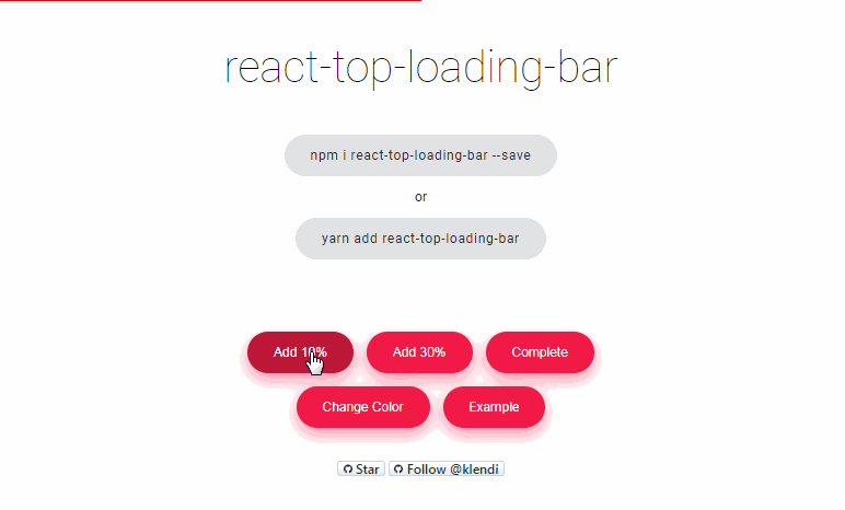
react-top-loading-bar
A very simple, highly customisable youtube-like react loader component.
Install
- using npm
npm install --save react-top-loading-bar
- using yarn
yarn add react-top-loading-bar
Usage
import React, { Component } from "react";

import LoadingBar from "react-top-loading-bar";

export default class App extends Component {
  state = {
    loadingBarProgress: 0
  };

  add = value => {
    this.setState({
      loadingBarProgress: this.state.loadingBarProgress + value
    });
  };

  complete = () => {
    this.setState({ loadingBarProgress: 100 });
  };

  onLoaderFinished = () => {
    this.setState({ loadingBarProgress: 0 });
  };

  render() {
    return (
      <div>
        <LoadingBar
          progress={this.state.loadingBarProgress}
          height={3}
          color="red"
          onLoaderFinished={() => this.onLoaderFinished()}
        />
        <button onClick={() => this.add(10)}>Add 10</button>
        <button onClick={() => this.add(30)}>Add 30</button>
        <button onClick={() => this.complete()}>Complete</button>
      </div>
    );
  }
}
Properties
| Property | Type | Default | Description |
|---|---|---|---|
| progress | Number | 0 |
The progress/width indicator, progress prop varies from 0 to 100. |
| color | String | red |
The color of the loading bar, color take values like css property background-color: do, for example red, #000 rgb(255,0,0) etc. |
| height | Number | 3 |
The height of the loading bar in pixels. |
| className | String | You can provide a class you'd like to add to the loading bar to add some styles to it | |
| onLoaderFinished | Function | This is called when the loading bar completes, reaches 100% of his width. | |
| onProgressChange | Function | This is called each time loading bar value changes. |