react-image-magnifiers
A collection of responsive, image magnifying React components for mouse and touch. Useful for product images in ecommerce sites, image galleries, stock photos, etc.
Included components:
- Magnifier: Can be zoomed in/out by click, double click, tap, double tap, or long touch. Click/touch and drag to move around the image while zoomed in. Alternate mode moves around the image via hover or touch/slide.
- GlassMagnifier: Simulates a magnifying glass. Includes offset options for use with touch (so the user's finger doesn't block the magnifying glass).
- SideBySideMagnifier: Displays a zoomed in view of the image on hover/touch alongside the small version. Automatically zooms in place when there's not enough room to display alongside.
- PictureInPictureMagnifier: Displays a small preview image with a zoom area preview box in the corner of the component. User can move the preview box around to change the portion of the enlarged image to display.
Installation
npm install --save react-image-magnifiers
Basic Usage
import {
  Magnifier,
  GlassMagnifier,
  SideBySideMagnifier,
  PictureInPictureMagnifier,
  MOUSE_ACTIVATION,
  TOUCH_ACTIVATION
} from "react-image-magnifiers";
...

<GlassMagnifier
  imageSrc="./image.jpg"
  imageAlt="Example"
  largeImageSrc="./large-image.jpg" // Optional
/>

<Magnifier
  imageSrc="./image.jpg"
  imageAlt="Example"
  largeImageSrc="./large-image.jpg" // Optional
  mouseActivation={MOUSE_ACTIVATION.DOUBLE_CLICK} // Optional
  touchActivation={TOUCH_ACTIVATION.DOUBLE_TAP} // Optional
/>
Note: The zoom level of all components depends on the rendered size difference between the small and large versions of the image. On all components except for the PictureInPictureMagnifier, the zoom functionality will be disabled if the large image size is <= the small image's current rendered size. The PictureInPictureMagnifier requires that the large/zoom image is larger to display properly.
Common Props
imageSrc is the only required prop.
cursorStyle: Accepts any valid CSS cursor. Default: Magnifier - "zoom-in", GlassMagnifier - "none", SideBySideMagnifier - "crosshair", PictureInPicture - "crosshair". Type: string.
imageSrc: Passed to the src of the small image (not zoomed). Also used for the large image (zoomed) if no largeImageSrc is set.
imageAlt: Passed to the alt of both images.
largeImageSrc: Passed to the src of the large image (zoomed).
style: Passed to the style of the parent div.
className: Passed to the className of the parent div.
renderOverlay: Render prop for custom overlays. Component function will receive a single boolean prop representing the active state. Be sure to use absolute position on your content to avoid changing the size/layout of the magnifier component, which would interfere with the functionality. Default: null, Type: function.
Magnifier Props
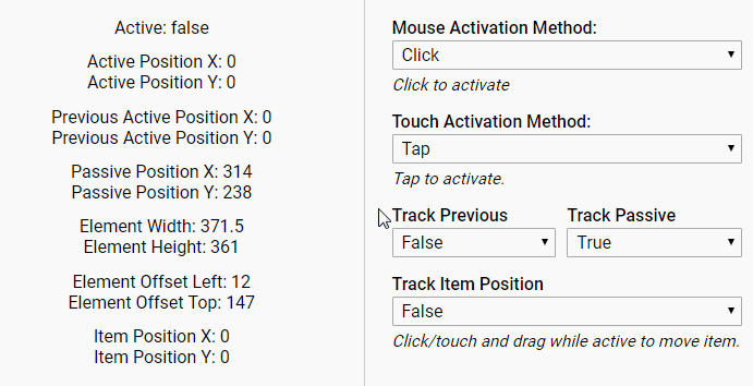
mouseActivation: Sets the mouse method for zooming in/out. Accepts: "click" or "doubleClick". Can also import the MOUSE_ACTIVATION constants to assist. Type: string, Default: "click".
touchActivation: Sets the touch method for zooming in/out. Accepts: "tap", "doubleTap", or "longTouch". Can also import the TOUCH_ACTIVATION constants to assist. Type: string, Default: "tap".
cursorStyleActive: Cursor style while the component is in an active (zoomed in) state. Accepts any valid CSS cursor. Type: string, Default: "move" while dragToMove is active, otherwise "zoom-out".
dragToMove: Movement of the image, while zoomed in, requires a click/touch drag gesture. Type: boolean, Default: true.
interactionSettings: Settings to fine tune the mouse and/or touch settings. Accepts an object with any of the following properties:
- tapDurationInMs: Sets the maximum length of touch events in order to be considered tap gestures. Type: number, Default: 180.
- doubleTapDurationInMs: Sets the minimum length of time in which two tap gestures must be performed in order to be considered a double tap gesture. Type: number, Default: 400.
- longTouchDurationInMs: Sets the minimum length of touch events in order to be consider a long touch gesture. Type: number, Default: 500.
- longTouchMoveLimit: Sets the maximum movement allowed during a long touch gesture. Type: number, Default: 5.
- clickMoveLimit: Sets the maximum movement allowed during a mouse click. Helps to differentiate between a drag and click. Type: number, Default: 5.
GlassMagnifier Props
allowOverFlow: Allows the magnifying glass to spill out over the edges of the component. Type: boolean, Default: true.
magnifierBorderColor: Color of the magnifying glass border. Accepts any valid CSS color. Type: string, Default: "rgba(255,255,255,.5)".
magnifierBorderSize: Size of the magnifying glass border in px. Type: number, Default: 3.
magnifierBackgroundColor: Background color of the magnifying glass. Can only be seen when overflow is allowed and the magnifying glass is at the edge of the image. Accepts any valid CSS color. Type: string, Default: "rgba(225,225,225,.5)".
magnifierOffsetX: Horizontal offset of the magnifying glass from the mouse/touch position. Type: number, Default: 0.
magnifierOffsetY: Vertical offset of the magnifying glass from the mouse/touch position. Type: number, Default: 0.
magnifierSize: Size of the magnifying glass in px or %. Type: string (must include "px" or "%") or number, Default: "25%".
square: Square magnifying glass. Type: boolean, Default: false.
PictureInPictureMagnifier Props
cursorStyleActive: Cursor style while click dragging to move preview box. Accepts any valid CSS cursor. Type: string, Default: If not provided, the cursorStyle is used.
previewHorizonalPos: Horizontal alignment of the small preview image. Accepts "left" or "right". Cannot change during runtime unless the component is reloaded, see the example project on github for a workaround. Type: string, Default: "left".
previewVerticalPos: Vertical alignment of the small preview image. Accepts "top" or "bottom". Cannot change during runtime unless the component is reloaded, see the example project on github for a workaround. Type: string, Default: "bottom".
previewOpacity: Sets the opacity of the small preview image. Accepts a number between 0 and 1. Type: number, Default: 0.8.
previewOverlayBoxOpacity: Sets the opacity of the white box (representing the zoom area) within the small preview image. Accepts a number between 0 and 1. Type: number, default: 0.8.
previewOverlayOpacity: Sets the opacity of the dark overlay (representing the area not shown during zoom). Accepts a number between 0 and 1. Type: number, Default: 0.4.
previewSizePercentage: Sets the size (percentage) of the small preview image. Type: number, Default: 35.
shadow: Activates a small box shadow around the small preview image. Type: boolean, Default: false.
shadowColor: Sets the color of the box shadow around the small preview image. Accepts any valid CSS color. Type: string, Default: "rgba(0,0,0,.4)".
SideBySideMagnifier Props
alwaysInPlace: Activate in place mode, which displays the zoomed image in the same place instead of to the side. By default, the component goes into this mode automatically whenever there isn't enough room to display the zoomed image alongside. Type: boolean, Default: false.
overlayBoxOpacity: Sets the opacity of the white box (representing the zoom area) within the small preview image. Accepts a number between 0 and 1. Type: number, default: 0.8.
overlayOpacity: Sets the opacity of the dark overlay (representing the area not shown during zoom). Accepts a number between 0 and 1. Type: number, Default: 0.5.
transitionSpeed: Speed, in seconds, of the fade transition while zooming in/out. Type: number, Default: 0.4.
transitionSpeedInPlace: Speed, in seconds, of the fade transition while zooming in/out while in place mode is active. Type: number, Default: 0.4.
Example Project
git clone https://github.com/adamrisberg/react-image-magnifiers.git
cd react-image-magnifiers
npm install
npm start