react-multi-carousel
A lightweight production-ready Carousel that rocks supports multiple items and server-side rendering with no dependency. Bundle size 2kb.
Production-ready, lightweight fully customizable React carousel component that rocks supports multiple items and SSR(Server-side rendering).


Features.
- Server-side rendering
- Infinite mode
- Dot mode
- Custom animation
- AutoPlay mode
- Auto play interval
- Supports images, videos, everything.
- Responsive
- Swipe to slide
- Mouse drag to slide
- Keyboard control to slide
- Multiple items
- Show / hide arrows
- Custom arrows / control buttons
- Custom dots
- Custom styling
- Accessibility support
- Center mode.
- Show next/previous set of items partially
Bundle size
Bundle-size.
2.5kB
Demo.
Documentation is here.
Demo for the SSR https://react-multi-carousel.now.sh/
Try to disable JavaScript to test if it renders on the server-side.
Codes for SSR at github.
Codes for the documentation at github.
Install
$ npm install react-multi-carousel --save

import Carousel from 'react-multi-carousel';
import 'react-multi-carousel/lib/styles.css';
How the SSR mode works?
Codes for SSR at github.
- Demo for the SSR are at here
- Try to disable JavaScript to test if it renders on the server-side.
Here is a lighter version of the library for detecting the user's device type alternative
You can choose to only bundle it on the server-side.
Minimum working set up.
import Carousel from "react-multi-carousel";
import "react-multi-carousel/lib/styles.css";
const responsive = {
  superLargeDesktop: {
    // the naming can be any, depends on you.
    breakpoint: { max: 4000, min: 3000 },
    items: 5
  },
  desktop: {
    breakpoint: { max: 3000, min: 1024 },
    items: 3
  },
  tablet: {
    breakpoint: { max: 1024, min: 464 },
    items: 2
  },
  mobile: {
    breakpoint: { max: 464, min: 0 },
    items: 1
  }
};
<Carousel responsive={responsive}>
  <div>Item 1</div>
  <div>Item 2</div>
  <div>Item 3</div>
  <div>Item 4</div>
</Carousel>;
Common Usage
import Carousel from "react-multi-carousel";
import "react-multi-carousel/lib/styles.css";

const responsive = {
  desktop: {
    breakpoint: { max: 3000, min: 1024 },
    items: 3,
    slidesToSlide: 3 // optional, default to 1.
  },
  tablet: {
    breakpoint: { max: 1024, min: 464 },
    items: 2,
    slidesToSlide: 2 // optional, default to 1.
  },
  mobile: {
    breakpoint: { max: 464, min: 0 },
    items: 1,
    slidesToSlide: 1 // optional, default to 1.
  }
};
<Carousel
  swipeable={false}
  draggable={false}
  showDots={true}
  responsive={responsive}
  ssr={true} // means to render carousel on server-side.
  infinite={true}
  autoPlay={this.props.deviceType !== "mobile" ? true : false}
  autoPlaySpeed={1000}
  keyBoardControl={true}
  customTransition="all .5"
  transitionDuration={500}
  containerClass="carousel-container"
  removeArrowOnDeviceType={["tablet", "mobile"]}
  deviceType={this.props.deviceType}
  dotListClass="custom-dot-list-style"
  itemClass="carousel-item-padding-40-px"
>
  <div>Item 1</div>
  <div>Item 2</div>
  <div>Item 3</div>
  <div>Item 4</div>
</Carousel>;
Custom Arrows.
You can pass your own custom arrows to make it the way you want, the same for the position. For example, add media query for the arrows to go under when on smaller screens.
Your custom arrows will receive a list of props/state that's passed back by the carousel such as the currentSide, is dragging or swiping in progress.
const CustomRightArrow = ({ onClick, ...rest }) => {
  const {
    onMove,
    carouselState: { currentSlide, deviceType }
  } = rest;
  // onMove means if dragging or swiping in progress.
  return <button onClick={() => onClick()} />;
};
<Carousel customRightArrow={<CustomRightArrow />} />;
Custom button group.
This is very useful if you don't want the dots, or arrows and you want to fully customize the control functionality and styling yourself.
const ButtonGroup = ({ next, previous, goToSlide, ...rest }) => {
  const { carouselState: { currentSlide } } = rest;
  return (
    <div className="carousel-button-group"> // remember to give it position:absolute
      <ButtonOne className={currentSlide === 0 ? 'disable' : ''} onClick={() => previous()} />
      <ButtonTwo onClick={() => next()} />
      <ButtonThree onClick={() => goToSlide(currentSlide + 1)}> Go to any slide </ButtonThree>
    </div>
  );
};
<Carousel arrows={false} customButtonGroup={<ButtonGroup />}>
  <ItemOne>
  <ItemTwo>
</Carousel>
renderButtonGroupOutside
Passing this props would render the button group outside of the Carousel container. This is done using React.fragment
<div className='my-own-custom-container'>
  <Carousel arrows={false} renderButtonGroupOutside={true} customButtonGroup={<ButtonGroup />}>
    <ItemOne>
    <ItemTwo>
  </Carousel>
</div>
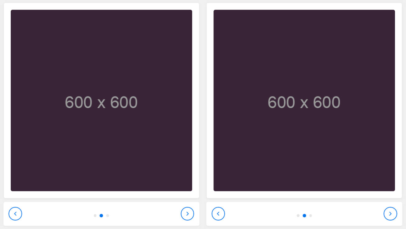
Custom dots.
You can pass your own custom dots to replace the default one.
Custom dots can also be a copy or an image of your carousel item. See example in this one
The codes for this example
You custom dots will receive a list of props/state that's passed back by the carousel such as the currentSide, is dragging or swiping in progress.
const CustomDot = ({ onClick, ...rest }) => {
  const {
    onMove,
    index,
    active,
    carouselState: { currentSlide, deviceType }
  } = rest;
  const carouselItems = [CarouselItem1, CaourselItem2, CarouselItem3];
  // onMove means if dragging or swiping in progress.
  // active is provided by this lib for checking if the item is active or not.
  return (
    <button
      className={active ? "active" : "inactive"}
      onClick={() => onClick()}
    >
      {React.Children.toArray(carouselItems)[index]}
    </button>
  );
};
<Carousel showDots customDot={<CustomDot />}>
  {carouselItems}
</Carousel>;
renderDotsOutside
Passing this props would render the dots outside of the Carousel container. This is done using React.fragment
<div className='my-own-custom-container'>
  <Carousel arrows={false} showDots={true} renderDotsOutside={renderButtonGroupOutside}>
    <ItemOne>
    <ItemTwo>
  </Carousel>
</div>
partialVisible props.
Shows the next items partially, this is very useful if you want to indicate to the users that this carousel component is swipable, has more items behind it.
This is different from the "centerMode" prop, as it only shows the next items. For the centerMode, it shows both.
const responsive = {
  desktop: {
    breakpoint: { max: 3000, min: 1024 },
    items: 3,
    partialVisibilityGutter: 40 // this is needed to tell the amount of px that should be visible.
  },
  tablet: {
    breakpoint: { max: 1024, min: 464 },
    items: 2,
    partialVisibilityGutter: 30 // this is needed to tell the amount of px that should be visible.
  },
  mobile: {
    breakpoint: { max: 464, min: 0 },
    items: 1,
    partialVisibilityGutter: 30 // this is needed to tell the amount of px that should be visible.
  }
}
<Carousel partialVisible={true} responsive={responsive}>
  <ItemOne />
  <ItemTwo />
</Carousel>
centerMode
Shows the next items and previous items partially.
<Carousel centerMode={true} />
afterChange callback.
This is a callback function that is invoked each time when there has been a sliding.
<Carousel
  afterChange={(previousSlide, { currentSlide, onMove }) => {
    doSpeicalThing();
  }}
/>
beforeChange call back
This is a callback function that is invoked each time before a sliding.
<Carousel
  beforeChange={(nextSlide, { currentSlide, onMove }) => {
    doSpeicalThing();
  }}
/>
Combine beforeChange and nextChange, real usage.
They are very useful in the following cases:
- The carousel item is clickable, but you don't want it to be clickable while the user is dragging it or swiping it.
<Carousel
  beforeChange={() => this.setState({ isMoving: true })}
  afterChange={() => this.setState({ isMoving: false })}
>
  <a
    onClick={e => {
      if (this.state.isMoving) {
        e.preventDefault();
      }
    }}
    href="https://w3js.com"
  >
    Click me
  </a>
</Carousel>
- Preparing for the next slide.
<Carousel beforeChange={nextSlide => this.setState({ nextSlide: nextSlide })}>
  <div>Initial slide</div>
  <div
    onClick={() => {
      if (this.state.nextSlide === 1) {
        doVerySpecialThing();
      }
    }}
  >
    Second slide
  </div>
</Carousel>
Skipping callbacks
When calling the goToSlide function on a Carousel the callbacks will be run by default. You can skip all or individul callbacks by passing a second parameter to goToSlide.
this.Carousel.goToSlide(1, true); // Skips both beforeChange and afterChange
this.Carousel.goToSlide(1, { skipBeforeChange: true }); // Skips only beforeChange
this.Carousel.goToSlide(1, { skipAfterChange: true }); // Skips only afterChange
focusOnSelect
Go to slide on click and make the slide a current slide.
<Carousel focusOnSelect={true} />
Using ref.
<Carousel ref={(el) => (this.Carousel = el)} arrows={false} responsive={responsive}>
  <ItemOne />
  <ItemTwo />
</Carousel>
<button onClick={() => {
    const nextSlide = this.Carousel.state.currentSlide + 1;
     // this.Carousel.next()
     // this.Carousel.goToSlide(nextSlide)
  }}>Click me</button>
additionalTransfrom Props.
This is very useful when you are fully customizing the control functionality by yourself like this one
For example if you give to your carousel item padding left and padding right 20px. And you have 5 items in total, you might want to do the following:
<Carousel ref={el => (this.Carousel = el)} additionalTransfrom={-20 * 5} /> // it needs to be a negative number
Specific Props
| Name | Type | Default | Description |
|---|---|---|---|
| responsive | object |
{} |
Numbers of slides to show at each breakpoint |
| deviceType | string |
'' |
Only pass this when use for server-side rendering, what to pass can be found in the example folder |
| ssr | boolean |
false |
Use in conjunction with responsive and deviceType prop |
| slidesToSlide | Number |
1 |
How many slides to slide. |
| draggable | boolean |
true |
Optionally disable/enable dragging on desktop |
| swipeable | boolean |
true |
Optionally disable/enable swiping on mobile |
| arrows | boolean |
true |
Hide/Show the default arrows |
| renderArrowsWhenDisabled | boolean |
false |
Allow for the arrows to have a disabled attribute instead of not showing them |
| removeArrowOnDeviceType | string or array |
'' |
Hide the default arrows at different break point, should be used with responsive props. Value could be mobile or ['mobile', 'tablet'], can be a string or array |
| customLeftArrow | jsx |
null |
Replace the default arrow with your own |
| customRightArrow | jsx |
null |
Replace the default arrow with your own |
| customDot | jsx |
null | Replace the default dots with your own |
| customButtonGroup | jsx |
null | Fully customize your own control functionality if you don't want arrows or dots |
| infinite | boolean |
false | Infinite loop |
| minimumTouchDrag | number |
50 |
The amount of distance to drag / swipe in order to move to the next slide. |
| afterChange | function |
null |
A callback after sliding everytime. |
| beforeChange | function |
null |
A callback before sliding everytime. |
| sliderClass | string |
'react-multi-carousel-track' |
CSS class for inner slider div, use this to style your own track list. |
| itemClass | string |
'' |
CSS class for carousel item, use this to style your own Carousel item. For example add padding-left and padding-right |
| containerClass | string |
'react-multi-carousel-list' |
Use this to style the whole container. For example add padding to allow the "dots" or "arrows" to go to other places without being overflown. |
| dotListClass | string |
'react-multi-carousel-dot-list' |
Use this to style the dot list. |
| keyBoardControl | boolean |
true |
Use keyboard to navigate to next/previous slide |
| autoPlay | boolean |
false |
Auto play |
| autoPlaySpeed | number |
3000 | The unit is ms |
| showDots | boolean |
false |
Hide the default dot list |
| renderDotsOutside | boolean |
false |
Show dots outside of the container |
| partialVisible | boolean |
string |
false |
| customTransition | string |
transform 300ms ease-in-out |
Configure your own anaimation when sliding |
| transitionDuration | number |300` |
The unit is ms, if you are using customTransition, make sure to put the duration here as this is needed for the resizing to work. | |
| focusOnSelect | boolean |false` |
Go to slide on click and make the slide a current slide. | |
| centerMode | boolean |false` |
Shows the next items and previous items partially. | |
| additionalTransfrom | number |0` |
additional transfrom to the current one. |
Author
? Yi Zhuang