React Modal Images
A lightweight React component providing modal image.
Features
- Only 2.3 kB when gzipped.
- Zero dependencies.
- Includes builds for CommonJS and ES modules.
- For React 16.x, 17.x and 18.x.
- Download and Zoom Buttons can be hidden.
- Image alt shown as title of Modal Image.
- Background color of transparent images can be overridden.
Usage
import React from 'react';
import { RModalImages } from 'react-modal-images';
interface IAppProps {}
export const App: React.FC<IAppProps> = () => {
return (
<div className="App">
<RModalImages
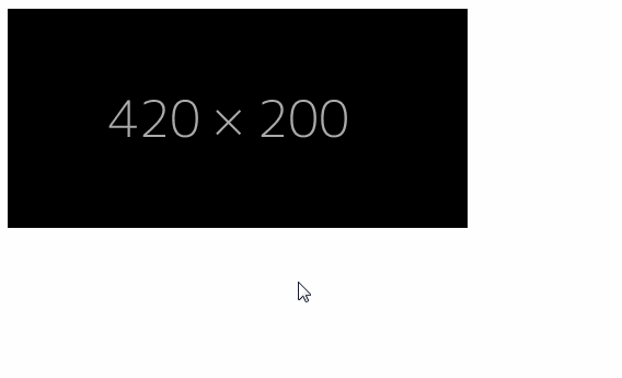
small={'https://dummyimage.com/420x200/000/aaa'}
medium={'https://dummyimage.com/720x400/000/aaa'}
large={'https://dummyimage.com/1020x800/000/aaa'}
alt={'An alternate text for this image'}
/>
</div>
);
};
| Prop | Type | Description |
|---|---|---|
className |
string |
Optional. Class name for the small preview image. |
alt |
string |
Optional. An alternate text for the small image. |
small |
string |
Required. Src for the small preview image. |
smallSrcSet |
string |
Optional. SrcSet for the small preview image. |
medium |
string |
Optional. If large is defined. Image shown when zoomed out in modal. |
large |
string |
Optional. If medium is defined. Image shown when zoomed in modal. Downloadable. |
hideDownloadButton |
boolean |
Optional. Set to true to hide download-button from the modal. |
hideZoomButton |
boolean |
Optional. Set to true to hide zoom-button from the modal. |
hideRotateButton |
boolean |
Optional. Set to true to hide rotate-button within the modal. |
imageBackgroundColor |
string |
Optional. Background color of the image shown in modal. Defaults to black. |