ui-percentage-bar
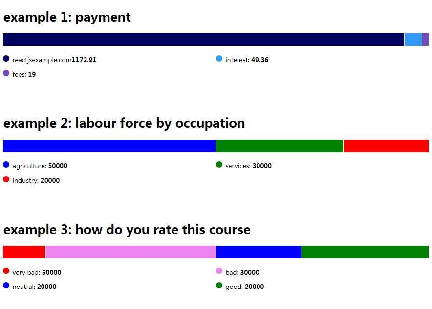
A lightweight, simple-to-use horizontal bar graph web component. Pass in the data array, with the value number and color of your choice, then ui-percentage-bar will handle the rest.
Since this is a web component, you can just use directly in your HTML like
this
To use it with other framework e.g Angular, React, Vue etc. see Framework Integrations from Stencil site.
Using this component
There are three strategies to use web components built with Stencil.
Script tag
- Put a script tag similar to this
<script type='module' src='https://unpkg.com/ui-percentage-bar@<latest-version>/dist/ui-percentage-bar.esm.js'></script>in the head of your index.html - Then you can use the element anywhere in your template, JSX, html etc
Node Modules
- Run
npm install ui-percentage-bar --save - Put a script tag similar to this
<script type='module' src='node_modules/ui-percentage-bar/dist/ui-percentage-bar.esm.js'></script>in the head of your index.html - Then you can use the element anywhere in your template, JSX, html etc
In a stencil-starter app
- Run
npm install ui-percentage-bar --save - Add an import to the npm packages
import ui-percentage-bar; - Then you can use the element anywhere in your template, JSX, html etc
Feedback
If you have found a bug or have another issue with the library —
please create an issue.
If you have a question regarding the library or it’s integration with your project —
consider asking a question at StackOverflow.
Have any ideas or propositions? Feel free to develop it further. See Developer guide below.
Cheers!
Developer guide
You’re welcome to make this component even more flexible, scalable and robust!
Fork, clone, create a feature branch, implement your feature, cover it with tests, commit, create a PR.
npm install
npm start // run development server serving src/index.html
To build the component for production, run:
npm run build
To run the unit tests for the components, run:
npm test
Support
If you like this library consider to add star on GitHub repository.
Thank you!


