@o2xp/react-datatable
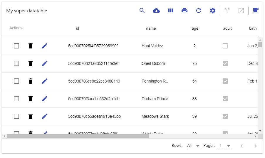
@o2xp/react-datatable is a modulable component to render data in a table with some nice features !
Getting Started
Installing
$ npm i --save @o2xp/react-datatable
In your file :
// ES6
import {Datatable} from "@o2xp/react-datatable";
import React, { Component } from "react";

// Basic Example
let options  = {
    keyColumn: 'id',
    data: {
        columns: [
            {
                id: "id",
                label: "id",
                colSize: "80px"
            },
            {
                id: "name",
                label: "name",
                colSize: "150px"
            },
            {
                id: "age",
                label: "age",
                colSize: "50px"
            },
        ],
        rows: [
            {
                id: "50cf",
                age: 28,
                name: "Kerr Mayo"
            },
            {
                id: "209",
                age: 34,
                name: "Freda Bowman"
            },
            {
                id: "2dd81ef",
                age: 14,
                name: "Becky Lawrence"
            }
        ],
    }
}

class App extends Component {
    render() {
        return <Datatable options={options} />;
    }
}

export default App;
Attention : the column id "o2xpActions" is reserved. Using it can result of unexpected behaviours.
To go further check all examples
Prop Types
Datatable Properties
| Property | Type | Required? | Description |
|---|---|---|---|
| options | object | yes | An object that all the options to render the datatable. See Options Properties. |
| actions | function | no | Function that take as parameter {type, payload}, where type is the action performed (save, delete etc..) and payload the data needed to perform the action. See advanced example. |
| refreshRows | function | no | Function that return an an array of objects where each object is defined by the columns identifier as key and the value. See advanced example. |
| forceRerender | boolean | no | Do you want to rerender the component on route change or keep the state ? |
| stripped | boolean | no | Do you want stripped rows ? |
| CustomTableBodyRow | function | no | Function that take { row, columnsOrder, rowIndex, columnSizeMultiplier, height } and return a react html element. See body row example. |
| CustomTableBodyCell | function | no | Function that take { cellVal, column, rowId } and return a react html element. See body cell example. |
| CustomTableHeaderRow | function | no | Function that take { columnsOrder, columnSizeMultiplier } and return a react html element. See header row example. |
| CustomTableHeaderCell | function | no | Function that take { column } and return a react html element. See header cell example. |
| customDataTypes | array | no | object that return an array of object with datatypes and react html element. See datatypes cell example. |
Options Properties
| Property | Type | Required? | Default | Description |
|---|---|---|---|---|
| title | string | no | " " | Title of the datatable. |
| dimensions .datatable .width | string | no | "100vw" | Width of the the Datatable. (in vw / px / %) |
| dimensions .datatable .height | string | no | "300px" | Height of the Datatable. (in vh / px / %) |
| dimensions .row .height | string | no | "60px" | Height of each row of the Datatable. (in px) Minimum 60px. |
| keyColumn | string | yes | / | Name of the column that has unique value and allows to identify a row. |
| font | string | no | "Roboto" | Name of the font you are using. It allows the datatable to calculate the overlapping of cells. |
| data .columns | array of object | yes | / | An array of objects where each object is defined by this keys. Click here to have more information. |
| data .rows | array of object | yes | / | An array of objects where each object is defined by the columns identifier as key and the value. |
| features .canEdit | boolean | no | false | If the user can edit the rows. |
| features .canGlobalEdit | boolean | no | false | If the user can turn in edit mode all the rows. |
| features .canPrint | boolean | no | false | If you want stripped rows. |
| features .canDownload | boolean | no | false | If the user can download the data. |
| features .canSearch | boolean | no | false | If the user can filter the data by text through a search input. |
| features .canRefreshRows | boolean | no | false | If the user can click to refresh the rows. |
| features .canOrderColumns | boolean | false | no | If the user can select the columns to display. |
| features .canSelectRow | boolean | false | no | If the user can select rows. |
| features .canSaveUserConfiguration | boolean | no | false | If the user can save his columns configuration. (order and which one is displayed) |
| features .userConfiguration .columnsOrder | array of strings | no | [ ] | An array of strings where the strings are the column identifier. Datatable will be rendered only with the columns present in the array. |
| features .userConfiguration .copyToClipboard | boolean | no | false | If true, when the user click on cell it will copy the value in the clipboard. |
| features .rowsPerPage .available | array of number and string | no | [10, 25, 50, 100, "All"] | An array with the numbers of rows per page you want available. |
| features .rowsPerPage .selected | number or string | no | "All" | The number of rows per page selected by default. |
| features .additionalIcons | array of object | no | [ ] | If you want to add icon which trigger a function. Click here to have more information. |
| features .selection .selectionIcons | array of object | no | [ ] | If you want to add icon which execute a function with the rows selected. Click here to have more information. |
Columns Props
Columns is an array of object construct with these keys :
| Property | Type | Required? | Description |
|---|---|---|---|
| id | string | yes | Id of the column (need to be unique). |
| label | string | yes | Label of the column. |
| colSize | number | yes | Size of the column (needs to be in px). |
| editable | boolean | no | If the each value of row corresponding to the column is editable or not. |
| dataType | string | no | Possible values: "number", "text", "boolean", "date", "time", "dateTime". For more type, see override section. |
| inputType | string | no | Possible values: "input", "boolean", "select", "datePicker", "timePicker", "dateTimePicker" |
| dateFormat | string | yes (only if datatype === "date" || "time" || "dateTime") | Format of the date. |
| values | array | yes (only if inputType === "select") | Possible values displayed in the select. |
| valueVerification | function | no | If you want to verify value on save. You need to provide a function which take a parameter (the new value) and return and object in this format {error: boolean, message: string} |
| mask | array of regex | no | Works only with inputType === input. To build regex see react-text-mask |
Additional Icons Props
Additional icons is an array of object construct with these keys :
| Property | Type | Required? | Description |
|---|---|---|---|
| title | string | yes | Description of the button. The text will be displayed on hovering the icon |
| icon | Component | yes | Use @material-ui/icons to provide an icon to display. |
| onClick | function | yes | A function that doesn't take parameter. The function will be triggered on click. |
Additional Selection Icons Props
Additional selection icons is an array of object construct with these keys :
| Property | Type | Required? | Description |
|---|---|---|---|
| title | string | yes | Description of the button. The text will be displayed on hovering the icon |
| icon | Component | yes | Use @material-ui/icons to provide an icon to display. |
| onClick | function | yes | A function that takes a parameter (the selected rows). . The function will be triggered on click. |
