react-png-tooltip
A graphical user interface element that will render when the user hovers over (optional) or clicks an item, a tooltip may appear with information about said item.
Install
npm install --save react-png-tooltip
Showcase
Servify

Anything Goes
Instructions
- Export the tooltip from the 'react-png-tooltip' and you're good to go!
- The tooltip will open after:
- Clicking (or touching) the tooltip button.
- Hovering over the tooltip button.
- The tooltip will close after:
- Pressing the ESC key on desktop.
- Clicking (or touching) anywhere on the screen unless it's inside the tooltip window.
- Clicking (or touching) the X button inside the tooltip window.
- On mouse leave IF the user has not clicked the tooltip (meaning, if the user was only hovering), in which case the user would have to click the cancel button, the ESC key, or anywhere on the screen to close the tooltip.
Features
- ESC key event listener triggered for desktop users, pressing it will close the modal.
- You can place it anywhere on your DOM tree.
- Can handle any type of children. It has a set width of 380px and a max-width of 80vw, this can't be changed for the time being.
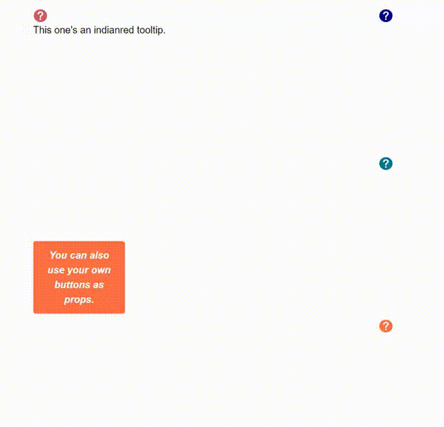
- Smart-Potisioning (illustration below), the tooltip is programmed to determine its initial rendering position and will make calculations depending on where it is, the viewport and its width to avoid overflowing outside the viewport.
- Tooltip window's CSS may be changed without disrupting the functionality of the component (don't change the positions, if you want something absolutely position then do it through an inner div).
- Instead of using the default tooltip button, you can pass your own buttons through a prop named tooltip, usage example and more props information below.
- Clicking and hovering functionalities may be disabled by passing
shouldDisableClickandshouldDisableHoverprops respectively to the tooltip.

Props
| Props | Functionality |
|---|---|
shouldDisableHover |
Disables hovering functionality, the tooltips will only render upon clicking the tooltip. |
shouldDisableClick |
Disables clicking functionality, the tooltips will only render upon hovering the tooltip. If passed as true, then the tooltip's cancel button will not be rendered. |
tooltip |
Your custom JSX button that will toggle the tooltip window, must be JSX. |
fill |
The fill prop will change the default icon question-mark color, e.g. '#484848' or 'red' (must be a string). |
background |
The background prop will change the default icon background color, e.g. '#0000FF' or 'blue' (must be a string). |
wrapperClassName |
You may change the wrapper CSS class if you don't like the default one (display: inline-table; position: 'relative'), the wrapper is the outer div that wraps the whole tooltip (content and icon). Make sure you set position relative if you decide to change the wrapperClassName, or else the positioning may be problematic. |
className |
You can use your own desired CSS class for the tooltip window by passing said class as a prop, pass them with the !important tag to overwrite the default ones, however, it is highly advised to only modify background-color, color, fill, border-colors, etc (aesthetics). Modifying width nor any similar properties is not recommended as of now. Usage examples below. |
Basic Usage
import React, { Component } from 'react'

import Tooltip from 'react-png-tooltip'

const component = () => {
    return (
    <Tooltip>
      The tooltip will accept any type of children.
    </Tooltip>
  )
}
Passing a CSS class
.IndianredTooltip {
  background-color: #cd5c5c;
  color: #FFF;
  fill: #FFF;
}
import React, { Component } from 'react'
// CSS
import classes from './yourcss.css'
// JSX
import Tooltip from 'react-png-tooltip'

const component = () => {
    return (
    <Tooltip background='indianred' className='IndianredTooltip'>
      The tooltip will accept any type of children.
    </Tooltip>
  )
}
Or if using CSS modules
import React, { Component } from 'react'
// CSS
import classes from './yourcss.css'
// JSX
import Tooltip from 'react-png-tooltip'

const component = () => {
    return (
    <Tooltip background='indianred' className={classes.IndianredTooltip}>
      The tooltip will accept any type of children.
    </Tooltip>
  )
}
Passing a custom tooltip button
Note that you can also pass classes to the Tooltip as normal, or modify the default icon's fill and background.
import React, { Component } from 'react'
// CSS
import classes from './yourcss.css'
// JSX
import Tooltip from 'react-png-tooltip'

const component = () => {
    return (
    <Tooltip className='OrangeTooltip' tooltip={<button className='CustomButton'>Your custom button!</button>}>
      And it still works as you'd expect! The tooltip's content would go inside.
    </Tooltip>
  )
}