react-numpad
A numpad for number, date and time, built with and for React. It's written with the extensibility in mind. The idea of this project is to cover the majority of input types in a form.
Installation
To use React-Numpad, install it from NPM and include it in your own React build process (using Webpack, etc).
npm install --save react-numpad
At this point you can import react-numpad in your application
import NumPad from 'react-numpad';
Usage
React-NumPad generates an input field containing the selected value, so you can submit it as part of a standard form. You can also listen for changes with the onChange event property.
When the value is changed, onChange(selectedValue) will fire.
React-NumPad is built based on a "main" component (NumPad.js). Following the higher-order component technique, is possible to create new components by simply overriding few common properties.
NumPad.Number
Input field for numeric value. There are also PositiveNumber, IntegerNumber, PositiveIntegerNumber components with the same properties.
<NumPad.Number
    onChange={(value) => { console.log('value', value)}}
    label={'Total'}
    placeholder={'my placeholder'}
    value={100}
/>
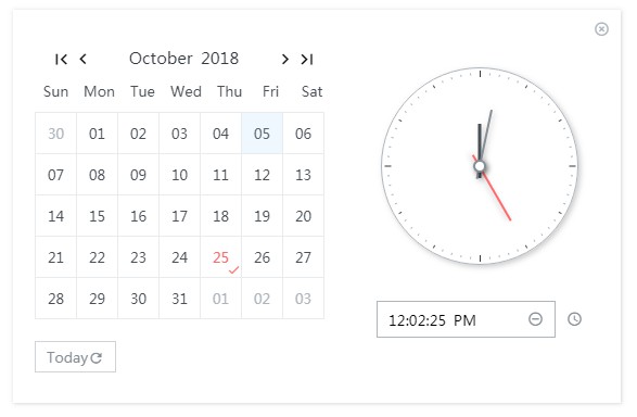
NumPad.Time
Input field with time format.
<NumPad.Time
    onChange={(value) => { console.log('value', value)}}
    label={'Departure time'}
    placeholder={'my placeholder'}
/>
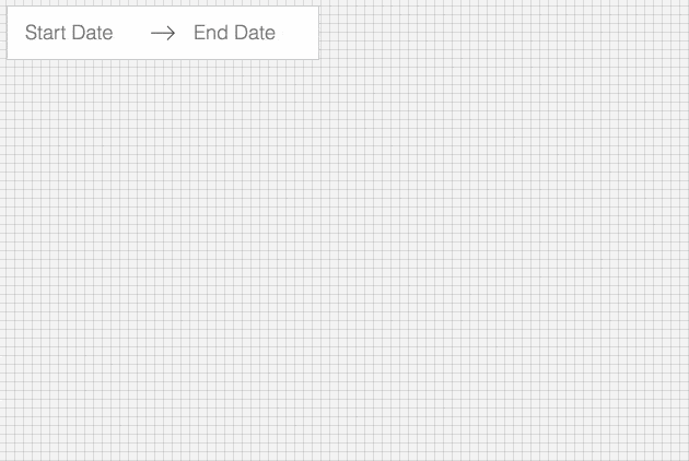
NumPad.Date
Input field with date format.
<NumPad.Date
    onChange={(value) => { console.log('value', value)}}
    label={'Data di nascita di partenza'}
/>
NumPad.DateTime
Input field with date and time format.
<NumPad.DateTime
    onChange={(value) => { console.log('value', value)}}
    dateFormat={'DD.MM.YYYY'}
    label={'Data e ora di partenza'}
    value={'10.02.2018 10:00'}
/>
NumPad Properties
| Property | Type | Default | Description |
|---|---|---|---|
onChange |
function |
required | function called when value change and is valid. |
placeholder |
string |
none | text to display as input placeholder. |
label |
string |
none | text to display as input label. |
position |
string |
flex-end |
Position to the screen. center, flex-start, flex-end, startBottomLeft, startBottomRight, startTopLeft, startTopRight |
theme |
string or object |
numpad |
string as the name of the theme or object as custom styles. |
dateFormat |
string |
MM/DD/YYYY |
specify a different date format. |
value |
string or number |
none | value (default) for the input field. |
sync |
boolean |
false | if true, callbacks calls while typing if the input is valid |
NumPad.Calendar
Calendar input field.
<NumPad.Calendar
    onChange={value => console.log('changed', value)}
    label='Data di nascita'
    locale="it"
    dateFormat="DD.MM.YYYY"
    min="01.01.1900"
    markers={['01.03.2018', '06.03.2018']}
/>
Calendar Properties
| Property | Type | Default | Description |
|---|---|---|---|
onChange |
function |
required | function called when value change and is valid. |
placeholder |
string |
none | text to display as input placeholder. |
label |
string |
none | text to display as input label. |
position |
string |
flex-end |
Position to the screen. center, flex-start, flex-end, startBottomLeft, startBottomRight, startTopLeft, startTopRight |
theme |
string or object |
numpad |
string as the name of the theme or object as custom styles. |
dateFormat |
string |
MM/DD/YYYY |
specify a different date format. |
value |
string or number |
none | value (default) for the input field. |
locale |
string |
en |
locale for days and months |
weekOffset |
number |
0 |
First day of the week, by default is Sunday |
markers |
array |
[] | list of dates to place a marker on Calendar. The string date format must be the same as dateFormat property |
min |
string |
none | min value for validation |
max |
string |
none | max value for validation |
NumPad.Appointment
Available date time appointments picker.
<NumPad.Appointment
    dateFormat={"DD.MM.YYYY"}
    dates={appointmentDates}
    locale={"it"}
    onChange={value => console.log("value", value)}
/>

const appointmentDates = {
    '01.04.2018': ['08:00', '09:00', '10:00', '11:00'],
    '03.04.2018': ['08:00', '09:00', '10:00'],
    '04.04.2018': ['08:00', '09:00', '10:00', '11:00', '17:00'],
    '09.04.2018': ['08:00', '10:00', '11:00', '15:00']
}
Appointment Properties
| Property | Type | Default | Description |
|---|---|---|---|
onChange |
function |
required | function called when value change and is valid. |
appointmentDates |
object |
required | object representing available dates with times |
placeholder |
string |
none | text to display as input placeholder. |
label |
string |
none | text to display as input label. |
position |
string |
flex-end |
Position to the screen. center, flex-start, flex-end, startBottomLeft, startBottomRight, startTopLeft, startTopRight |
theme |
string or object |
numpad |
string as the name of the theme or object as custom styles. |
dateFormat |
string |
MM/DD/YYYY |
specify a different date format. |
locale |
string |
en |
locale for days and months |
It's possible to override the InputField component by passing your input field as child component of NumPad.
<NumPad.Number onChange={(value) => console.log('value', value)}>
    <button>Click me!</button>
</NumPad.Number>
Themes
There is only one theme available for now, in /styles folder, numpad.
Any css style is customizable using styled components.
It is possible to override a theme by defining an object with the theme properties:
const myTheme = {
  header: {
    primaryColor: '#263238',
    secondaryColor: '#f9f9f9',
    highlightColor: '#FFC107',
    backgroundColor: '#607D8B',
  },
  body: {
    primaryColor: '#263238',
    secondaryColor: '#32a5f2',
    highlightColor: '#FFC107',
    backgroundColor: '#f9f9f9',
  },
  panel: {
    backgroundColor: '#CFD8DC'
  }
};


<NumPad.Number theme={myTheme}>
Keyboard support
0, 1, 2, ... 9: input number.
- and .: input symbol.
Esc: close keypad or calendar.
Enter: submit value.
Calendar swipe support
On mobile is possible to switch between months by swipe.
Developing
git clone [email protected]:gpietro/react-numpad.git
cd react-numpad/
npm install
npm start
npm run storybook
Visit localhost:6006 to see the NumPad components available so far.
Build
npm run build
A bundle will be created in the dist directory.