react-bootstrap-daterangepicker
A date/time picker for react (using bootstrap). This is a react port of bootstrap-daterangepicker.
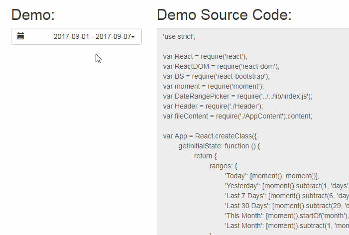
Live Demo
https://projects.skratchdot.com/react-bootstrap-daterangepicker/
Getting Started
-
Install the module with:
npm install --save react-bootstrap-daterangepicker -
Install the needed peer dependencies:
npm install --save react react-dom jquery create-react-class prop-types -
Create your module (you need to use something like browserify to build)
var React = require('react');
var moment = require('moment');
var DateRangePicker = require('react-bootstrap-daterangepicker');
var someReactComponent = React.createClass({
    render: function () {
        return (
            <DateRangePicker startDate={moment('1/1/2014')} endDate={moment('3/1/2014')}>
                <div>Click Me To Open Picker!</div>
            </DateRangePicker>
        );
    }
});
- Include the daterangepicker CSS in your project somewhere. The CSS file is here: daterangepicker.css (don't hotlink- download and host your own copy)
<link rel="stylesheet" href="daterangepicker.css" type="text/css" />
Documentation
For in depth documentation, see the original
bootstrap-daterangepicker project page.
You can pass all the same props as the original plugin:
- <input>, alwaysShowCalendars, applyClass, autoApply, autoUpdateInput,
buttonClasses, cancelClass, dateLimit, drops, endDate, isCustomDate,
isInvalidDate, linkedCalendars, locale, maxDate, minDate, opens, parentEl,
ranges, showCustomRangeLabel, showDropdowns, showISOWeekNumbers,
showWeekNumbers, singleDatePicker, startDate, template, timePicker,
timePicker24Hour, timePickerIncrement, timePickerSeconds
You can listen to the following 7 events:
- onShow: thrown when the widget is shown
- onHide: thrown when the widget is hidden
- onShowCalendar: thrown when the calendar is shown
- onHideCalendar: thrown when the calendar is hidden
- onApply: thrown when the apply button is clicked
- onCancel: thrown when the cancel button is clicked
- onEvent: thrown when any of the 4 events above are triggered
All 7 of the events above should take a handler that is passed 2 arguments: event and picker
Example event handler:
var someReactComponent = React.createClass({
    handleEvent: function (event, picker) {
        console.log(picker.startDate);
    },
    render: function () {
        return (
            <DateRangePicker onEvent={this.handleEvent} />
        );
    }
});
Release Notes
Release notes can be found in the
Changelog.
We will try to release a new version of this project with each new
React
release. We will bump the major version with each React release. If you are using
a specific version of react or react-bootstrap, make sure you specify the correct
version of react-bootstrap-daterangepicker in your package.json file.
- React 15: react-bootstrap-daterangepicker v3.x.x
- React 14: react-bootstrap-daterangepicker v1.x.x
- React 13: react-bootstrap-daterangepicker v0.x.x
- React 14/15 Experimental: react-bootstrap-daterangepicker v2.x.x (do not use)