react-querybuilder
A QueryBuilder component for React.
Getting Started

npm install react-querybuilder --save
Demo
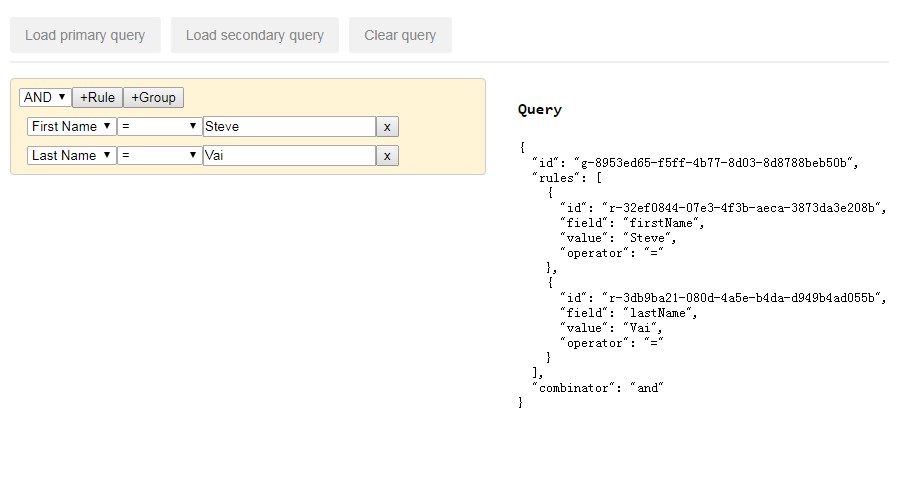
To run a demo of the react-querybuilder being used, go through the following steps.
npm installInstall npm packagesnpm startRun a local serverhttp://localhost:8080/Visit your localhost in your browser
Usage
import QueryBuilder from "react-querybuilder";

const fields = [
  { name: "firstName", label: "First Name" },
  { name: "lastName", label: "Last Name" },
  { name: "age", label: "Age" },
  { name: "address", label: "Address" },
  { name: "phone", label: "Phone" },
  { name: "email", label: "Email" },
  { name: "twitter", label: "Twitter" },
  { name: "isDev", label: "Is a Developer?", value: false }
];

const dom = <QueryBuilder fields={fields} onQueryChange={logQuery} />;

function logQuery(query) {
  console.log(query);
}
API
<QueryBuilder /> is the only top-level component exposed from this library. It supports the following properties:
fields (Required)
[ {name:String, label:String, id:ID} ]
The array of fields that should be used. Each field should be an object with:
{name:String, label:String, id:ID} |
The id is optional, if you do not provide an id for a field then the name will be used.
operators (Optional)
[ {name:String, label:String} ]
The array of operators that should be used. The default operators include:
[
  { name: "null", label: "Is Null" },
  { name: "notNull", label: "Is Not Null" },
  { name: "in", label: "In" },
  { name: "notIn", label: "Not In" },
  { name: "=", label: "=" },
  { name: "!=", label: "!=" },
  { name: "<", label: "<" },
  { name: ">", label: ">" },
  { name: "<=", label: "<=" },
  { name: ">=", label: ">=" }
];
combinators (Optional)
[ {name:String, label:String} ]
The array of combinators that should be used for RuleGroups. The default set includes:
[{ name: "and", label: "AND" }, { name: "or", label: "OR" }];
controlElements (Optional)
React.PropTypes.shape({
  addGroupAction: React.PropTypes.func, //returns ReactClass
  removeGroupAction: React.PropTypes.func, //returns ReactClass
  addRuleAction: React.PropTypes.func, //returns ReactClass
  removeRuleAction: React.PropTypes.func, //returns ReactClass
  combinatorSelector: React.PropTypes.func, //returns ReactClass
  fieldSelector: React.PropTypes.func, //returns ReactClass
  operatorSelector: React.PropTypes.func, //returns ReactClass
  valueEditor: React.PropTypes.func //returns ReactClass
});
This is a custom controls object that allows you to override the control elements used. The following control overrides are supported:
addGroupAction: By default a<button />is used. The following props are passed:
{
  label: React.PropTypes.string, //"+Group"
  className: React.PropTypes.string, //css classNames to be applied
  handleOnClick: React.PropTypes.func, //callback function to invoke adding a <RuleGroup />
  rules: React.PropTypes.array, //Provides the number of rules already present for this group,
  level: React.PropTypes.number //The level of the current group
}
removeGroupAction: By default a<button />is used. The following props are passed:
{
  label: React.PropTypes.string, //"x"
  className: React.PropTypes.string, //css classNames to be applied
  handleOnClick: React.PropTypes.func, //callback function to invoke removing a <RuleGroup />
  rules: React.PropTypes.array, //Provides the number of rules already present for this group,
  level: React.PropTypes.number //The level of the current group
}
addRuleAction: By default a<button />is used. The following props are passed:
{
  label: React.PropTypes.string, //"+Rule"
  className: React.PropTypes.string, //css classNames to be applied
  handleOnClick: React.PropTypes.func, //callback function to invoke adding a <Rule />
  rules: React.PropTypes.array, //Provides the number of rules already present for this group,
  level: React.PropTypes.number //The level of the current group
}
removeRuleAction: By default a<button />is used. The following props are passed:
{
  label: React.PropTypes.string, //"x"
  className: React.PropTypes.string, //css classNames to be applied
  handleOnClick: React.PropTypes.func, //callback function to invoke removing a <Rule />
  level: React.PropTypes.number //The level of the current group
}
combinatorSelector: By default a<select />is used. The following props are passed:
{
  options: React.PropTypes.array.isRequired, //same as 'combinators' passed into QueryBuilder
  value: React.PropTypes.string, //selected combinator from the existing query representation, if any
  className: React.PropTypes.string, //css classNames to be applied
  handleOnChange: React.PropTypes.func, //callback function to update query representation
  rules: React.PropTypes.array, //Provides the number of rules already present for this group
  level: React.PropTypes.number //The level of the current group
}
fieldSelector: By default a<select />is used. The following props are passed:
{
  options: React.PropTypes.array.isRequired, //same as 'fields' passed into QueryBuilder
  value: React.PropTypes.string, //selected field from the existing query representation, if any
  className: React.PropTypes.string, //css classNames to be applied
  handleOnChange: React.PropTypes.func, //callback function to update query representation
  level: React.PropTypes.number //The level the group this rule belongs to
}
operatorSelector: By default a<select />is used. The following props are passed:
{
  field: React.PropTypes.string, //field name corresponding to this Rule
  options: React.PropTypes.array.isRequired, //return value of getOperators(field)
  value: React.PropTypes.string, //selected operator from the existing query representation, if any
  className: React.PropTypes.string, //css classNames to be applied
  handleOnChange: React.PropTypes.func //callback function to update query representation
  level: React.PropTypes.number //The level the group this rule belongs to
}
valueEditor: By default a<input type="text" />is used. The following props are passed:
{
  field: React.PropTypes.string, //field name corresponding to this Rule
  operator: React.PropTypes.string, //operator name corresponding to this Rule
  value: React.PropTypes.string, //value from the existing query representation, if any
  handleOnChange: React.PropTypes.func //callback function to update the query representation
  level: React.PropTypes.number //The level the group this rule belongs to
}
getOperators (Optional)
function(field):[]
This is a callback function invoked to get the list of allowed operators for the given field.
onQueryChange (Optional)
function(queryJSON):void
This is a notification that is invoked anytime the query configuration changes. The query is provided as a JSON structure, as shown below:
{
  "combinator": "and",
  "rules": [
    {
      "field": "firstName",
      "operator": "null",
      "value": ""
    },
    {
      "field": "lastName",
      "operator": "null",
      "value": ""
    },
    {
      "combinator": "and",
      "rules": [
        {
          "field": "age",
          "operator": ">",
          "value": "30"
        }
      ]
    }
  ]
}
controlClassnames (Optional)
This can be used to assign specific CSS classes to various controls that are created by the <QueryBuilder />. This is an object with the following properties:
{
    queryBuilder:String, // Root <div> element

    ruleGroup:String, // <div> containing the RuleGroup
    combinators:String, // <select> control for combinators
    addRule:String, // <button> to add a Rule
    addGroup:String, // <button> to add a RuleGroup
    removeGroup:String, // <button> to remove a RuleGroup

    rule:String, // <div> containing the Rule
    fields:String, // <select> control for fields
    operators:String, // <select> control for operators
    value:String, // <input> for the field value
    removeRule:String // <button> to remove a Rule

}
translations (Optional)
This can be used to override translatable texts applied to various controls that are created by the <QueryBuilder />. This is an object with the following properties:
{
    fields: {
        title: "Fields",
    },
    operators: {
        title: "Operators",
    },
    value: {
        title: "Value",
    },
    removeRule: {
        label: "x",
        title: "Remove rule",
    },
    removeGroup: {
        label: "x",
        title: "Remove group",
    },
    addRule: {
        label: "+Rule",
        title: "Add rule",
    },
    addGroup: {
        label: "+Group",
        title: "Add group",
    },
    combinators: {
        title: "Combinators",
    }
}
Development
Changelog Generation
We are using github-changes to generate the changelog.
To use it:
- tag your commit using semantic versioning
- run
npm run generate-changelog - enter your github credentials at the prompt
- commit
- push your commit and tags