React-Quill
A Quill component for React.
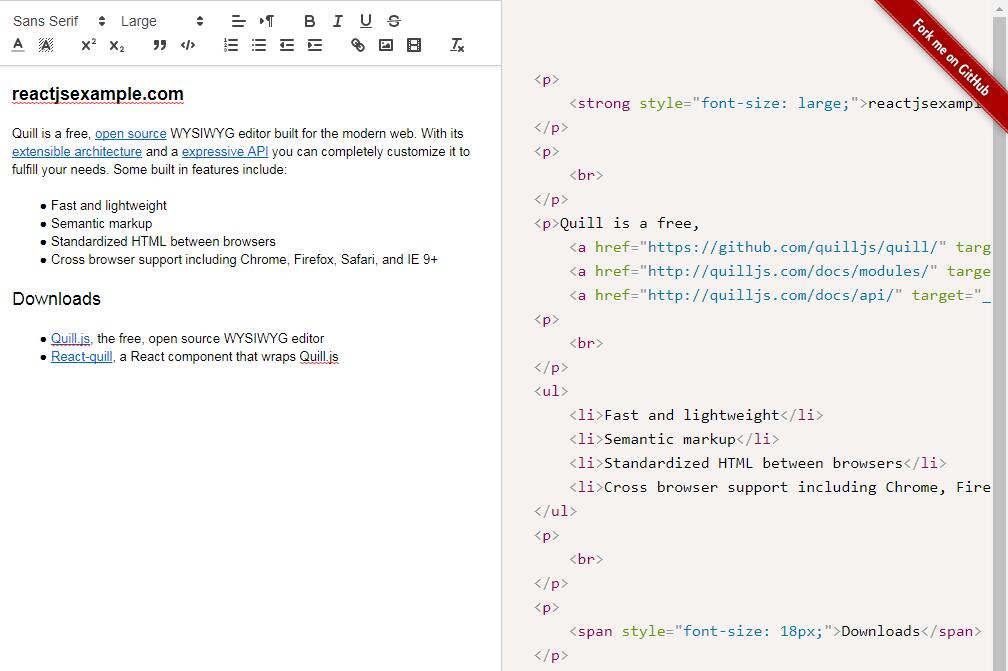
Live Demo
https://zenoamaro.github.io/react-quill/
? React Quill now supports Quill v1.0.0!
Thanks to @clemmy and @alexkrolick for landing this much-awaited change. There are many breaking changes, so be sure to read the migration guide.
? Latest published package version: v1.0.0
npm install [email protected]
Special thank you to everyone who contributed during the 1.0.0 release cycle!
? Welcoming @alexkrolick to the team!
His contributions have been incredible so far, and his passion and dedication will bring some much-deserved love to this project.
Quick Start
Import the component
const ReactQuill = require('react-quill'); // CommonJS
import ReactQuill from 'react-quill'; // ES6
Import the stylesheet
Two common examples are shown below. How stylesheets are included in your app depends on build system (Webpack, SCSS, LESS, etc). See the documentation on Themes for more information.
Fetching styles from the CDN
<link rel="stylesheet" href="//cdn.quilljs.com/1.2.6/quill.snow.css">
Using css-loader with Webpack or create-react-app
require('react-quill/dist/quill.snow.css'); // CommonJS
import 'react-quill/dist/quill.snow.css'; // ES6
Use the component
class MyComponent extends React.Component {
  constructor(props) {
    super(props)
    this.state = { text: '' } // You can also pass a Quill Delta here
    this.handleChange = this.handleChange.bind(this)
  }

  handleChange(value) {
    this.setState({ text: value })
  }

  render() {
    return (
      <ReactQuill value={this.state.text}
                  onChange={this.handleChange} />
    )
  }
}
Using Deltas
You can pass a Quill Delta, instead of an HTML string, as the value and defaultValue properties. Deltas have a number of advantages over HTML strings, so you might want use them instead. Be aware, however, that comparing Deltas for changes is more expensive than comparing HTML strings, so it might be worth to profile your usage patterns.
Note that switching value from an HTML string to a Delta, or vice-versa, will trigger a change, regardless of whether they represent the same document, so you might want to stick to a format and keep using it consistently throughout.
⚠️ Do not use the delta object you receive from the onChange event as value. This object does not contain the full document, but only the last modifications, and doing so will most likely trigger an infinite loop where the same changes are applied over and over again. Use editor.getContents() during the event to obtain a Delta of the full document instead. ReactQuill will prevent you from making such a mistake, however if you are absolutely sure that this is what you want, you can pass the object through new Delta() again to un-taint it.
Controlled vs Uncontrolled Mode
Pass defaultValue instead of value if you need to use DOM or Quill APIs to imperatively manipulate the editor state.
In this "uncontrolled" mode ReactQuill uses the prop as the initial value but allows the element to deviate after that. The onChange callback still works normally.
- Read more about uncontrolled components in the React docs.
- Read more about the available props.
Options
Theme
The Quill editor supports themes. It includes a full-fledged theme, called snow, that is Quill's standard appearance, a bubble theme that is similar to the inline editor on Medium, and a core theme containing only the bare essentials to allow modules like toolbars or tooltips to work.
These stylesheets can be found in the Quill distribution, but for convenience they are also linked in React Quill's dist folder. In a common case you would activate a theme by setting the theme prop. Pass a falsy value (null) to disable the theme.
<ReactQuill theme="snow" /> // or "bubble", null to use minimal core theme
And then link the appropriate stylesheet (only link the CSS for the themes you want to use):
<link rel="stylesheet" href="node_modules/react-quill/dist/quill.snow.css">
<link rel="stylesheet" href="node_modules/react-quill/dist/quill.bubble.css">
<link rel="stylesheet" href="node_modules/react-quill/dist/quill.core.css">
This may vary depending how application is structured, directories or otherwise. For example, if you use a CSS pre-processor like SASS, you may want to import that stylesheet inside your own.
Custom Toolbar
Default Toolbar Elements
The Quill Toolbar Module API provides an easy way to configure the default toolbar icons using an array of format names.
Example Code
var MyComponent = React.createClass({

  modules: {
    toolbar: [
      [{ 'header': [1, 2, false] }],
      ['bold', 'italic', 'underline','strike', 'blockquote'],
      [{'list': 'ordered'}, {'list': 'bullet'}, {'indent': '-1'}, {'indent': '+1'}],
      ['link', 'image'],
      ['clean']
    ],
  },

  formats: [
    'header',
    'bold', 'italic', 'underline', 'strike', 'blockquote',
    'list', 'bullet', 'indent',
    'link', 'image'
  ],

  render: function() {
    return (
      <div className="text-editor">
        <ReactQuill theme="snow"
                    modules={this.modules}
                    formats={this.formats}>
        </ReactQuill>
      </div>
    );
  },

});
HTML Toolbar
You can also supply your own HTML/JSX toolbar with custom elements that are not part of the Quill theme.
See this example live on Codepen: Custom Toolbar Example
Example Code
/*
 * Custom "star" icon for the toolbar using an Octicon
 * https://octicons.github.io
 */
const CustomButton = () => <span className="octicon octicon-star" />

/*
 * Event handler to be attached using Quill toolbar module
 * http://quilljs.com/docs/modules/toolbar/
 */
function insertStar () {
  const cursorPosition = this.quill.getSelection().index
  this.quill.insertText(cursorPosition, "★")
  this.quill.setSelection(cursorPosition + 1)
}

/*
 * Custom toolbar component including insertStar button and dropdowns
 */
const CustomToolbar = () => (
  <div id="toolbar">
    <select className="ql-header">
      <option value="1"></option>
      <option value="2"></option>
      <option selected></option>
    </select>
    <button className="ql-bold"></button>
    <button className="ql-italic"></button>
    <select className="ql-color">
      <option value="red"></option>
      <option value="green"></option>
      <option value="blue"></option>
      <option value="orange"></option>
      <option value="violet"></option>
      <option value="#d0d1d2"></option>
      <option selected></option>
    </select>
    <button className="ql-insertStar">
      <CustomButton />
    </button>
  </div>
)

/*
 * Editor component with custom toolbar and content containers
 */
class Editor extends React.Component {
  constructor (props) {
    super(props)
    this.state = { editorHtml: '' }
    this.handleChange = this.handleChange.bind(this)
  }

  handleChange (html) {
  	this.setState({ editorHtml: html });
  }

  render() {
    return (
      <div className="text-editor">
        <CustomToolbar />
        <ReactQuill
          onChange={this.handleChange}
          placeholder={this.props.placeholder}
          modules={Editor.modules}
        />
      </div>
    )
  }
}

/*
 * Quill modules to attach to editor
 * See http://quilljs.com/docs/modules/ for complete options
 */
Editor.modules = {
  toolbar: {
    container: "#toolbar",
    handlers: {
      "insertStar": insertStar,
    }
  }
}

/*
 * Quill editor formats
 * See http://quilljs.com/docs/formats/
 */
Editor.formats = [
  'header', 'font', 'size',
  'bold', 'italic', 'underline', 'strike', 'blockquote',
  'list', 'bullet', 'indent',
  'link', 'image', 'color',
]

/*
 * PropType validation
 */
Editor.propTypes = {
  placeholder: React.PropTypes.string,
}

/*
 * Render component on page
 */
ReactDOM.render(
  <Editor placeholder={'Write something or insert a star ★'}/>,
  document.querySelector('.app')
)
Custom Formats
The component has two types of formats:
- The default Quill formats that are enabled/disabled using the
formatsprop. All formats are enabled by default. - Custom formats created using Parchment and registered with your component's Quill instance
Example Code
const ReactQuill = require('react-quill'); // CommonJS
import ReactQuill, { Quill } from 'react-quill'; // ES6
/*
 * Example Parchment format from
 * https://quilljs.com/guides/cloning-medium-with-parchment/
 */
let Inline = Quill.import('blots/inline');
class BoldBlot extends Inline { }
BoldBlot.blotName = 'bold';
BoldBlot.tagName = 'strong';
Quill.register(BoldBlot);

/*
 * Editor component with default and custom formats
 */
class MyComponent extends React.Component {
  constructor(props) {
    this.formats = ['italic, 'underline'] // default formats
    this.state = { text: '' }
  }

  handleChange(value) {
    this.setState({text: value})
  }

  render() {
    return (
      <ReactQuill
        value={this.state.text}
        onChange={this.handleChange}
        formats={this.formats} // the custom format is already registered
      />
    )
  }
}
Custom editing area
If you instantiate ReactQuill without children, it will create a <div> for you, to be used as the editing area for Quill. If you prefer, you can specify your own element for ReactQuill to use. Note that <textarea>s are not supported by Quill at this time.
class MyComponent extends React.Component {

  render() {
    return (
      <ReactQuill>
        <div className="my-editing-area"/>
      </ReactQuill>
    );
  }

});
Mixin
The module exports a mixin which can be used to create custom editor components. (Note that mixins will be deprecated in a future version of React).
Example Code
The ReactQuill default component is built using the mixin. See component.js for source.
import {Mixin} from 'react-quill'

var MyComponent = React.createClass({
  mixins: [ ReactQuill.Mixin ],

  componentDidMount: function() {
    var editor = this.createEditor(
      this.getEditingArea(),
      this.getEditorConfig()
    );
    this.setState({ editor:editor });
  },

  componentWillReceiveProps: function(nextProps) {
    if ('value' in nextProps && nextProps.value !== this.props.value) {
      this.setEditorContents(this.state.editor, nextProps.value);
    }
  },

});
Upgrading to React-Quill v1.0.0
In most cases, ReactQuill will raise useful warnings to help you perform any necessary migration steps.
Please note that many migration steps to Quill v1.0 may also apply.
Expand Upgrade Guide
The toolbar module
With v1.0.0, Quill adopted a new toolbar configuration format, to which React Quill will delegates all toolbar functionality, and which is now the preferred way to customize the toolbar.
Previously, toolbar properties could be set by passing a toolbar prop to React Quill. Pass the same options as modules.toolbar instead.
Read More
+ modules: {
    toolbar: [
       ...
    ],
+ },

  <ReactQuill
-   toolbar={this.toolbar}
+   modules={this.modules}
  />
If you used to provide your own HTML toolbar component, you can still do the same:
+ modules: {
+   toolbar: '#my-toolbar-component',
+ },

  <ReactQuill
-   toolbar="#my-toolbar-component"
+   modules={this.modules}
  />
Note that it is not possible to pass a toolbar component as a child to ReactQuill anymore.
Previously, React Quill would create a custom HTML toolbar for you if you passed a configuration object as the toolbar prop. This will not happen anymore. You can still create a ReactQuill.Toolbar explicitly:
+ modules: {
+   toolbar: '#my-quill-toolbar',
+ },

+ <ReactQuill.Toolbar
+   id='my-quill-toolbar'
+   items={this.oldStyleToolbarItems}
+ />

  <ReactQuill
-   toolbar={this.oldStyleToolbarItems}
+   modules={this.modules}
  />
However, consider switching to the new Quill format instead, or provide your own toolbar component.
React Quill now follows the Quill toolbar format closely. See the Quill toolbar documentation for a complete reference on all supported options.
Custom editing areas and refs
Previously, to provide a custom element for Quill to mount on, it was necessary to pass a child identified by a specific ref: editor.
This is now unnecessary, so you can omit the ref entirely if you don't need it. In addition, any ref you keep won't be stolen from the owner component anymore.
Note, however, that React Quill will now ensure that the element is compatible with Quill. This means that passing a <textarea> now produces an error.
Passing children to ReactQuill
Previously, it was possible to pass arbitrary components as children of React Quill. Their ref would identify them as either a custom toolbar or a custom editing area.
This is not possible anymore, and the only child you can pass now is an optional custom Editing Area element.
Adding custom formats with the formats property is deprecated
As of 1.0.0, use Parchment to define new formats. Use the Quill export from the module to register and extend formats:
Quill.register('formats/CustomFormat', MyCustomFormat);
The styles property
Previously, it was allowed to inject CSS styles by providing an object to the styles property. This option has been removed from Quill 1.0, and support for it in React Quill has gone as well. If you need to inject styles, link an external stylesheet instead.
See the Quill Release Notes.
The pollInterval property
This property previously set the frequency with which Quill polled the DOM for changes. It does not have any effect anymore, and can safely be removed from the props.
API reference
Exports
const ReactQuill = require('react-quill'); // CommonJS
const {Quill, Mixin, Toolbar} = ReactQuill;

import ReactQuill, { Quill, Mixin, Toolbar } from 'react-quill'; // ES6
Mixin
: Provides the bridge between React and Quill. ReactQuill implements this mixin; in the same way you can use it to build your own component, or replace it to implement a new core for the default component. Note that mixins are deprecated in React and this export will be replaced by an HOC in the future.
Toolbar
: The component that renders the custom ReactQuill toolbar. The default collection of items and color swatches is available as ReactQuill.Toolbar.defaultItems and ReactQuill.Toolbar.defaultColors respectively. ⚠️ The Toolbar component is deprecated since v1.0.0. See upgrading to React Quill v1.0.0.
Quill
: The Quill namespace on which you can call registerModule and such.
Props
id
: ID to be applied to the DOM element.
className
: Classes to be applied to the DOM element.
value
: Value for the editor as a controlled component. Can be a string containing HTML, a Quill Delta instance, or a plain object representing a Delta.
Note that due to limitations in Quill, this is actually a semi-controlled mode, meaning that the edit is not prevented, but changing value will still replace the contents.
Also note that passing a Quill Delta here, and then an HTML string, or vice-versa, will always trigger a change, regardless of whether they represent the same document.
⚠️ Do not pass the delta object from the onChange event as value, as it will cause a loop. See Using Deltas for details.
defaultValue
: Initial value for the editor as an uncontrolled component. Can be a string containing HTML, a Quill Delta, or a plain object representing a Delta.
readOnly
: If true, the editor won't allow changing its contents.
placeholder
: The default value for the empty editor.
modules
: An object specifying which modules are enabled, and their configuration. The editor toolbar is a commonly customized module. See the modules section over the Quill documentation for more information on what modules are available.
formats
: An array of formats to be enabled during editing. All implemented formats are enabled by default. See Formats for a list.
Custom formats should not be included in the array as of version 1.0.0. Instead they should be created through Parchment and registered with the module's Quill export.
style
: An object with custom CSS rules to apply on the editor's container. Rules should be in React's "camelCased" naming style.
theme
: The name of the theme to apply to the editor. Defaults to snow, Quill's standard theme. Pass null to use the minimal core theme. See the docs on themes for more information on including the required stylesheets.
tabIndex
: The order in which the editor becomes focused, among other controls in the page, during keyboard navigation.
bounds
: Selector or DOM element used by Quill to constrain position of popups. Defaults to document.body.
children
: A single React element that will be used as the editing area for Quill in place of the default, which is a <div>. Note that you cannot use a <textarea>, as it is not a supported target. Also note that updating children is costly, as it will cause the Quill editor to be recreated. Set the value prop if you want to control the html contents of the editor.
onChange(content, delta, source, editor)
: Called back with the new contents of the editor after change. It will be passed the HTML contents of the editor, a delta object expressing the change, the source of the change, and finally a read-only proxy to editor accessors such as getHTML().
⚠️ Do not use this delta object as value, as it will cause a loop. Use editor.getContents() instead. See Using Deltas for details.
onChangeSelection(range, source, editor)
: Called back with the new selected range, or null when unfocused. It will be passed the selection range, the source of the change, and finally a read-only proxy to editor accessors such as getBounds().
onFocus(range, source, editor)
: Called when the editor becomes focused. It will receive the new selection range.
onBlur(previousRange, source, editor)
: Called when the editor loses focus. It will receive the selection range it had right before losing focus.
onKeyPress(event)
: Called after a key has been pressed and released.
: Note that, like its native counterpart, this won't be called for special keys such as shift or enter. If you need those, hook onto onKeyDown or onKeyUp.
onKeyDown(event)
: Called after a key has been pressed, but before it is released.
: Note that, due to how Quill works, it's possible that you won't receive events for keys such as enter, backspace or delete. If that's the case, try hooking onto onKeyUp instead.
onKeyUp(event)
: Called after a key has been released.
Methods
If you have a ref to a ReactQuill node, you will be able to invoke the following methods:
focus()
: Focuses the editor.
blur()
: Removes focus from the editor.
getEditor()
: Returns the Quill instance that backs the editor. While you can freely use this to access methods such as getText(), please avoid from imperatively manipulating the instance, to avoid getting ReactQuill and Quill out-of-sync. A much-safer unprivileged editor is available as replacement.
Example
class Editor extends React.Component {
  constructor(props) {
    super(props)
    this.quillRef = null;      // Quill instance
    this.reactQuillRef = null; // ReactQuill component
  }

  componentDidMount() {
    this.attachQuillRefs()
  }

  componentDidUpdate() {
    this.attachQuillRefs()
  }

  attachQuillRefs = () => {
    if (typeof this.reactQuillRef.getEditor !== 'function') return;
    this.quillRef = this.reactQuillRef.getEditor();
  }

  insertText = () => {
    var range = this.quillRef.getSelection();
    let position = range ? range.index : 0;
    this.quillRef.insertText(position, 'Hello, World! ')
  }

  render() {
    return (
      <div>
        <ReactQuill
          ref={(el) => { this.reactQuillRef = el }}
          theme={'snow'} />
        <button onClick={this.insertText}>Insert Text</button>
      </div>
    )
  }
}
The unprivileged editor
During events, ReactQuill will make a restricted subset of the Quill API available as the editor argument. This prevents access to destructive methods, which might case ReactQuill to get out-of-sync with the component. It provides the following methods, which are mostly proxies of existing Quill methods:
getLength()
: Returns the length of the editor contents, in characters, not including any HTML tag.
getText()
: Returns the string contents of the editor, not including any HTML tag.
getHTML()
: Returns the full HTML contents of the editor.
getContents()
: Returns a Quill Delta of the complete document.
getSelection()
: Returns the current selection range, or null if the editor is unfocused.
getBounds()
: Returns the pixel position, relative to the editor container, and dimensions, of a selection, at a given location.
Building and testing
You can run the automated test suite:
npm test
And build a minificated version of the source:
npm run build
More tasks are available on the Makefile:
lint: lints the source
spec: runs the test specs
coverage: runs the code coverage test
test: lint, spec and coverage threshold test
build: builds the minified version
Note that dist is ignored in the git repository as of version 1.0.0. If you need to use the built files without downloading the package from NPM, you can run the build tasks yourself or use a CDN like unpkg.
Bundling with Webpack
Quill ships only a pre-built javascript file, so Webpack will complain after building a bundle:
Error: ./~/react-quill/~/quill/dist/quill.js
Critical dependencies:
6:478-485 This seems to be a pre-built javascript file. Though this is possible, it's not recommended. Try to require the original source to get better results.
@ ./~/react-quill/~/quill/dist/quill.js 6:478-485
The warning is harmless, but if you want to silence it you can avoid parsing Quill by adding this to your Webpack configuration:
module: {
  // Shut off warnings about using pre-built javascript files
  // as Quill.js unfortunately ships one as its `main`.
  noParse: /node_modules\/quill\/dist/
}
See #7 for more details.
Browser support
Please check the browser support table for the upstream Quill dependency. The React part of the codebase is ES5-compatible.
Changelog
v1.1.0
- Add support for React 16 and onwards by depending on
prop-typesandcreate-react-class(#181 @mikecousins) - Allow setting contents with a Quill Delta via the
valueprop (#101) - Add onFocus/onBlur props (#110)
- Add tabindex support (#232)
v1.0.0
This release adds support for Quill v1.0.0+. ⚠️ There are many breaking changes, both in Quill and in ReactQuill. See Upgrading to React-Quill v1.0.0.
- Updated to support Quill v1.0.0+ (@clemmy, @alexkrolick)
- Bundling Quill with ReactQuill (@clemmy)
- Bundling CSS files in the NPM package
- Removed
distfrom source control (@alexkrolick) - Deprecated
toolbarproperty and component - Deprecated the
stylesproperty - Deprecated custom formats via the
formatsproperty - Deprecated the
pollIntervalproperty - Rerendering on
styleproperty change (@lavrton) - Improved docs for
bounds, which now rerenders on change - Performing deep props comparison to avoid rerenders
- Fixed the unprivileged editor not returning values
- Restoring selection event after text change
- Fixed the order of parameters in change events (@webcarrot)
- Using 'core' instead of 'base' CSS (@alexkrolick)
- Added support for the
placeholderproperty (@alexkrolick) - Enable/disable editor using top-level Quill API (@alexkrolick)
- Prevent whitespace issues when initializing the editor (@bobrafie)
- Using buttons instead of spans for toolbar actions (@clemmy)
- Removed getHtml from unprivileged editor (@clemmy)
- Fixed calculations for range fields (@clemmy)
- Removed deprecated destroy functionality (@clemmy)
- Added return statement to proxy editor methods (@druti)
- Inline styles support for Quill Toolbar (@e-jigsaw)
- Fixed custom font size definitions (@clemmy)
- Support for bullet and ordered lists in toolbar (@clemmy)
- Updated the toolbar alignment section (@clemmy)
- Updated rendering of toolbar actions (@clemmy)
- Improved toolbar renderChoices implementation (@zhang-z)
- Fixed use of
defaultValuein Toolbar selects - Fixed bounds validation in setEditorSelection (@wouterh)
- Exposed Quill in exports (@tdg5)
- Added unhook function to clean up event listeners on unmount (@alexkrolick, @jrmmnr)
- Fixed documentation typos (@l3kn)
- Started testing with Enzyme (@alexkrolick)
- Fixed issue where changing props caused re-render artifacts (#147)
- Fixed bounds validation in setEditorSelection (@wouterh)
- Updated README.md to reference core.css instead of base.css (@sandbochs)
- Updated React peerDependency (@rpellerin)
- Removed inline Parchment formats for font-size and font-family (#217)
v0.4.1
- Added contents of
distto NPM package.
v0.4.0
This release adds support for React 0.14. ⚠️ Shims to support older versions of React have been removed.
- React 0.14 support (@jacktrades, #49)
- Removed shims for React 0.12 and 0.13
- Bumped Quill.js to v0.20.1
- Normal and smaller sizes are not swapped anymore. (#63)
- Various toolbar choice items are now correctly ordered.
- Added image tooltips to the default set of modules (@kairxa, #54)
- Fixed extra white-space in classnames (@asiniy, #67)
- Published the Quill namespace on ReactQuill (@Sajam, #60)
- Quill stylesheets are now linked to
dist/for convenience. (#70) - Exposed editor accessor methods in change events. (#33)
