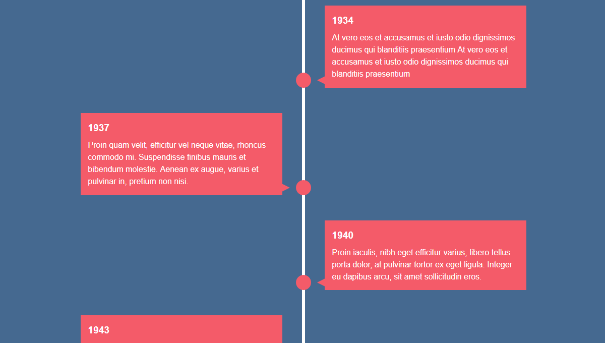
React Timeline
A react component for animated timelines.

Usage
Requirements: radium
import Timeline from 'timeline'

render(
  <StyleRoot>
    <Timeline>
      <div>Arbitrary entry</div>
      <div icon='x'>Arbitrary entry</div>
    </Timeline>
  </StyleRoot>
)
A custom icon can (optionally) be provided for each entry.
Configuration
src/config.js holds the default configuration.
Alternative values can be passed to the <Timeline> component,
e.g. <Timeline animations={false} to disable animations (far more efficient,
as otherwise boundingRect of every entry is checked on every scroll event).
| name | default value | description |
|---|---|---|
| paddingTop | 50 | |
| mediaWidthMed | 900 | |
| mediaWidthSmall | 700 | |
| activeColor | #F45B69 | |
| color | black | |
| twoSidedOverlap | 80 | negative overlap between items if two-sided |
| animations | true | |
| addEvenPropToChildren | false | |
| lineColor | #FFF | |
| circleWidth | 30 | |
| paddingToItem | 30 | |
| paddingToItemSmall | 20 | |
| lineWidth | 5 | |
| triangleWidth | 16 | |
| triangleHeight | 8 | |
| itemWidth | 350 | |
| itemWidthMed | 250 | |
| offsetHidden | 200 | |
| triangleOffset | 7 | |
| smallItemWidthPadding | 50 | |
| itemPadding | 16 | |
| evenItemOffset | 0 | important when using bootstrap.css |
Demo
See the Pen Building a Vertical Timeline With CSS and a Touch of JavaScript by Envato Tuts+ (@tutsplus) on CodePen.
