React Chord Diagram
A React component for building D3 Chord Diagrams.
Installation
$ npm install react-chord-diagram
Usage
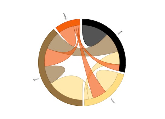
import ChordDiagram from 'react-chord-diagram'

const matrix = [
  [11975, 5871, 8916, 2868],
  [1951, 10048, 2060, 6171],
  [8010, 16145, 8090, 8045],
  [1013, 990, 940, 6907]
];

<ChordDiagram
  matrix={matrix}
  componentId={1}
  groupLabels={['Black', 'Yellow', 'Brown', 'Orange']}
  groupColors={["#000000", "#FFDD89", "#957244", "#F26223"]}
/>
Required Props
matrix
- type:
array of arrays
The matrix to be visualized. See D3 Chord.
example:
[
  [11975,  5871, 8916, 2868],
  [ 1951, 10048, 2060, 6171],
  [ 8010, 16145, 8090, 8045],
  [ 1013,   990,  940, 6907],
]
componentId
- type:
number
A unique id for the component.
Optional Props
width
- type:
number
Width of the diagram.
height
- type:
number
Height of the diagram.
style
- type:
object
Custom styles applied to the diagram's root div.
example:
    {
        font: '10px sans-serif'
    }
className
- type:
string
Custom class name applied to the root svg.
outerRadius
- type:
number
Outer radius of the diagram.
innerRadius
- type:
number
Inner radius of the diagram.
groupColors
- type:
array
List of colors, one for each group.
example:
["#000000", "#FFDD89", "#957244", "#F26223"]
padAngle
- type:
number
Specifies the percent of padding between arcs or groups.
default: .05
sortGroups
- type:
function
A function that specifies how the groups should be sorted. See chord.sortGroups.
default: null
sortSubGroups
- type:
function
A function that specifies how subgroups should be sorted. See chord.sortSubGroups.
default: d3.descending
sortChords
- type:
function
A function that specifies how chords should be sorted. See chord.sortChords.
default: d3.descending
labelColors
- type:
array
The color of each label in the diagram.
default: #000000
disableHover
- type:
boolean
Whether to hide other ribbons while mousing over a particular group or ribbon.
This overrides the individual group / ribbon hover settings.
default: false
disableGroupHover
- type:
boolean
Whether to hide other ribbons while mousing over a particular group.
default: false
disableRibbonHover
- type:
boolean
Whether to hide other ribbons while mousing over a particular ribbon.
default: false
blurOnHover
- type:
boolean
Whether to blur other ribbons instead of hiding them on hover.
default: false
persistHoverOnClick
- type:
boolean
If true, ribbons highlighted on hover will remain highlighted if you click on
the element causing the hover. Click anywhere on the SVG to clear this state.
default: false
ribbonOpacity
- type:
string
Default opacity value for ribbons.
default: '0.67'
ribbonBlurOpacity
- type:
string
If blurOnHover is true, then set 'hidden' ribbons to this opacity instead of
hiding them.
default: '0.2'
strokeWidth
- type:
number
Will change the stroke width of the ribbons.
default: 1
resizeWithWindow
- type:
boolean
Resize the svg when the window is resized.
default: false
groupOnClick
- type:
function
A function that will happen when a group is clicked. Group index is passed to
the function.
default: null
ribbonOnClick
- type:
function
A function that will happen when a ribbon is clicked. Ribbon index is passed
to the function.
default: null