react-tab-set
A React component for rendering tabbed content.
<TabSet selectedTab='one'>
  <TabGroup>
    <Tab tab='one'>
      One
    </Tab>
    <Tab tab='two'>
      Two
    </Tab>
  </TabGroup>
  <TabPanel tab='one'>
    One
  </TabPanel>
  <TabPanel tab='two'>
    Two
  </TabPanel>
</TabSet>
The <TabSet /> component manages state, and applies additional props to the <Tab /> and <TabPanel /> components.
TabSet
Rendered as a <div /> the <TabSet /> component can contain or be contained by an valid children or parent.
A <TabSet /> has one prop, selectedTab. The value of that prop should be the same as the tab prop of a <Tab /> and its paired <TabPanel />.
TabGroup and Tab
A <TabGroup /> contains <Tab /> components.
These are rendered as <ul/> and <li /> elements, respectively; there should be no elements between them.
A <TabGroup /> has no props.
Each <Tab /> component has one prop, tab. The value of that prop pairs with the tab prop of a <TabPanel /> component (such that when a <Tab /> is selected with a click, its paired <TabPanel /> is rendered).
TabPanel
A <TabPanel /> is a container for content.
Content can be declared either as children or as the return of a function assigned to its prop render.
If your component extends PureComponent or is presentational, you might prefer to declare content as children.
Otherwise, you might prefer to assign a function to the render prop, so that rendering is deferred until the tab is selected.
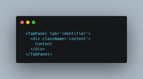
Content as children
  <TabPanel tab='identifier'>
    <div className='content'>
      Content
    </div>
  </TabPanel>
Content as return
  <TabPanel tab='identifier' render={() => (
    <div className='content'>
      Content
    </div>
  )} />
(Notice that in this case there is no closing tag; if there were, children would be ignored in favour of the return from the function, anyway.)
Presentational elements
A <TabPanel /> component can contain or be contained by an valid children or parent, just like a <TabSet />.
<TabSet selectedTab='one'>
  { /*
    Etc.
  */ }
  <div className='a'>
    <div className='b'>
      <div className='c'>
        <TabPanel tab='one'>
          One
        </TabPanel>
      </div>
    </div>
  </div>
  <TabPanel tab='two' render={() => {
    return 'Two'
  }} />
</TabSet>
Similarly, they can be declared in any combination.
Demonstrating react-tab-set
Example Storybooks are available on GitHub.
Clone the repository, then:
npm install
npm run storybook
And with your preferred browser visit http://localhost:6006.