react-tailwind-tabs
React Context-powered tabs with Tailwind styling.
How to add to your codebase
Don’t clone the repo, don’t npm install anything, just copy the TailwindTabs.jsx file into your own codebase. People install too much these days.
This project assumes you have React (16+) and Tailwind already installed. It’s also compatible with Preact (just change the import at the top), but not as tested so YMMV. You can use this with any bundler!
I didn’t want to mess with Tailwind JIT stuff for custom color classes, so just edit the classes at the top of the file for the colors that you want!
How to use out of the box
There’s two ways to use these tabs, as a compound component, or as a single component.
Compound component
Using this in the compound component style is very similar to the HTML <table> setup (with <th>s and <tr>s and <td>s). You can rearrange components however you’d like (for example putting the panels above the tab list). You can put components in the tab panels, not just strings!
import {
	TailwindTabs,
	TailwindTabList,
	TailwindTab,
	TailwindTabPanels,
	TailwindTabPanel,
} from "./TailwindTabs.jsx";

function SomeComponent() {
	return (
		<TailwindTabs>
			<TailwindTabList>
				<TailwindTab>Tab #1</TailwindTab>
				<TailwindTab>Tab #2</TailwindTab>
				<TailwindTab isDisabled>Tab #3</TailwindTab>
			</TailwindTabList>
			<TailwindTabPanels>
				<TailwindTabPanel>Content of Tab #1</TailwindTabPanel>
				<TailwindTabPanel>
					<SomeExampleComponent />
				</TailwindTabPanel>
				<TailwindTabPanel>Content of Tab #3</TailwindTabPanel>
			</TailwindTabPanels>
		</TailwindTabs>
	);
}
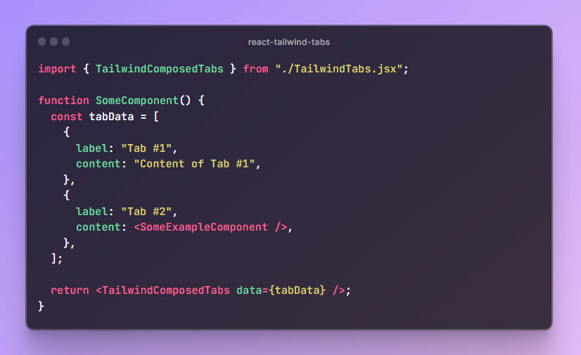
Single component
Using this style is a bit more restricted, in that you can only pass in your data as an array with a label and content, and it generates the tabs for you.
import { TailwindComposedTabs } from "./TailwindTabs.jsx";

function SomeComponent() {
	const tabData = [
		{
			label: "Tab #1",
			content: "Content of Tab #1",
		},
		{
			label: "Tab #2",
			content: <SomeExampleComponent />,
		},
	];

	return <TailwindComposedTabs data={tabData} />;
}
Customizing colors
These are the variables you’ll edit to customize the colors you want for your tabs:
let tabBackgroundColorClass = "bg-white";
let borderColorClass = "border-pink-300";
let hoverBorderColorClass = "hover:border-accent-900";
let textColorClass = "text-black";
let hoverTextColorClass = "hover:text-pink-600";
What if I don’t want to use Tailwind?
Just take out the CSS classes and add your own! Tailwind isn’t necessary for the logic to work. You can add whatever classes you’d like.
You can also rename the components if you want. I called them this so that they wouldn’t collide with any UI libraries that might already exist that have their own Tab components.
License and credit and stuff
It’d be cool if you tell me if you use this, but follow your dreams and don’t let me stop you. Check out the license if your company needs to know the deets.
Contributing
I use/like this the way it is in my various projects (if I’m being honest, I open sourced it because I was lazy about sharing it to myself on different machines), so please don’t add new features. If you want new features, fork it! If you wanna fix a bug or something, that’s when a PR or issue would be better.