React-PanelGroup
A React component for resizable panel group layouts.
Features
- Absolute & Relative Sizing
Choose between absolute pixel sizing and relative weights to describe your layout. Even mix the two per panel for more complex layouts. Supports fixed-size, dynamic (absolute pixel), and stretchy (relative weights) resizing - Neighbor-Aware Resizing
When a panel is resized beyond it's extents, it will begin to push or pull at it's neighbors recursively. - Column & Row Orientations
Supports vertical and horizontal orientations. Nest them together to produce grid-like layouts - Snap points
If supplied, panels can snap to pre-defined sizes
Installation
$ npm install --save react-panelgroup
Examples
Defaults
When not specifying any props, the panel group defaults to a horizontal orientation with panels of equal (stretchy) widths. PanelGroup will always try to entirely fill it's container.
<PanelGroup>
  <div>panel 1</div>
  <div>panel 2</div>
  <div>panel 3</div>
</PanelGroup>
Column layout
Setting the direction prop to "column" will result in a vertical layout
<PanelGroup direction="column">
  <div>panel 1</div>
  <div>panel 2</div>
  <div>panel 3</div>
</PanelGroup>
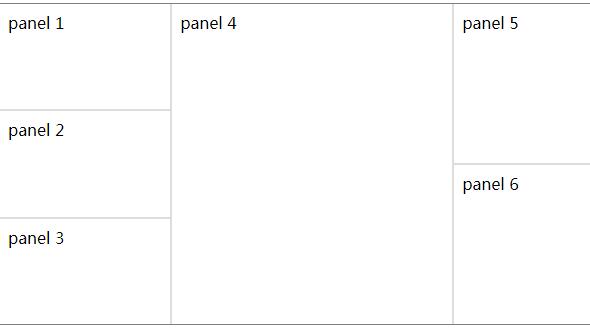
Nested layout
Nest multiple panelGroups for more complex layouts
<PanelGroup direction="row">
  <PanelGroup direction="column">
    <div>panel 1</div>
    <div>panel 2</div>
    <div>panel 3</div>
  </PanelGroup>
  <div>panel 4</div>
  <PanelGroup direction="column">
    <div>panel 5</div>
    <div>panel 6</div>
  </PanelGroup>
</PanelGroup>
Defined panel sizes
Providing panelWidths with an array of objects defining each panel's size parameters will set the initial sizing for each panel. If any property is missing, it will resort to the default for that property.
<PanelGroup panelWidths={[
  {size: 100, minSize:50, resize: "dynamic"},
  {minSize:100, resize: "stretch"},
  {size: 100, minSize:50, resize: "dynamic"}
]}>
  <div>panel 1</div>
  <div>panel 2</div>
  <div>panel 3</div>
</PanelGroup>
Component Props
spacing: number
sets the width of the border between each panelborderColor: Valid CSS color string
Optionally defines a border color for panel dividers. Defaults to "transparent"panelColor: Valid CSS color string
Optionally defines a background color for the panels. Defaults to "transparent"direction: [ "row" | "column" ]
Sets the orientation of the panel grouppanelWidths: [panelWidth, ...]
An array of panelWidth objects to initialize each panel with. If a property is missing, or an index is null, it will resort to default valuespanelWidth.size: number
Initial panel size. If panelWidth.resize is "fixed" or "dynamic" the size will be pixel units. If panelWidth.resize is "stretch" then it is treated as a relative weight: Defaults to 256panelWidth.minSize: number
minimum size of panel in pixels. Defaults to 48panelWidth.resize: [ "fixed" | "dynamic" | "stretch" ]
Sets the resize behavior of the panel. Fixed cannot be resized. Defaults to "stretch"panelWidth.snap: [snapPoint, ...]
An array of positions to snap to per panelonUpdate: function()
Callback to recieve state updates from PanelGroup to allow controlling state externally. Returns an array of panelWidths
Contribute
Prerequisites
Node.js >= v4 must be installed.
Installation
- Running
npm installin the components's root directory will install everything you need for development.
Demo Development Server
npm startwill run a development server with the component's demo app at http://localhost:3000 with hot module reloading.
Running Tests
npm testwill run the tests once.npm run test:coveragewill run the tests and produce a coverage report incoverage/.npm run test:watchwill run the tests on every change.
Building
npm run buildwill build the component for publishing to npm and also bundle the demo app.npm run cleanwill delete built resources.