react-infinity-menu
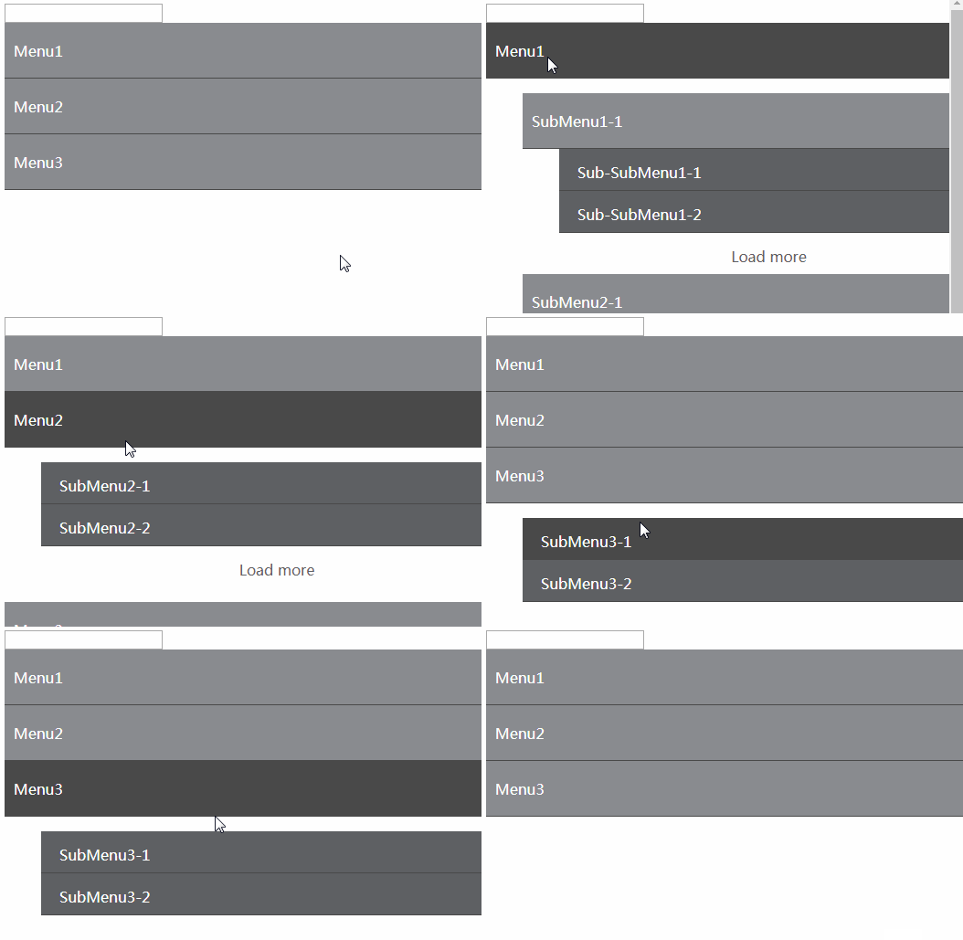
A react component that displays an unlimited deep menu.
Installation
npm install react-infinity-menu
How to use
import InfinityMenu from "react-infinity-menu";
import "react-infinity-menu/src/infinity-menu.css";

class Example extends React.Component {
	onNodeMouseClick(event, tree, node, level, keyPath) {
		this.setState({
			tree: tree
		});
	}

	onLeafMouseClick(event, leaf) {
		console.log( leaf.id ); // Prints the leaf id
		console.log( leaf.name ); // Prints the leaf name
	}

	onLeafMouseUp(event, leaf) {
		console.log( leaf.id ); // Prints the leaf id
		console.log( leaf.name ); // Prints the leaf name
	}

	onLeafMouseDown(event, leaf) {
		console.log( leaf.id ); // Prints the leaf id
		console.log( leaf.name ); // Prints the leaf name
	}

	render() {
		return (
			<InfinityMenu
				tree={this.state.tree}
				onNodeMouseClick={this.onNodeMouseClick}
				onLeafMouseClick={this.onLeafMouseClick}/*optional*/
				onLeafMouseDown={this.onLeafMouseDown}/*optional*/
				onLeafMouseUp={this.onLeafMouseUp}/*optional*/
				maxLeaves={5}/*optional*/
			/>
		);
	}
}
Properties
tree(Array)
A tree to represent the folder structure.
Here is the example data you could pass into the tree props.
[
	{
		name: "menu1", /*require*/
		id: 1, /*require*/
		isOpen: true, /*require*/
		customComponent: YOUR_OWN_COMPONENT_FOR_MENU,
		children: [
			{
				name: "submenu1",
				id: 1,
				isOpen: true,
				customComponent: YOUR_OWN_COMPONENT_FOR_SUB_MENU,
				children: [
					{
						name: "item1-1",
						id: 1
					},
					{
						name: "item1-2",
						id: 2
					}
				]
			},
			{
				name: "submenu2",
				id: 2,
				isOpen: true,
				customComponent: YOUR_OWN_COMPONENT_FOR_SUB_MENU,
				children: [
					{
						name: "item2-1",
						id: 1
					}
				]
			}
		]
	},
	{
		name: "menu2", /*require*/
		id: 2, /*require*/
		isOpen: true, /*require*/
		customComponent: YOUR_OWN_COMPONENT_FOR_MENU,
		children: [
			{
				name: "item3-1",
				id: 1
			}
		]
	}
];
disableDefaultHeaderContent (boolean)
A boolean to set if user want to display the default header search input. If user pass in headerContent, the default header will be disabled.
headerContent(React Component)
Subcomponent rendered above the tree.
headerContent is passed in to InfinityMenu. It is rendered above the tree subcomponent.
headerProps(object)
Additional props for headerContent.
headerPropsis an optional prop of InfinityMenu. The props in this object are passed as props to aheaderContentcomponent. This is useful when extending InfinityMenu.
Passing the following into InfinityMenu as the headerProps prop sets the title prop on the headerContent component.
{
	title: "my great title"
}
customComponentMappings (object)
A mapping that let user to pass in customComponent as string.
var myComponentMappings = {
    "MyComponent1": MyComponent1,
    "MyComponent2": MyComponent2
}
customComponent(React Component)
A custom React component the user can pass in.
-
As the
customComponentat the node level, you will receive propskey,onClick,name,isOpen,dataandisSearching. -
As the
customComponentat the leaf level, you will receive propskey,onMouseDown,onMouseUp,onClick,name,iconanddata.Example of
customComponentclass Node extends React.Component { render() { return ( <div key={this.props.key} onClick={this.props.onClick}> <label>{this.props.name}</label> </div> ); } }
filter(function)[node, searchInput]
By default, when the menu is in searching mode, it will filter all nodes by whether their name is equal to the current searchInput. If the node name is equal to the searchInput, then the node will pass the filter and be displayed in tree (if it fails the filter, it will not be displayed in the tree).
This allows the user to specify their own filtering criteria. When the menu is in search mode, every node will be run against the filter() function:
- If the function returns
true, the node will pass the filter, and be displayed in the tree. - If the function returns
false, the node will fail the filter, and will not be displayed in the tree.
The function takes the following arguments:
node (object)is the folder(node) the user clicked on. Includes the following properties:id,name,isOpenandchildren.searchInput (string)The current search term
emptyTreeComponent (React Component)
If the tree prop is an empty array or if the menu is in searching mode and no nodes match the filter, then the tree is considered "empty".
By default, nothing will be displayed in an empty tree.
However, if this prop is passed in, the specified component will be rendered when the tree is empty.
This allows you have a very customized "empty tree" message/image.
emptyTreeComponentProps (object)
Allows you to specify props to pass to the emptyTreeComponent.
By default, this is an empty object.
onNodeMouseClick(function)[event, tree, node, level, keyPath]
This function will get call when user click on the folder(node).
The function arguments include event, tree, node and level.
eventis the mouse click event.treeis the updated tree, you should update your own tree accordingly.nodeis the folder(node) the user clicked on. Including the id, name, isOpen and children.levelis the distance from the root.keyPathis the path from root to current node
onLeafMouseClick(function)[event, leaf]
Bind to the onClick on the leaf.
This function will get call when user click on the item(leaf).
The function arguments include event, leaf.
eventis the click event.leafis the item user clicked on. Includes name, id, keyPath and all data the user inputs when they pass in the tree.
onLeafMouseDown(function)[event, leaf]
Bind to the onMouseDown on the leaf.
This function will get call when user mouse down on the item(leaf).
The function arguments include event, leaf.
eventis the click event.leafis the item user clicked on. Includes name, id, keyPath and all data the user inputs when they pass in the tree.
onLeafMouseUp(function)[event, leaf]
Bind to the onMouseUp on the leaf.
This function will get call when user mouse up on the item(leaf).
The function arguments include event, leaf.
eventis the click event.leafis the item user clicked on. Includes name, id, keyPath and all data the user inputs when they pass in the tree.
maxLeaves(integer)
Sets the maximum number of leaf to show initially. Also used as an increment when then load more is pressed.
shouldComponentUpdate(function) [currProps, currState, nextProps, nextState]
A function that will be called inside shouldComponentUpdate. It's a good place to optimize update.
Styles
There is a default style sheet you can use if you so desire.
/src/infinity-menu.css


