React Likert Scale
A React component that makes a Likert Scale for collecting data or to make a survey.
It has the following features:
- it is fully responsive (looks great on laptops and phones)
- has a very small size (less than 4kb)
- has zero-dependencies
- the styling can be customized by providing your own CSS styles
Installation
npm i react-likert-scale
Usage
import React from 'react';
import Likert from 'react-likert-scale';
export default () => {
const likertOptions = {
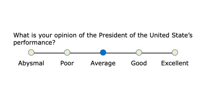
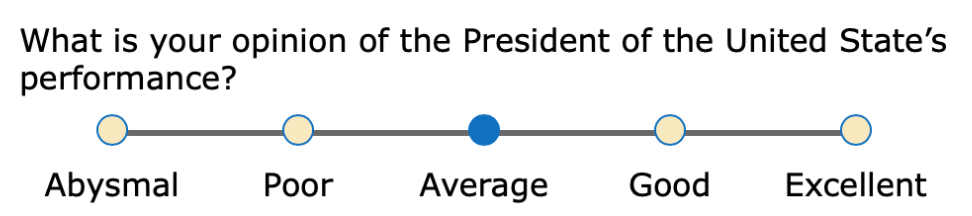
question: "What is your opinion of the President’s performance?",
responses: [
{ value: 1, text: "Abysmal" },
{ value: 2, text: "Poor" },
{ value: 3, text: "Average", checked: true },
{ value: 4, text: "Good" },
{ value: 5, text: "Excellent" }
],
onChange: val => {
console.log(val);
}
};
return (
<Likert {...likertOptions} />
)
}
Likert Props
Required props
responses— (array of objects) These are the radio button options. Thevaluekey is what is
returned to the calling application in theonChangecallback.textis what’s shown on-screen.
The optionalcheckedkey will pre-check a radio button when set totrue.
Semi-required props
Technically, these are all optional, however you need to pass in an onChange prop if you want to be notified about which option a user chose.
onChange— (callback function) Optionally, you can provide a callback function that returns the
value of the option that was clicked.
For accessibility reasons, each likert scale on your page needs a unique identifier. If you are
passing in a question prop and each question is unique, then that text will be used to generate a
unique identifier. On the other hand, if you are not using question or the question text is
duplicated across multiple likert scales, you will need to pass in an id prop.
question— (string) This is the prompt that displays above the options. The easiest way to
create these likert scales is by passing in your question text in this prop, however if you want a
more custom layout then you can omit this prop. You can see a grid layout example on
Codepen that uses this technique.id- (string) It is your responsibility to pass in a unique ID. If you are using thequestion
prop it is safe to omit thisidprop.
Optional props
flexible(boolean|integer) This controls the type of layout. Whenflexibleis set totrue,
which is the default setting, the radio buttons will stretch to fill available space. The question
text will get positioned to the left of the radio buttons when there is plenty of space, otherwise
it will appear above the radio buttons. Setflexibletofalseif you want the radio buttons to
use a minimum amount of space at all times. Passing in an integer is an advanced use-case and frankly isn’t of much value. See the source code for more info. The integer is used as aflex-growvalue.className(string) You can use this to apply custom CSS. You class name will be put on a<fieldset>element, which is the top-level element of this component.ref(React ref) For advanced use-cases, you may need a reference to the DOM element itself. Pass in a React ref.- DOM attributes such as
id,disabled,data-*,onClick, etc. These will get applied to a<fieldset>element.
FAQ
How do I change colors or other CSS styling?
The top-level DOM element that gets created by this component is <fieldset class="likertScale">.
You can override any styles by prefixing your rule with fieldset.likertScale. For example, let’s
say you want the radio button “dots” to have a light gray background with a dark green ring.
fieldset.likertScale .likertIndicator {
  border: thin solid darkGreen;
  background-color: lightGray;
}
You can pass in a className prop to the Likert component that can also be used for styling. Refer to the custom styling example on Codepen.
I need access to the DOM element created by React. How is that done?
This isn’t very common, but you may want to set focus on a Likert Scale after the page renders. This
is done with React via refs. Either create your ref with React.createRef() or the useRef()
hook. You can then pass your ref to the Likert component.
import React, { useRef } from 'react';
import Likert from 'react-likert-scale';

export default () => {
  const likertOptions = {
    question: "What is your opinion of the President’s performance?",
    responses: [
      { value: 1, text: "Abysmal" },
      { value: 2, text: "Poor" },
      { value: 3, text: "Average" },
      { value: 4, text: "Good" },
      { value: 5, text: "Excellent" }
    ]
  };

  const likertRef = useRef();

  return (
    <Likert {...likertOptions} ref={likertRef} />
  )
}
Can I pass in DOM attributes such as id, class, disabled, data-*, onClick, etc.?
Sure. They will be applied to the likert component’s top-level DOM element, <fieldset>.
<Likert {...likertOptions}
  id='Q1'
  className='myClass'
  onClick={() => {
    doThis();
    andThis();
  }}
/>