react-event-timeline
A responsive event timeline in React.js
Features
- It's lightweight
- Responsive and extensible
Getting started
To install the dependency
npm install --save react-event-timeline
or if you use yarn
yarn add react-event-timeline
Usage
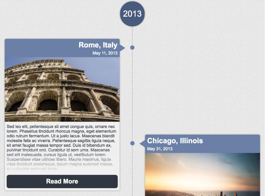
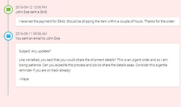
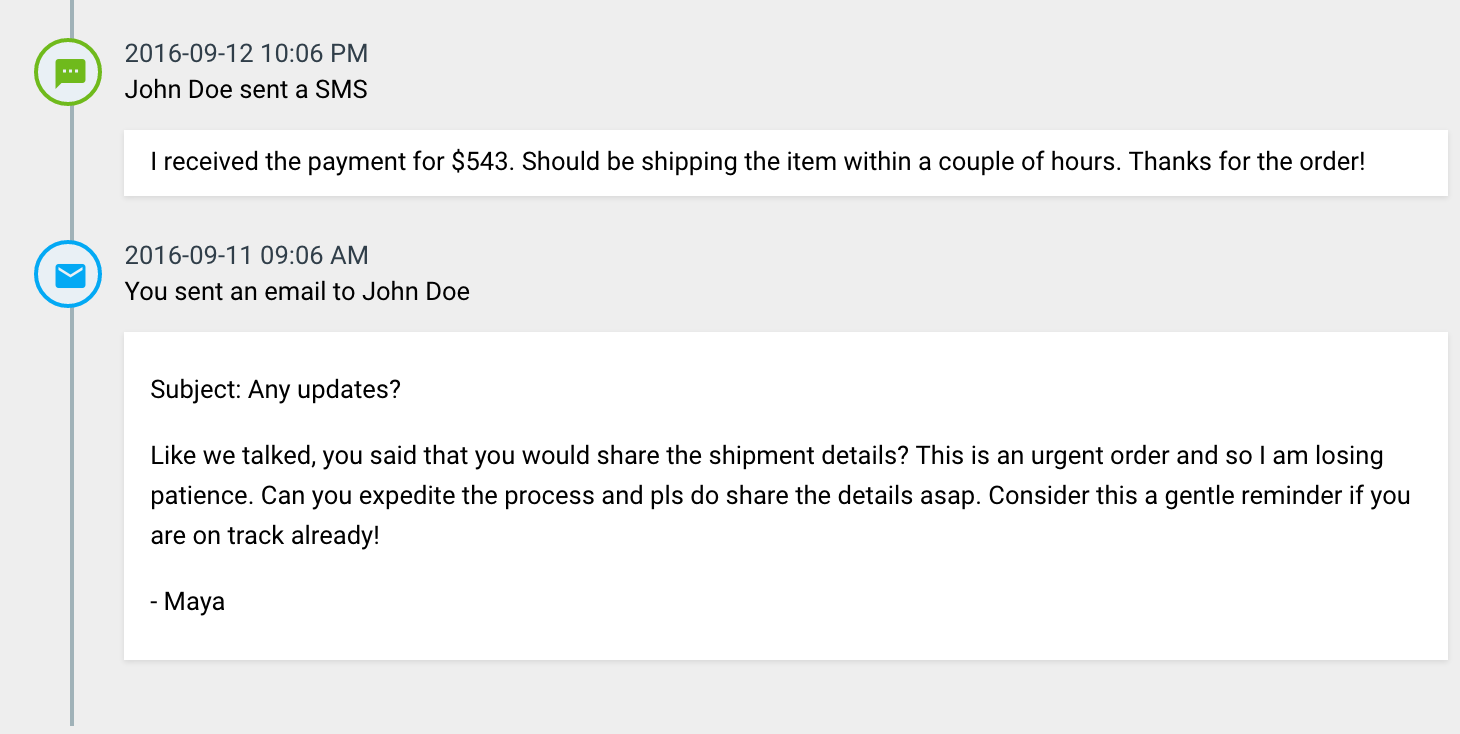
The following snippet generates the timeline you see in the screenshot:
import {Timeline, TimelineEvent} from 'react-event-timeline'

ReactDOM.render(
    <Timeline>
            <TimelineEvent title="John Doe sent a SMS"
                           createdAt="2016-09-12 10:06 PM"
                           icon={<i className="material-icons md-18">textsms</i>}
            >
                I received the payment for $543. Should be shipping the item within a couple of hours.
            </TimelineEvent>
            <TimelineEvent
                title="You sent an email to John Doe"
                createdAt="2016-09-11 09:06 AM"
                icon={<i className="material-icons md-18">email</i>}
            >
                Like we talked, you said that you would share the shipment details? This is an urgent order and so I
                    am losing patience. Can you expedite the process and pls do share the details asap. Consider this a
                    gentle reminder if you are on track already!
            </TimelineEvent>
    </Timeline>,
      document.getElementById('container')
);
Please refer to story description to check out code for all the examples in the storybook
API Documentation
Timeline
This is the wrapper component that creates the infinite vertical timeline
| Name | Type | Description |
|---|---|---|
| className | string | The css class name of timeline container |
| style | object | Override inline styles of timeline container |
| orientation | string | Display the timeline on right or left. Default: left |
TimelineEvent
Each event in the timeline will be represented by the TimelineEvent component. There can be multiple repeating instances of this component inside Timeline wrapper
| Name | Type | Description |
|---|---|---|
| title | node | The title of the event. Can be string or any DOM element node(s) |
| createdAt | node | The time at which the event occurred. Can be datetime string or any DOM element node(s) |
| subtitle | node | If you prefer having the title at the top and some caption below, omit createdAt and specify title and subtitle |
| icon | node | The icon to show as event lable. Can be a SVG or font icon |
| iconStyle | object | Custom CSS styling for the icon |
| bubbleStyle | object | Custom CSS styling for the bubble containing the icon |
| buttons | node | Action buttons to display to the right of the event content |
| contentStyle | node | Override content style |
| container | string | Optional value card will render event as a Card |
| style | object | Override style for the entire event container. Can be used to modify card appearance if container is selected as card |
| titleStyle | object | Override style for the title content |
| subtitleStyle | object | Override style for the subtitle content |
| cardHeaderStyle | object | Override style for the card header if container is card |
TimelineBlip
Use this component if your event footprint is too small and can be described in a single line
| Name | Type | Description |
|---|---|---|
| title | node | The title of the event. Can be string or any DOM element node(s) |
| icon | node | The icon to show as event lable. Can be a SVG or font icon |
| iconColor | string | CSS color code for icon |
| iconStyle | object | Custom CSS styling for the icon |
| style | object | Override style for the entire event container |
Refer to Condensed Timeline in Storybook for examples of using this component