react-flip-toolkit
A React FLIP animation helper library for highly configurable transitions.
Comparison with other React FLIP libraries
| Feature | react-flip-move |
react-overdrive |
react-flip-toolkit |
|---|---|---|---|
| Animate position | ✅ | ✅ | ✅ |
| Animate size | ❌ | ✅ | ✅ |
| Animate opacity | ❌ | ✅ | ✅ |
| Animate parent's size without warping children | ❌ | ❌ | ✅ |
| Use real FLIP instead of cloning & crossfading | ✅ | ❌ | ✅ |
| Enable nested animations | ❌ | ❌ | ✅ |
| Use springs for animations | ❌ | ❌ | ✅ |
| Easy to set up & beginner-friendly | ✅ | ✅ | ? |
Demos
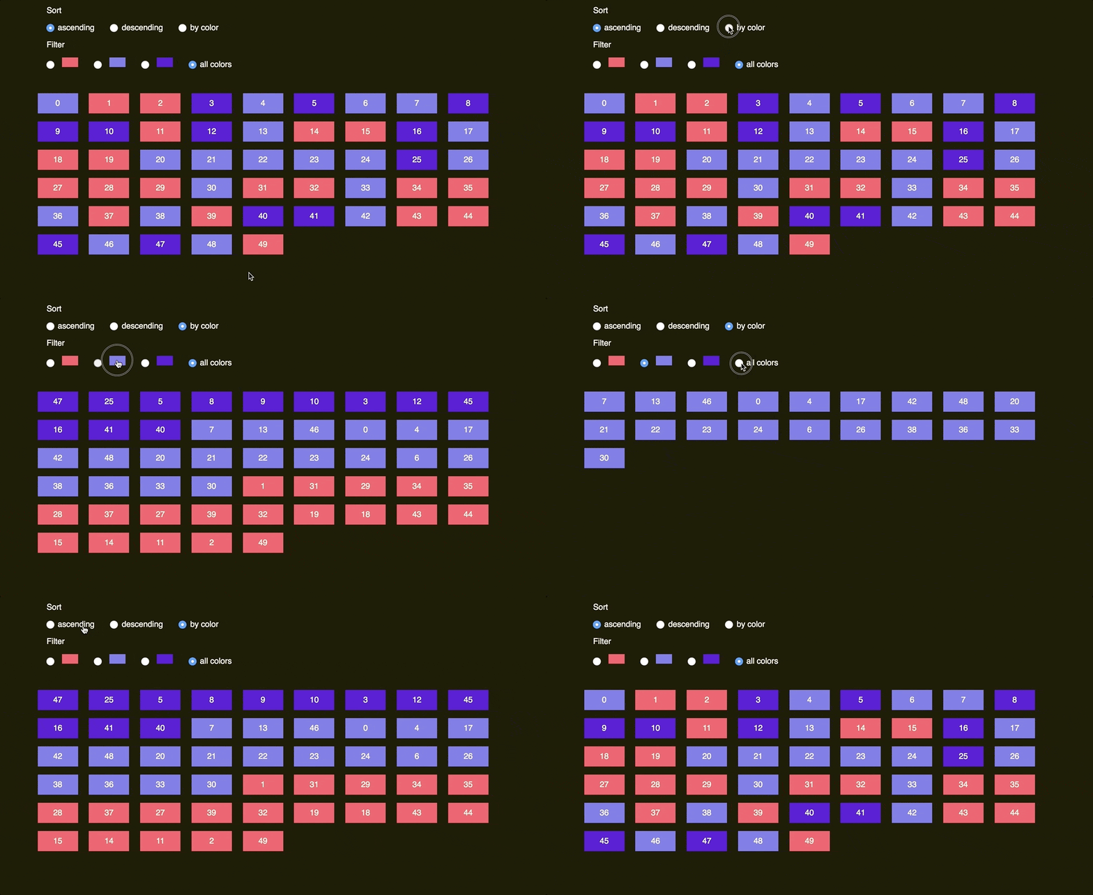
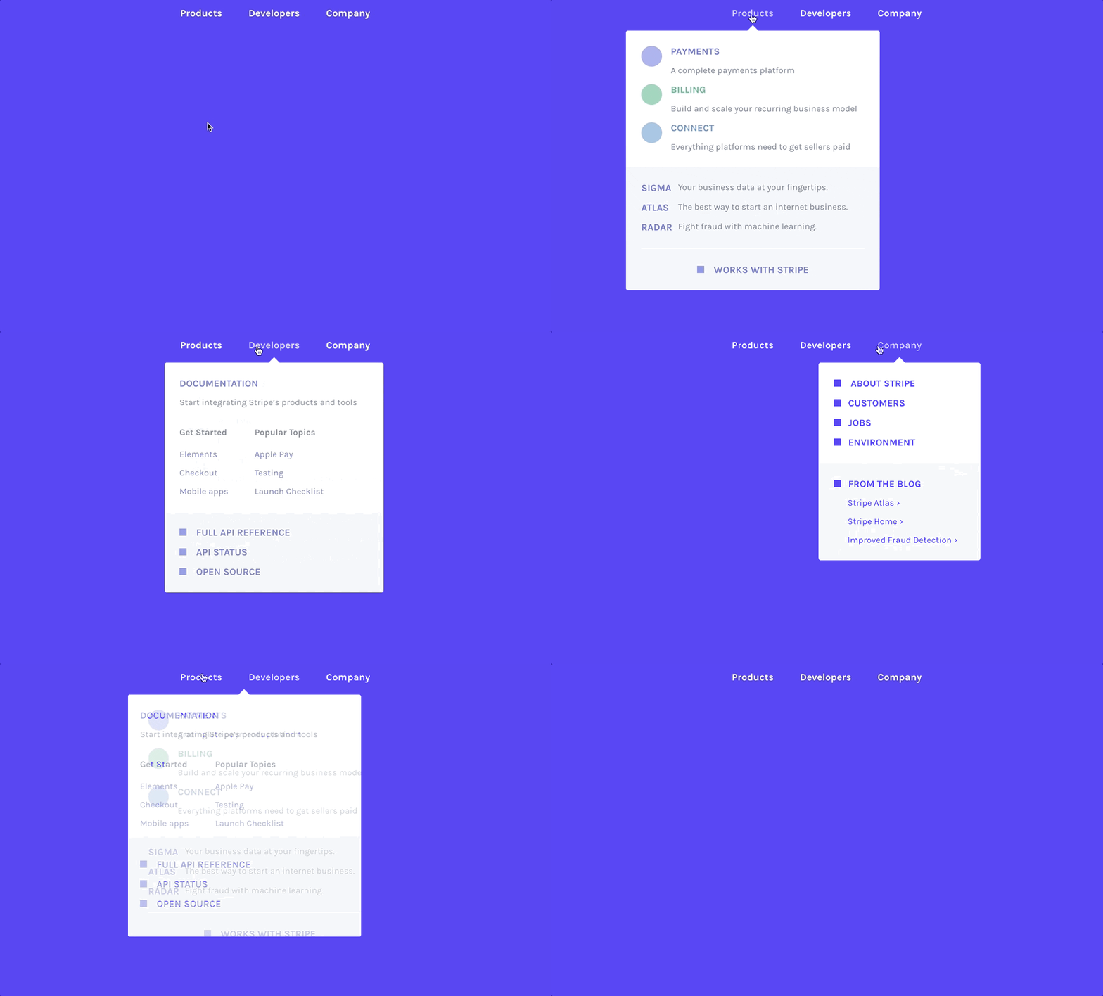

Quick start
npm install react-flip-toolkit
Wrap your container element with a Flipper component that has a flipKey prop that changes every time an animation should happen.
Wrap elements that should be animated with Flipped components that have flipId props matching them across renders.
Simplest example: tweening a single element
import React, { Component } from React;
import { Flipper, Flipped } from 'react-flip-toolkit';

class AnimatedSquare extends Component {
  state = { fullScreen: false };

  toggleFullScreen = () => {
    this.setState(prevState => ({
      fullScreen: !prevState.fullScreen
    }));
  };

  render() {
    return (
      <Flipper flipKey={this.state.fullScreen}>
        <Flipped flipId="square">
          <div
            className={this.state.fullScreen ? "full-screen-square" : "square"}
            onClick={this.toggleFullScreen}
          />
        </Flipped>
      </Flipper>
    );
  }
}
More useful: tweening different elements
The power of FLIP lies in smoothly tweening two completely separate elements to appear as if they are one:
import React, { Component } from React;
import { Flipper, Flipped } from 'react-flip-toolkit';

const SmallSquare = ({ onClick, ...rest}) => (
  <div className="square" onClick={onClick} {...rest} />
);

const BigSquare = ({ onClick, ...rest }) => (
  <div className="full-screen-square" onClick={onClick} {...rest}/>
);

class AnimatedSquare extends Component {
  state = { fullScreen: false };

  toggleFullScreen = () => {
    this.setState(prevState => ({
      fullScreen: !prevState.fullScreen
    }));
  };

  render() {
    return (
      <Flipper flipKey={this.state.fullScreen}>
        {this.state.fullScreen ? (
          <Flipped flipId="square">
            <BigSquare onClick={this.toggleFullScreen} />
          </Flipped>
        ) : (
          <Flipped flipId="square">
            <SmallSquare onClick={this.toggleFullScreen} />
          </Flipped>
        )}
      </Flipper>
    );
  }
}
The Components
1. Flipper
The parent wrapper component that contains all the elements to be animated.
<Flipper flipKey={someKeyThatChanges}>
  {/* children */}
</Flipper>
Props
| prop | default | type | details |
|---|---|---|---|
| flipKey (required) | - | string, number, bool |
Changing this tells react-flip-toolkit to transition child elements wrapped in Flipped components. |
| children (required) | - | node |
One or more element children |
| spring | {stiffness: 1000, damping: 500, mass: 3} |
object |
The default easing for all transitions uses springs. You can customize the spring by changing the stiffness, damping, or mass values passed in the spring object prop. If you provide an ease prop (described below), that will be used instead instead of a spring. You can explore the spring setting options here. |
| ease | easeOutExpo |
string |
If you'd rather use easing functions instead of springs, you can set the default easing for all FLIP transitions by providing a name of an easing function. Try out all easing options. |
| duration | 250 |
number |
Default duration in ms for all FLIP transitions that use the ease prop instead of the default spring (which uses a physics simulation and therefore doesn't require a duration) |
| applyTransformOrigin | true |
bool |
Whether or not react-flip-toolkit should apply a transform-origin of "0 0" to animating children (this is generally desirable for FLIP animations) |
2. Flipped
Wraps an element that needs to be animated.
E.g. in one component you can have
<Flipped flipId="coolDiv">
  <div className="small" />
</Flipped>
and in another component somewhere else you can have
<Flipped flipId="coolDiv">
  <div className="big" />
</Flipped>
and they will be tweened by react-flip-toolkit.
Basic props
| prop | default | type | details |
|---|---|---|---|
| children (required) | - | node |
Wrap a single child with the Flipped component. If the child is a React component, make sure it passes down unknown props directly to the rendered DOM element so that Flipped can pass down the necessary data-* attributes. |
| flipId (required) | - | string |
Use this to tell react-flip-toolkit how elements should be matched across renders so they can be animated. |
| inverseFlipId | - | string |
Refer to the id of the parent Flipped container whose transform you want to cancel out. Read more about canceling out parent transforms here. |
| transformOrigin | "0 0" |
string |
This is a convenience method to apply the proper CSS transform-origin to the element being FLIP-ped. This will override react-flip-toolkit's default application of transform-origin: 0 0 if it is provided as a prop. |
| spring | {stiffness: 1000, damping: 500, mass: 3} |
object |
You can customize the spring on a per-element basis by changing the stiffness, damping, or mass values passed in the spring object prop. If you provide an ease prop (described below), that will be used instead instead of a spring. You can explore the spring setting options here. |
| ease | easeOutExpo |
string |
This string should refer to one of the available easing options. This prop will override the easing specified in the parent Flipped component. |
| duration | 250 |
number |
Timing for the individual FLIP transition. This is only meaningful if you've specified an ease prop, because springs don't take durations. This prop will override the one specified in the parent Flipped component if one exists. |
| delay | 0 |
number |
Amount of time to wait before tweening the element position. You can use this to create staggered transitions. |
Callback props
| prop | arguments | details |
|---|---|---|
| onAppear | element, index |
Called when the element first appears. It is provided a reference to the DOM element being transitioned as the first argument, and the index of the element relative to all appearing elements as the second. |
| onDelayedAppear | element, index |
This is a replacement for onAppear that is called only after all exiting elements have finished exiting. It automatically applies opacity: 0 to newly appeared elements at the very beginning. The onDelayedAppear function is responsible for setting the opacity to the final value. |
| onStart | element |
Called when the FLIP animation starts. It is provided a reference to the DOM element being transitioned as the first argument |
| onComplete | element |
Called when the FLIP animation completes. It is provided a reference to the DOM element being transitioned as the first argument. (If transitions are interruped by new ones, onComplete will still be called.) |
| onExit | element, index, removeElement |
Called when the element is removed from the DOM. It must call the removeElement function when the exit transition has completed. |
Transform props
By default the FLIP-ped elements' translate, scale, and opacity properties are all transformed. However, certain effects require more control so if you specify any of these props, only the specified attribute(s) will be tweened:
| prop | type | details |
|---|---|---|
| translate | bool |
Tween translateX and translateY |
| scale | bool |
Tween scaleX and scaleY |
| opacity | bool |
Advanced props
| prop | type | details |
|---|---|---|
| componentId | string |
Unique identifier for the component |
| componentIdFilter | array,string |
Only apply FLIP transitions if the transition originates or ends with a component with the specified componentId. To limit the application of an inverse transform, you refer to the parent's componentId as seen in this example. |
Scale transitions made eas(ier)
Some other FLIP libraries just allow you to animate position changes, but things get more interesting once you can animate scale changes as well.

The problem with scale animations has to do with children — if you scale a div up 2x, you will warp any children it has by scaling them up too, creating a weird-looking animation. That's why this library allows you to wrap the child with a Flipped component that has an inverseFlipId to counteract the transforms of the parent:
<Flipped flipId={parentFlipId}>
  <div>
    <Flipped inverseFlipId={parentFlipId} scale>
      <div>some text that will not be warped</div>
    </Flipped>
  </div>
</Flipped>
By default, both the scale and the translation transforms of the parent will be counteracted (this allows children components to make their own FLIP animations without being affected by the parent).
But for many/most use cases, you'll want to additionally specify the scale prop to limit the adjustment to the scale and allow the positioning to move with the parent.
For the most seamless results the DOM element with the inverse transform applied should lie flush against its parent container — that means any padding should be applied to the inverted container rather than the parent container.
