Stail
Incredible fast template toolkit for making new or re-styling existing components with Tailwind CSS.
Why it’s needed?
First of all, I’m tired from CSS-in-JS libraries. They are powerful but slow. Why? Because they building/prefixing/recalculating everything in browser.
For example, if you use template literals for your components in emotion it will make new AST -> CSS string -> style element change for every render with different output. Why? Because in your ${(props) => props.value} you can return anything starting from a number and ending by returning all new
styled.
Why not just use Tailwind in classNames
Just look at this className:
<div
  onClick={onClick}
  className={`flex h-56 max-w-71 rounded-lg flex-col relative overflow-hidden flex-1 border border-[#2d34365a] bg-[#2d343653] cursor-pointer flex-basis-30 m-1 sm:h-64 sm:flex-basis-40 sm:m-2 lg:h-96 lg:flex-basis-60 lg:m-3 ${
    className || ''
  }`}
>
  {/** Card body */}
</div>
Believe me, this is not the biggest className line that I’ve seen.
Let’s write this mess using Stail:
const Card = stail.div`
  // Layout
  flex flex-col relative flex-1
  // Style
  rounded-lg border border-[#2d34365a] bg-[#2d343653]
  cursor-pointer overflow-hidden

  /**
   * Media
   * H      Basis             Margin   Addition
   */
  h-56      flex-basis-30     m-1      max-w-71
  sm:h-64   sm:flex-basis-40  sm:m-2
  lg:h-96   lg:flex-basis-60  lg:m-3
`

<Card onClick={onClick} className={className}>
{/** Card body */}
</Card>
As you can see it’s much easier to read and write. Everything is on their place. Also with Tailwind CSS plugin for VS Code you can easily check
what each item is representing in end CSS file
How to install
yarn add stail
Or
npm install --save stail
That’s it. You don’t need to configure TailwindCSS to use it with Stail. It will just work from the box.
What features Stail supports?
Comments
Stail supports single line columns like // My Comment so as multiline /* ... */
Props passing
const IconButton = stail.button`
  rounded-[50%] py-0 px-2 inline-flex mr-0 w-[fit-content] ${(props) =>
    props.active
      ? undefined
      : 'bg-transparent hover:bg-white/10 active:bg-white/25'}
`
Value passing
const EmptySection = stail.div`
  flex ${
    !isSafari && 'backdrop-blur'
  } // Can be used for platform specific things.
`
Dom element wrappers
Stail have shortcuts for all native browser element under stail.* name. So if you want to make some small component, you don’t need to write everything.
const Wrapper = stail.div`flex flex-nowrap`
Restyle any component that supports className prop
const Select = stail(ReactSelect)`py-1 px-4 bg-white/50`
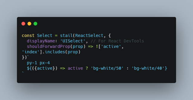
Filter props that passing to dom element or component
By default stail will not pass props that starts from $ sign to dom elements, so if you use components from stail.* or you create your own like stail("div") you are free to use props like $active without need to clear it
const Select = stail(ReactSelect, {
  displayName: 'UISelect', // For React DevTools
  shouldForwardProp(prop) => !['active', 'index'].includes(prop)
})`
  py-1 px-4
  ${({active}) => active ? 'bg-white/50' : 'bg-white/40'}
`
VS Code support using Tailwind CSS IntelliSense plugin
You can enable auto-complete and CSS on hover in your IDE by adding additional config to the settings.json file:
{
  // Stail auto-complete and highlight
  "tailwindCSS.experimental.classRegex": [
    [
      "stail\\.?\\(?\\s*[\\w]+\\s*\\)?`[^\\$`]*\\$\\{\\s*\\([^\\)]*\\)\\s*\\=\\>\\s*\\(?([^\\}]*)\\}",
      "'([^']*)'"
    ],
    "stail\\.?\\(?\\s*[\\w,]+\\s*\\)?`([^`]*)"
  ]
}
Overriding base component at render-time for native dom elements
const MySuperButton = stail.div`
  // ...some classes for your button
`

render(
  <MySuperButton as="a" href="#">
    Now I'm a link
  </MySuperButton>,
)
Tailwind Plugins
Stail provides additional plugins for Tailwind which makes writing complex styles much easier.
Tailwind child plugin
This plugin make it possible to apply style for a direct child component. This can be useful when you are
wrapping component
For example let’s imagine the following css:
.wrapper {
  & > div {
    border-radius: 0;
    border-right: 1px solid rgba(0,0,0,0.1)
    &:last-child {
      border-right-width: 0;
    }
  }
}
This can be converted into:
child-div:rounded-none child-div:border-r child-div:border-black/10 child-div:last:border-r-0
Or in stail
const Wrapper = stail.div`
child-div:rounded-none
child-div:border-r child-div:border-black/10
// Remove border from last element
child-div:last:border-r-0
`
Installation
In your tailwind.config.js file, please add this to your plugins array:
plugins: [
  //... other plugins
  require('stail/plugins').child(),
]
By default plugin enables support for a & > div(child-div:*), & > svg(child-svg:*), & >span(child-span:*)
and wildcard selector & > *(child:*).
You can modify this list by adding tags field into plugin initialization:
plugins: [
  //... other plugins
  require('stail/plugins').child({
    tags: ['svg', 'div', 'span', 'a', 'button'],
  }),
]