PayGreen-UI
A library of reusable React components powered by styled-components.
Installation
PayGreen-UI is available as an npm package.
// with npm
npm install @paygreen/paygreen-ui

// with yarn
yarn add @paygreen/paygreen-ui
Usage
import React from 'react';
import ReactDOM from 'react-dom';
import {
    PGThemeProvider,
    ThemeDefault,
    Card,
    Text,
    Title,
} from '@paygreen/paygreen-ui';

const App = () => (
    <PGThemeProvider theme={ThemeDefault}>
        <Card>
            <Title align="center">
                Hello <strong>World</strong>!
            </Title>

            <Text>
                A simple example of use for the component <strong>Card</strong>.
            </Text>
        </Card>
    </PGThemeProvider>
);

ReactDOM.render(<App />, document.getElementById('root'));
NB: don't forget to pass the PGThemeProvider as the highest component of your application. It will spread the Theme through all its children. Without it, PG-UI components cannot be rendered!
Storybook
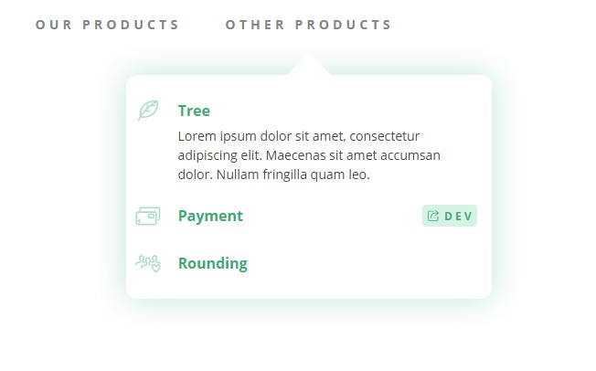
We use Storybook during the development of our components to isolate them and get an organized and efficient display of our library. With Storybook, you can manipulate each component, modify the props it receives and analyze its behavior to fully understand how it works. But you can also take a look at the code to explore further more PayGreen-UI.
You can access the storybook of the latest version of PG-UI at our GitHub Pages.
Development process
To develop a new component for the library, create a sub-directory inside src/lib/ with the following structure:
.
+--_MyComponent
   +--_style
   |  +--_index.js
   +--_MyComponent.js
   +--_MyComponent.stories.js
   +--_MyComponent.test.js
- Files inside the sub-directory
styleis used to contains the definition of a styled-component that will be used to style the main component. - The main file
MyComponent.jsmust contains the definition of the React component with its PropTypes and defaultProps. - The file
MyComponent.stories.jscontains the definition of a story used by Storybook to display an example of use of the component. - The test file contains tests for the component. Tests are performed by Jest.
Deployment
The deployment of PayGreen-UI use the GitHub Actions to work on CI/CD. Each version of the library correspond to a tag pushed on the GitHub repository.
