React SVG Donuts
A ReactJS component for simple (and complex) SVG donuts.
Dependencies
- NodeJS
- NPM / Yarn
- React and ReactDOM
- A ReactJS application
Usage
First install the package
$ npm i react-svg-donuts

# or

$ yarn add react-svg-donuts
Then
import React from 'react';
import { render } from 'react-dom';

import Donut from 'react-svg-donuts';

// The donut will be half filled
const progress = 50;

// The value will be wrapped inside a <strong> tag.
const renderProgress = progress => <strong>{progress}%</strong>;

render(<Donut progress={progress} onRender={renderProgress} />, document.getElementById('demo'));
Props
progress: number (required)- should be between 0 and 100 and represent the amount of the donut that should be filled. Works with negative values too (between -100 and 0).onRender: function (required)- any function which returns a valid React node (either React element or null).prefix: string (optional)- a string which will be used as prefix for all CSS classnames. Defaults todonut.
CSS
There is a predefined stylesheet which can be used as is.
If you want it, just import it:
@import 'react-svg-donuts/dist/index.css';
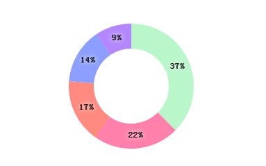
Bonus - Complex Donut
import React from 'react';
import { render } from 'react-dom';

import ComplexDonut from 'react-svg-donuts/complex';

render(
	<ComplexDonut
		size={200}
		radius={80}
		segments={[
			{
				color: '#FF8A80',
				value: 230
			},
			{
				color: '#FF80AB',
				value: 308
			},
			{
				color: '#B9F6CA',
				value: 520
			},
			{
				color: '#B388FF',
				value: 130
			},
			{
				color: '#8C9EFF',
				value: 200
			}
		]}
		thickness={40}
		startAngle={-90}
	/>,
	document.getElementById('demo')
);
Props
size: number (required)- The size of the donut (width and height).radius: number (required)- The radius of the donut.segments: array (required)- An array of donut segments with the following shape:[ { value: 10, color: '#BADA55' }, { value: 20, color: '#CCDDEE' } ];thickness: number (required)- A number for the thickness of the donutstartAngle: number (required)- A degree between -360 and 360className: string (optional)- Well, a custom css class namecircleProps: object(optional)- Your custom svg circle propstextProps: object(optional)- Your custom svg text props
CSS
There is a predefined stylesheet which can be used as is.
If you want it, just import it:
@import 'react-svg-donuts/dist/complex.css';
