react-image-magnify
A responsive React image zoom component for touch and mouse.
Designed for shopping site product detail.
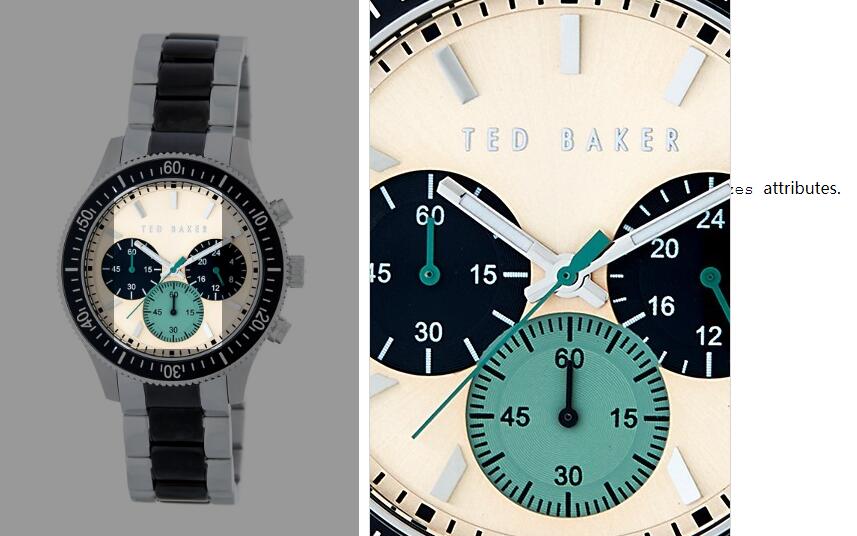
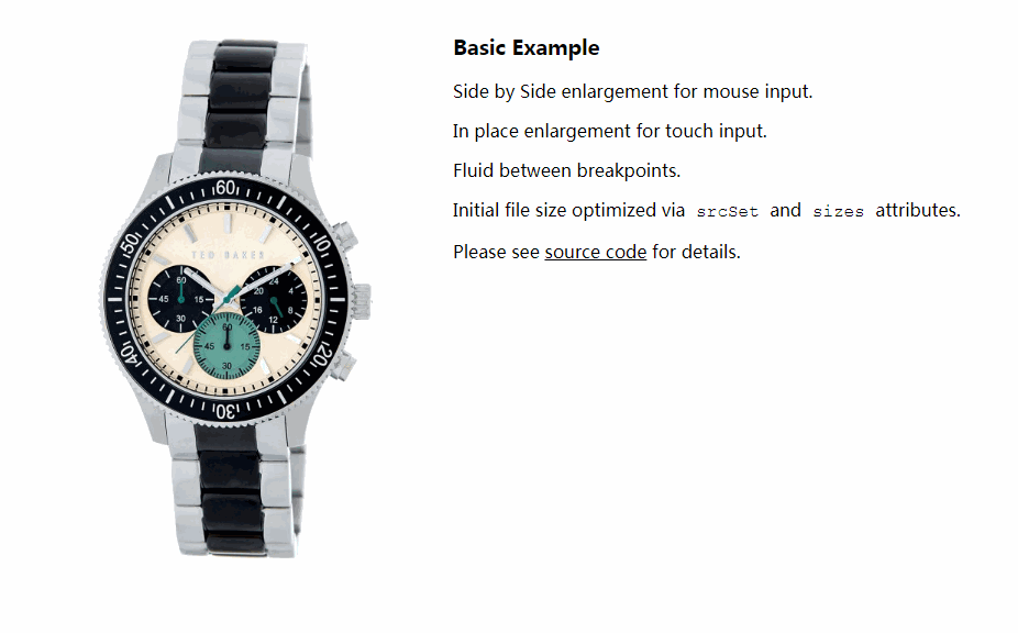
Supports in-place and side-by-side image enlargement.
Supports react-slick carousel.
Features tinted guide lens, interaction hint, hover intent, long-press gesture, and fade transitions.
Demo
Integration with react-slick carousel
Enlarged Image Container Dimensions
Experiment with react-image-magnify live on CodePen.
Use the Change View button to select editing mode or for different layout options.
Use the Fork button to save your changes.
Installation
npm install --save react-image-magnify
Usage
If you are upgrading from v1x to v2x, please see the release notes.
import ReactImageMagnify from 'react-image-magnify';
...
<ReactImageMagnify {...{
    smallImage: {
        alt: 'Wristwatch by Ted Baker London',
        isFluidWidth: true,
        src: watchImg1200,
        srcSet: [
            `${watchImg687} 687w`,
            `${watchImg770} 770w`,
            `${watchImg861} 861w`,
            `${watchImg955} 955w`
        ].join(', '),
        sizes: '(min-width: 480px) 30vw, 80vw'
    },
    largeImage: {
        alt: '',
        src: watchImg1200,
        width: 1200,
        height: 1800
    }
}} />
...
Props API
Desktop and Touch
| Prop | Type | Required | Default | Description |
|---|---|---|---|---|
smallImage |
Object | Yes | Small image information. See Small Image below. | |
largeImage |
Object | Yes | Large image information. See Large Image below. | |
className |
String | No | CSS class applied to root container element. | |
style |
Object | No | Style applied to root container element. | |
fadeDurationInMs |
Number | No | 300 | Milliseconds duration of magnified image fade in/fade out. |
imageClassName |
String | No | CSS class applied to small image element. | |
imageStyle |
Object | No | Style applied to small image element. | |
enlargedImageContainerClassName |
String | No | CSS class applied to enlarged image container element. | |
enlargedImageContainerStyle |
Object | No | Style applied to enlarged image container element. | |
enlargedImageClassName |
String | No | CSS class applied to enlarged image element. | |
enlargedImageStyle |
Object | No | Style applied to enlarged image element. | |
enlargedImageContainerDimensions |
Object | No | {width: '100%', height: '100%'} | Specify enlarged image container dimensions as an object with width and height properties. Values may be expressed as a percentage (e.g. '150%') or a number (e.g. 200). Percentage is based on small image dimension. Number is pixels. Not applied when enlargedImagePosition is set to 'over', the default for touch input. |
enlargedImagePortalId |
String | No | Render enlarged image into an HTML element of your choosing by specifying the target element id. Requires React v16. Ignored for touch input by default - see isEnlargedImagePortalEnabledForTouch. |
|
isEnlargedImagePortalEnabledForTouch |
Boolean | No | false | Specify portal rendering should be honored for touch input. |
hintComponent |
Function | No | (Provided) | Reference to a component class or functional component. A Default is provided. |
shouldHideHintAfterFirstActivation |
Boolean | No | true | Only show hint until the first interaction begins. |
isHintEnabled |
Boolean | No | false | Enable hint feature. |
hintTextMouse |
String | No | Hover to Zoom | Hint text for mouse. |
hintTextTouch |
String | No | Long-Touch to Zoom | Hint text for touch. |
Mouse Specific
| Prop | Type | Required | Default | Description |
|---|---|---|---|---|
hoverDelayInMs |
Number | No | 250 | Milliseconds to delay hover trigger. |
hoverOffDelayInMs |
Number | No | 150 | Milliseconds to delay hover-off trigger. |
lensStyle |
Object | No | Style applied to tinted lens. | |
enlargedImagePosition |
String | No | beside | Enlarged image position. Can be 'beside' or 'over'. |
Touch Specific
| Prop | Type | Required | Default | Description |
|---|---|---|---|---|
isActivatedOnTouch |
Boolean | No | false | Activate magnification immediately on touch. May impact scrolling. |
pressDuration |
Number | No | 500 | Milliseconds to delay long-press activation (long touch). |
pressMoveThreshold |
Number | No | 5 | Pixels of movement allowed during long-press activation. |
enlargedImagePosition |
String | No | over | Enlarged image position. Can be 'beside' or 'over'. |
Small Image
{
    alt: String,
    isFluidWidth: Boolean, (default false)
    src: String, (required)
    srcSet: String,
    sizes: String,
    width: Number, (required if isFluidWidth is not set)
    height: Number, (required if isFluidWidth is not set)
    onLoad: Function,
    onError: Function
}
Large Image
{
    alt: String,
    src: String, (required)
    srcSet: String,
    sizes: String,
    width: Number, (required)
    height: Number, (required)
    onLoad: Function,
    onError: Function
}
Example Project
git clone https://github.com/ethanselzer/react-image-magnify.git
cd react-image-magnify
yarn
yarn run build
cd example
yarn
yarn start
If your default browser does not start automatically, open a new browser window and go to localhost:3000
Development
git clone https://github.com/ethanselzer/react-image-magnify.git
cd react-image-magnify
yarn
npm run #See available commands