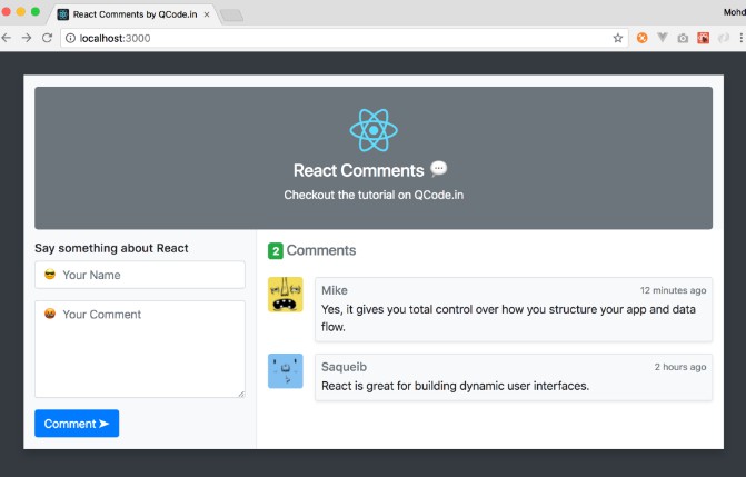
Supabase Comments Extension
Add a robust comment system to your react app in ~10 minutes!
This library provides comments, replies, reactions, mentions, and authentication all out of the box.
Demos
- https://malerba118.github.io/supabase-comments-extension
- https://codesandbox.io/s/supabase-comments-extension-demo-8hg9s?file=/src/App.tsx
Getting Started
First things first, this project is powered by supabase so if you don’t already have a supabase db, head over there and make one (it’s super simple and literally takes a few seconds)
Installation
Install this package and its peer dependencies
npm install --save supabase-comments-extension @supabase/ui @supabase/supabase-js react-query
Running Migrations
Once you’ve got yourself a supabase db, you’ll need to add a few tables and other sql goodies to it with the following command
npx supabase-comments-extension run-migrations <supabase-connection-string>
You can find your connection string on the supabase dashboard: https://app.supabase.io/project/PUT-YOUR-PROJECT-ID-HERE/settings/database
It should look something like this: postgresql://postgres:[email protected]:5432/postgres
Usage With Auth
Then in your app code you can add comments with the following
import { useState } from 'react';
import { createClient } from '@supabase/supabase-js';
import {
  Comments,
  AuthModal,
  CommentsProvider,
} from 'supabase-comments-extension';

const supabase = createClient(SUPABASE_URL, SUPABASE_ANON_KEY);

const App = () => {
  const [modalVisible, setModalVisible] = useState(false);

  return (
    <CommentsProvider
      supabaseClient={supabase}
      onAuthRequested={() => setModalVisible(true)}
    >
      <AuthModal
        visible={modalVisible}
        onAuthenticate={() => setModalVisible(false)}
        onClose={() => setModalVisible(false)}
	providers={['google', 'facebook']}
      />
      <Comments topic="tutorial-one" />
    </CommentsProvider>
  );
};
Note that supabase supports social auth with dozens of providers out-of-the-box so you can sign in with Google, Facebook, Twitter, Github and many more.
supabase-comments-extension exports two auth components, Auth and AuthModal. The Auth component is a small adaptation of @supabase/ui’s Auth component and supports all of the same props. AuthModal also supports all of the same props as the Auth component along with a few additional props.
Lastly, if you want to write your own authentication ui, then know that the supbase client provides a method supabase.auth.signIn which can authenticate the supabase client without forcing any ui on you.
import { createClient } from '@supabase/supabase-js';

const supabase = createClient(SUPABASE_URL, SUPABASE_ANON_KEY);

// Social Auth
const { user, error } = await supabase.auth.signIn({
  provider: 'facebook',
})

// Email/Password Auth
const { user, error } = await supabase.auth.signIn({
  email: '[email protected]',
  password: 'example-password',
})
Usage Without Auth
If you already have an app set up with supabase authentication,
then you can skip the AuthModal and direct the user to your
existing sign-in system.
import { useState } from 'react';
import { createClient } from '@supabase/supabase-js';
import { Comments, CommentsProvider } from 'supabase-comments-extension';

const supabase = createClient(SUPABASE_URL, SUPABASE_ANON_KEY);

const App = () => {
  return (
    <CommentsProvider
      supabaseClient={supabase}
      onAuthRequested={() => {
        window.location.href = '/sign-in';
      }}
    >
      <Comments topic="tutorial-one" />
    </CommentsProvider>
  );
};
Advanced Features
supabase-comments-extension includes a handful of customization options to meet your app’s needs
Bring Your Own Reactions
You can add your own reactions by adding rows to the sce_reactions table.
It’s easy to add rows via the supabase dashboard or if you prefer you can write some sql to insert new rows.
insert into sce_reactions(type, label, url) values ('heart', 'Heart', 'https://emojis.slackmojis.com/emojis/images/1596061862/9845/meow_heart.png?1596061862');
insert into sce_reactions(type, label, url) values ('like', 'Like', 'https://emojis.slackmojis.com/emojis/images/1588108689/8789/fb-like.png?1588108689');
insert into sce_reactions(type, label, url) values ('party-blob', 'Party Blob', 'https://emojis.slackmojis.com/emojis/images/1547582922/5197/party_blob.gif?1547582922');
Custom Reaction Rendering
If you want to customize the way comment reactions are rendered then you’re in luck!
You can pass your own CommentReactions component to control exactly how reactions are rendered beneath each comment.
import { useState } from 'react';
import { createClient } from '@supabase/supabase-js';
import { Button } from '@supabase/ui';
import {
  Comments,
  CommentsProvider,
  CommentReactionsProps,
} from 'supabase-comments-extension';

const supabase = createClient(SUPABASE_URL, SUPABASE_ANON_KEY);

const CustomCommentReactions: FC<CommentReactionsProps> = ({
  activeReactions,
  toggleReaction,
}) => {
  return (
    <Button className="!py-0.5" onClick={() => toggleReaction('like')}>
      {activeReactions.has('like') ? 'unlike' : 'like'}
    </Button>
  );
};

const App = () => {
  return (
    <CommentsProvider
      supabaseClient={supabase}
      components={{
        CommentReactions: CustomCommentReactions,
      }}
    >
      <Comments topic="custom-reactions" />
    </CommentsProvider>
  );
};
The above code will render the following ui
Handling Mentions
This library includes support for mentions, however mentions are fairly useless without a way to notify the users who are mentioned. You can listen to mentions via postgres triggers and perform some action in response such as insert into a notifications table or send an http request to a custom endpoint.
CREATE OR REPLACE FUNCTION notify_mentioned_users()
  RETURNS trigger AS
$$
DECLARE
  mentioned_user_id uuid;
BEGIN
  FOREACH mentioned_user_id IN ARRAY NEW.mentioned_user_ids LOOP
	  INSERT INTO your_notifications_table (actor, action, receiver) VALUES(NEW.user_id, 'mention', mentioned_user_id);
  END LOOP;
RETURN NEW;
END;
$$
LANGUAGE 'plpgsql';

CREATE TRIGGER comment_insert_trigger
  AFTER INSERT
  ON sce_comments
  FOR EACH ROW
  EXECUTE PROCEDURE notify_mentioned_users();
If you don’t care about mentions, then you can disable them via the CommentsProvider
<CommentsProvider supabaseClient={supabase} enableMentions={false}>
  <Comments topic="mentions-disabled" />
</CommentsProvider>
API
Here’s the prop options for primary components you’ll be working with
interface CommentsProviderProps {
  queryClient?: QueryClient;
  supabaseClient: SupabaseClient;
  onAuthRequested?: () => void;
  onUserClick?: (user: DisplayUser) => void;
  mode?: 'light' | 'dark';
  accentColor?: string;
  onError?: (error: ApiError, query: Query) => void;
  components?: {
    CommentReactions?: ComponentType<{
      activeReactions: Set<string>;
      reactionsMetadata: api.CommentReactionMetadata[];
      toggleReaction: (reactionType: string) => void;
    }>;
  };
  enableMentions?: boolean;
}

interface CommentsProps {
  topic: string;
}

interface AuthModalProps extends AuthProps {
  visible: boolean;
  onClose?: () => void;
  onAuthenticate?: (session: Session) => void;
  title?: string;
  description?: string;
}

// This comes from @supabase/ui (https://ui.supabase.io/components/auth)
// supabase-comments-extension provides an adapted version of supabase ui's
// Auth component with support for display names/avatars
interface AuthProps {
  supabaseClient: SupabaseClient
  className?: string
  children?: React.ReactNode
  style?: React.CSSProperties
  socialLayout?: 'horizontal' | 'vertical'
  socialColors?: boolean
  socialButtonSize?: 'tiny' | 'small' | 'medium' | 'large' | 'xlarge'
  providers?: Provider[]
  verticalSocialLayout?: any
  view?: ViewType
  redirectTo?: RedirectTo
  onlyThirdPartyProviders?: boolean
  magicLink?: boolean
}


