react-big-scheduler
A scheduler and resource planning component built for React and made for modern browsers (IE10+), IE needs babel-polyfill.
Use and Setup
npm install react-big-scheduler --save
//1. import
import Scheduler, {SchedulerData, ViewTypes, DATE_FORMAT} from 'react-big-scheduler'
//include `react-big-scheduler/lib/css/style.css` for styles, link it in html or import it here
import 'react-big-scheduler/lib/css/style.css'
import moment from 'moment'
...

//2. create the view model, put it in the props obj
let schedulerData = new SchedulerData(new moment().format(DATE_FORMAT), ViewTypes.Week);
//set locale moment to the schedulerData, if your locale isn't English. By default, Scheduler comes with English(en, United States).
moment.locale('zh-cn');
schedulerData.setLocaleMoment(moment);
//set resources here or later
let resources = [
                    {
                       id: 'r1',
                       name: 'Resource1'
                    },
                    {
                       id: 'r2',
                       name: 'Resource2'
                    },
                    {
                       id: 'r3',
                       name: 'Resource3'
                    }
                ];
schedulerData.setResources(resources);
//set events here or later,
//the event array should be sorted in ascending order by event.start property, otherwise there will be some rendering errors
let events = [
                {
                     id: 1,
                     start: '2017-12-18 09:30:00',
                     end: '2017-12-19 23:30:00',
                     resourceId: 'r1',
                     title: 'I am finished',
                     bgColor: '#D9D9D9'
                 },
                 {
                     id: 2,
                     start: '2017-12-18 12:30:00',
                     end: '2017-12-26 23:30:00',
                     resourceId: 'r2',
                     title: 'I am not resizable',
                     resizable: false
                 },
                 {
                     id: 3,
                     start: '2017-12-19 12:30:00',
                     end: '2017-12-20 23:30:00',
                     resourceId: 'r3',
                     title: 'I am not movable',
                     movable: false
                 },
                 {
                     id: 4,
                     start: '2017-12-19 14:30:00',
                     end: '2017-12-20 23:30:00',
                     resourceId: 'r1',
                     title: 'I am not start-resizable',
                     startResizable: false
                 },
                 {
                     id: 5,
                     start: '2017-12-19 15:30:00',
                     end: '2017-12-20 23:30:00',
                     resourceId: 'r2',
                     title: 'R2 has recurring tasks every week on Tuesday, Friday',
                     rrule: 'FREQ=WEEKLY;DTSTART=20171219T013000Z;BYDAY=TU,FR',
                     bgColor: '#f759ab'
                 }
             ];
schedulerData.setEvents(events);

...

//3. render the scheduler component, mind that the Scheduler component should be placed in a DragDropContext(father or ancestor).
...
const {schedulerData} = this.props;
<Scheduler schedulerData={schedulerData}
           prevClick={this.prevClick}
           nextClick={this.nextClick}
           onSelectDate={this.onSelectDate}
           onViewChange={this.onViewChange}
           eventItemClick={this.eventClicked}
/>
...
Run examples locally
- Clone this repository
- Retrieve dependencies:
npm install - Start:
npm run example - Open http://localhost:8080/example/#/.
API
1.SchedulerData
SchedulerData is the view model of Scheduler, we can modify it to control the view of the Scheduler.
constructor
constructor(date=moment().format(DATE_FORMAT), viewType = ViewTypes.Week,
                showAgenda = false, isEventPerspective = false,
                newConfig = undefined, newBehaviors=undefined
                localeMoment = undefined)
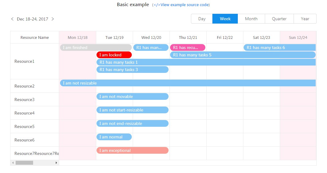
dateis a string inYYYY-MM-DDformat, and is the initial date Scheduler will render. Take the date2017-12-20
for example, Scheduler will render the time window of the week from2017-12-18to2017-12-24inViewTypes.Week
view type, and will render the time window of the2017-12month inViewTypes.Monthview type.viewTypeis the initial view type, now Scheduler supportsDay,Week,Month,Quarter,Year5 built-in view types,
in addition Scheduler now supportsCustom,Custom1,Custom23 custom view types at the same time, in which you can control
the time window yourself, refer to this example.viewType,
showAgendaandisEventPerspectiveare a group which should be contained in the SchedulerData.config.views array,
and they together decide which view should be rendered. WhenshowAgendaandisEventPerspectiveare bothfalse,
Scheduler will render the resource view, refer to this example.showAgendais a bool value, if true, Scheduler will display the agenda view of current view type. Agenda view is
read only.isEventPerspectiveis a bool value, if true, Scheduler will display the task view of current view type. In
resource view, every slot(row) describes how many events a resource does in the time window, while in task view,
every slot describes how many events a big task is divided into and who will make it done. Add agroupIdand
groupNameproperty to every event object, so that the events having the samegroupIdwill belong to the same big task and
be rendered in the same slot in task view. IfgroupIdandgroupNameare not provided, SchedulerData will take
theidas thegroupId, and take thetitleas thegroupName. See theeventsForTaskViewin the
DemoData.js for details.newConfigis a config object, used to override the default config
fully or partly.newBehaviorsis a config object, used to override the default behaviors
fully or partly.localeMomentis a locale moment object, which is unified used in react-big-scheduler. If not provided, Scheduler will come
with English(en, United States) locale strings.
setLocaleMoment
setLocaleMoment(localeMoment)
Used to set locale moment to the schedulerData, if your locale isn't English. By default, Scheduler comes with English(en, United States)
setResources
setResources(resources)
Used to set the resources(the slots in resource view), make sure that there are no duplicated resource.id in the resources.
See the demo resources in the DemoData.js.
setEvents
setEvents(events)
Used to set the events. the event array should be sorted in ascending order by event.start property.
See the demo events in the DemoData.js.
If we use the task view, we'd better add the groupId and the groupName property to each event object, see the
eventsForTaskView in the DemoData.js for details.
prev
prev()
Let the time window scroll to the left once. When SchedulerData,viewType is ViewTypes.Month, the time window will
scroll a month, when SchedulerData,viewType is ViewTypes.Week, the time window will scroll a week. SchedulerData.events
will be clear after calling this method.
next
next()
Let the time window scroll to the right once. SchedulerData.events will be clear after calling this method.
setDate
setDate(date=moment().format(DATE_FORMAT))
Let the time window jump to the provided date directly. SchedulerData.events will be clear after calling this method.
setViewType
setViewType(viewType = ViewTypes.Week, showAgenda = false, isEventPerspective = false)
Tell SchedulerData to change current view, the viewType, showAgenda and isEventPerspective group should be
provided, and should be contained in the SchedulerData.config.views array. SchedulerData.events will be clear
after calling this method.
setEventGroups
setEventGroups(eventGroups)
Used to set the event groups(the slots in task view), make sure that there are no duplicated eventGroup.id in the eventGroups.
This method is optional, and is needed only when SchedulerData.eventGroupsAutoGenerated is false.
setEventGroupsAutoGenerated
setEventGroupsAutoGenerated(autoGenerated)
Tell SchedulerData to generate SchedulerData.eventGroups automatically or not. If true, SchedulerData will generate the event
groups(slots) automatically according to the event.groupId and 'event.groupName' automatically. If groupId and 'groupName' are
not provided, SchedulerData will take event.id and event.title instead.
setMinuteStep
setMinuteStep(minuteStep)
Used to set minute step for daily view and refresh the render data.
getMinuteStepsInHour
getMinuteStepsInHour()
Used to get minute steps in an hour, it equals 60 / SchedulerData.config.minuteStep.
addResource
addResource(resource)
Add the resource to the SchedulerData.resources, make sure that resource.id is not duplicated. Refer
to this example.
addEventGroup
addEventGroup(eventGroup)
Add the eventGroup to the SchedulerData.eventGroups, make sure that eventGroup.id is not duplicated. Please note
that the eventGroup added may be override when SchedulerData.eventGroupsAutoGenerated is true and
SchedulerData.eventGroups is auto-generated.
addEvent
addEvent(newEvent)
Add the newEvent to the SchedulerData.events, make sure that newEvent.id is not duplicated. SchedulerData will
place the newEvent in the right index according to the newEvent.start property.
updateEventStart
updateEventStart(event, newStart)
Update the newStart to the event.start, newStart is a string in YYYY-MM-DD HH:mm:ss format(similarly hereinafter).
SchedulerData will replace the event in the right index according to the newStart value.
updateEventEnd
updateEventEnd(event, newEnd)
Update the newEnd to the event.end.
moveEvent
moveEvent(event, newSlotId, newSlotName, newStart, newEnd)
Update the newSlotId, newSlotName, newStart, newEnd of the event. In resource view, new slot is a resource,
while in task view, new slot is a event group. SchedulerData will replace the event in the right index according
to the newStart value.
getSlots
getSlots()
Returns the slot array, SchedulerData.resources in resource view, SchedulerData.eventGroups in task view.
getSlotById
getSlotById(slotId)
Returns the slot by slotId, returns undefined if not found.
getResourceById
getResourceById(resourceId)
Returns the resource by resourceId, returns undefined if not found.
isEventInTimeWindow
isEventInTimeWindow(eventStart, eventEnd, windowStart, windowEnd)
Returns whether an event is in the time window or not, remind that eventStart, eventEnd, windowStart, windowEnd
are all moment objects.
2.Locale support(Refer to this example for details.)
SchedulerData.config.resourceName
The locale string of resource name.
SchedulerData.config.taskName
The locale string of task name.
SchedulerData.config.agendaViewHeader
The locale string of agenda view header.
SchedulerData.config.addMorePopoverHeaderFormat
The locale string of add more popover header format.
SchedulerData.config.eventItemPopoverDateFormat
The locale string of event item popover date format.
SchedulerData.config.nonAgendaDayCellHeaderFormat
The locale string of non-agenda view cell header format of day view type.
SchedulerData.config.nonAgendaOtherCellHeaderFormat
The locale string of non-agenda view cell header format of other view types.
SchedulerData.behaviors.getDateLabelFunc
Used to resolve the locale string of date label of Scheduler component.(Refer to the getDateLabel func for example)
3.SchedulerData.config(See the config.js for details.)
schedulerWidth
The width of Scheduler.
schedulerMaxHeight
The max height of Scheduler. If the desired height is bigger than the max height, the header row of Scheduler will be
frozen and vertical scroll bar will appear, but this won't happen when the max height is set to 0. Refer
to this example.
tableHeaderHeight
Height of Scheduler table header.
agendaResourceTableWidth
Width of the left Scheduler resource column in agenda view.
agendaMaxEventWidth
Max width of an event item in agenda view.
dayResourceTableWidth, weekResourceTableWidth, monthResourceTableWidth, yearResourceTableWidth, quarterResourceTableWidth
Width of the left Scheduler resource column in resource view and task view of different view types.
dayCellWidth, weekCellWidth, monthCellWidth, yearCellWidth, quarterCellWidth
Width of Scheduler table cells in resource view and task view of different view types.
dayMaxEvents, weekMaxEvents, monthMaxEvents, yearMaxEvents, quarterMaxEvents
Max events count of a cell in resource view and task view of different view types. A '+N more' will appear when exceeded.
Refer to this example.
eventItemHeight
Height of an event item in 3 views.
eventItemLineHeight
Line height of an event item in 3 views.
nonAgendaSlotMinHeight
Min height of a slot in non-agenda views, default 0, means there is no min height.
dayStartFrom
Start hour rendered from in ViewTypes.Day in resource view and task view, default 0.
dayStopTo
End hour rendered to in ViewTypes.Day in resource view and task view, default 23.
defaultEventBgColor
Default event item background color in 3 views, will be override if there is a bgColor property in event object.
selectedAreaColor
Selected cells color in resource view and task view, cells are selectable only when creatable is true.
nonWorkingTimeHeadColor
Color of non-working time head cells. Modify SchedulerData.behaviors.isNonWorkingTimeFunc to re-define non-working time.
Refer the isNonWorkingTime func in the behaviors.js.
nonWorkingTimeHeadBgColor
Background color of non-working time head cells.
nonWorkingTimeBodyBgColor
Background color of non-working time body cells.
summaryColor
Color of cell summary. Modify SchedulerData.behaviors.getSummaryFunc to display summary in a cell.
Refer the getSummary func in the behaviors.js.
summaryPos
Position of cell summary, supports SummaryPos.Top, SummaryPos.TopRight, SummaryPos.TopLeft, SummaryPos.Bottom,
SummaryPos.BottomRight and SummaryPos.BottomLeft.
startResizable
Controls whether to resize the start of every event item in resource view and task view. If false, all item starts are
non-resizable, if true, all item starts are resizable except those who have a resizable or startResizable
property and its value is false.
endResizable
Controls whether to resize the end of every event item in resource view and task view. If false, all item ends are
non-resizable, if true, all item ends are resizable except those who have a resizable or endResizable
property and its value is false.
movable
Controls whether to move every event item in resource view and task view. If false, all items are
non-movable, if true, all items are movable except those who have a movable property and its value is false.
creatable
Controls whether to create new event item in resource view and task view.
crossResourceMove
Controls whether to cross-slot move an event item in resource view and task view. If false, the slotId and slotName
won't change in the moveEvent method. Refer to this example.
checkConflict
Controls whether to check conflicts when creating, resizing or moving an event item in resource view and task view. If
true, Scheduler will call the conflictOccurred function if given. Refer to
this example.
scrollToTodayEnabled
Controls Scheduler whether to scroll to today automatically when the time window contains today. If true, Scheduler
horizontal bar will scroll to today after calling setScrollToToday(true) to SchedulerData.
eventItemPopoverEnabled
Controls Scheduler whether to display event item popover when moving mouse on an event item, default true.
calendarPopoverEnabled
Controls Scheduler whether to display calendar popover when clicking on a date label in header, default true.
recurringEventsEnabled
Controls Scheduler whether to support recurring event, refer to this feature request, default true.
If true, SchedulerData will filter out those template events who has a rrule string property in setEvents method,
generate the recurring events in the time window, and insert them into the event array in the right orders. The recurring events
generated from the same template event, all have a new id like ${templateEvent.id}-${number}, and have a recurringEventId
property with the value templateEvent.id.
headerEnabled
Controls Scheduler whether to display header, default true.
displayWeekend
Controls Scheduler whether to display weekends in non-agenda view, default true.
relativeMove
Controls Scheduler whether to move events(only DnDTypes.EVENT type) relatively or absolutely, default true, means relatively.
minuteStep
Minute step for day view type in non-agenda view, can be 10, 12, 15, 20, 30, 60, etc, default 30.
views
Array of view that Scheduler will support.
4.SchedulerData.behaviors(See the behaviors.js for details.)
getEventTextFunc
getEventTextFunc(schedulerData, event)
Method that defines the text displayed in the event.
isNonWorkingTimeFunc
isNonWorkingTimeFunc(schedulerData, time)
Method that defines non-working time.
getSummaryFunc
getSummary(schedulerData, headerEvents, slotId, slotName, headerStart, headerEnd)
Method that defines the summary text displayed in the Scheduler cells.Refer
to this example.
5.Scheduler.propTypes
schedulerData
schedulerData: PropTypes.object.isRequired
View model of the Scheduler component, provides data.
prevClick
prevClick: PropTypes.func.isRequired
prevClick(schedulerData)
Callback function fired when the left point bracket '<' is clicked.
nextClick
nextClick: PropTypes.func.isRequired
nextClick(schedulerData)
Callback function fired when the right point bracket '>' is clicked.
onViewChange
onViewChange: PropTypes.func.isRequired
onViewChange(schedulerData, view)
Callback function fired when the Scheduler view changed. view is a json such as { viewType: ViewTypes.Month,
showAgenda: true, isEventPerspective: false}.
onSelectDate
onSelectDate: PropTypes.func.isRequired
onSelectDate(schedulerData, date)
Callback function fired when a new date is selected. date is the new selected data, a string in YYYY-MM-DD format.
eventItemClick
eventItemClick: PropTypes.func
eventItemClick(schedulerData, event)
Callback function fired when you click an event item.
updateEventStart
updateEventStart: PropTypes.func
updateEventStart(schedulerData, event, newStart)
Callback function fired when resizing the start of the event, newStart is a string in YYYY-MM-DD HH:mm:ss format.
updateEventEnd
updateEventEnd: PropTypes.func
updateEventEnd(schedulerData, event, newEnd)
Callback function fired when resizing the end of the event, newEnd is a string in YYYY-MM-DD HH:mm:ss format.
moveEvent
moveEvent: PropTypes.func
moveEvent((schedulerData, event, slotId, slotName, newStart, newEnd))
Callback function fired when moving the event. slotId, slotName are the new id and name of the slot moving into,
but they won't change if the SchedulerData.config.crossResourceMove is false. newStart, newEnd are the new beginning
and ending of the event.
newEvent
newEvent: PropTypes.func
newEvent(schedulerData, slotId, slotName, start, end, type, item)
Callback function fired when creating a new event, or dragging an external item and dropping it into the resource view or task
view. slotId and slotName are the slot creating in or dropping into, start, end are the beginning and ending of the
event. If it's a drag&drop operation, the type is the DnDType of DnDSource registered to Scheduler, and the item is the
external item.
leftCustomHeader, rightCustomHeader
leftCustomHeader: PropTypes.object
rightCustomHeader: PropTypes.object
Component you need to put in the Scheduler header, it could be a div or a react component. Refer
to this example.
conflictOccurred
conflictOccurred: PropTypes.func
Callback function fired when there is a conflict. This could happen when creating, resizing or moving an event, and when
SchedulerData.config.checkConflict is true.
eventItemTemplateResolver
eventItemTemplateResolver: PropTypes.func
eventItemTemplateResolver(schedulerData, event, bgColor, isStart, isEnd, mustAddCssClass, mustBeHeight, agendaMaxEventWidth)
Use this function, you can customize the event style. Refer to this example.
slotItemTemplateResolver
slotItemTemplateResolver: PropTypes.func
slotItemTemplateResolver(schedulerData, slot, slotClickedFunc, width, clsName)
Use this function, you can customize the left slot style.
nonAgendaCellHeaderTemplateResolver
nonAgendaCellHeaderTemplateResolver: PropTypes.func
nonAgendaCellHeaderTemplateResolver(schedulerData, item, formattedDateItems, style)
Use this function, you can customize the table header cell style. Refer to this example.
onScrollLeft, onScrollRight
onScrollLeft: PropTypes.func
onScrollLeft(schedulerData, schedulerContent, maxScrollLeft)
onScrollRight: PropTypes.func
onScrollRight(schedulerData, schedulerContent, maxScrollLeft)
Callback function fired when the scheduler content div scrolls to leftmost or rightmost. Refer to this example.
onScrollTop, onScrollBottom
onScrollTop: PropTypes.func
onScrollTop(schedulerData, schedulerContent, maxScrollTop)
onScrollBottom: PropTypes.func
onScrollBottom(schedulerData, schedulerContent, maxScrollTop)
Callback function fired when the scheduler content div scrolls to topmost or bottommost. Refer to this example.
slotClickedFunc
slotClickedFunc: PropTypes.func
If it's set, slots will be clickable, and will fire this function when a slot is clicked. Refer
to this example.
dndSources
dndSources: PropTypes.array
DnDSource array that registered to Scheduler. Use DnDSource,
we can simplify the drag and drop coding in React-Big-Scheduler. Refer
to this example.
onSetAddMoreState
onSetAddMoreState: PropTypes.func
onSetAddMoreState(newState)
Callback function fired when a '+N more' is clicked, is used to control the visibility and the position of the AddMorePopover.
newState is a json such as {headerItem: headerItem, left: 20, top: 20, height: 100}. Refer
to this example.
subtitleGetter
subtitleGetter: PropTypes.func
subtitleGetter(schedulerData, event)
Use this function, you can display a subtitle in the EventItemPopover.
viewEventClick
viewEventClick: PropTypes.func
viewEventClick(schedulerData, event)
Callback function fired when you click one operation link in the EventItemPopover. The operation link won't appear if this
function isn't set.
viewEventText
viewEventText: PropTypes.string
Text of one operation link in the EventItemPopover. The operation link won't appear if this text isn't set.
viewEvent2Click
viewEvent2Click: PropTypes.func
viewEvent2Click(schedulerData, event)
Callback function fired when you click the other operation link in the EventItemPopover. The other operation link won't
appear if this function isn't set.
viewEvent2Text
viewEvent2Text: PropTypes.string
Text of the other operation link in the EventItemPopover. The other operation link won't appear if this text isn't set.
