react-responsive-audio-player
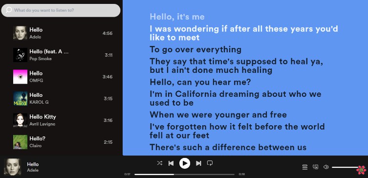
A simple, clean, and responsive visual wrapper for the HTML audio tag, built with React. Give it a playlist and go.

Usage
HTML:
<!DOCTYPE html>
<html>
  <head><link rel="stylesheet" href="audioplayer.css"></head>
  <body>
    <div id="audio_player_container"></div>
    <script src="dist/main.js"></script>
  </body>
</html>
JavaScript (with JSX):
// dist/main.js
var React = require('react');
var ReactDOM = require('react-dom');
var AudioPlayer = require('react-responsive-audio-player');

var playlist =
  [{ url: 'audio/track1.mp3',
     title: 'Track 1 by Some Artist' },
   { url: 'audio/track2.mp3',
     title: 'Some Other Artist - Track 2' }];
ReactDOM.render(
  <AudioPlayer playlist={playlist} />,
  document.getElementById('audio_player_container')
);
JavaScript (without JSX):
// dist/main.js
...
ReactDOM.render(
  React.createElement(AudioPlayer, { playlist: playlist }),
  document.getElementById('audio_player_container')
);
Getting started
Quick start
The fastest way to get off the ground with this module is to paste the following code into an HTML file and open it in a web browser:
<!DOCTYPE html>
<html>
  <head>
    <meta charset="utf-8" />
    <meta name="viewport" content="width=device-width,initial-scale=1">
    <title>React Responsive Audio Player</title>
    <style> html, body { margin: 0; background: lightseagreen; } </style>
    <link rel="stylesheet" href="https://unpkg.com/[email protected]/dist/audioplayer.css">
  </head>
  <body>
    <div id="audio_player_container"></div>

    <script src="https://unpkg.com/react@16/umd/react.development.js"></script>
    <script src="https://unpkg.com/react-dom@16/umd/react-dom.development.js"></script>
    <script src="https://unpkg.com/prop-types/prop-types.js"></script>
    <script src="https://unpkg.com/[email protected]/dist/audioplayer.js"></script>
    <script>
      var playlist =
        [{ url: 'song1.mp3', title: 'Track 1 - a track to remember' },
         { url: 'song2.ogg', title: 'Oggs Oggs Oggs' }];
      ReactDOM.render(
        React.createElement(AudioPlayer, {
          playlist: playlist,
          autoplay: true,
          autoplayDelayInSeconds: 2.1,
          style: { position: 'fixed', bottom: 0 },
          controls: ['playpause', 'forwardskip', 'progressdisplay']
        }),
        document.getElementById('audio_player_container')
      );
    </script>
  </body>
</html>
Of course you'll need to include paths to actual audio files, or the player will display and not work.
Package installation
it's recommended that you install the package and its dependencies in your project:
npm install --save react-responsive-audio-player react react-dom
While react-dom isn't technically a peer dependency, you'll need it if you plan to place the audio player in the DOM, which you probably will.
When you first include the component in your project it might not look how you're expecting. Be sure to check the Styling section below.
Options
Options can be passed to the AudioPlayer element as props. Currently supported props are:
-
playlist(required): an array containing data about the tracks which will be played. undefined by default. Each track object can contain the following properties:url(required): A string containing the address of the audio file to playtitle: The title of the track - corresponds to theMediaMetadata.titlepropertyartist: The track's artist - corresponds to theMediaMetadata.artistpropertyalbum: The album the track belongs to - corresponds to theMediaMetadata.albumpropertyartwork: The artwork for the track - corresponds to theMediaMetadata.artworkpropertymeta: An object containing any other track-specific information you want to store
-
controls: an array of keyword strings which correspond to available audio control components. The order of keywords translates to the order of rendered controls. The default array is:['spacer', 'backskip', 'playpause', 'forwardskip', 'spacer', 'progress']. The possible keyword values are:'playpause'(play/pause toggle button)'backskip'(previous track skip button)'forwardskip'(next track skip button)'progress'(a drag-to-seek audio progress bar)'progressdisplay'(a read-only [non-draggable] progress bar)'spacer'(a transparent space-filling element whose default width is10px, although the style of the.spacerclass can be overridden)
-
autoplay: a boolean value (true/false) that if true will cause the player to begin automatically once mounted. false by default. -
autoplayDelayInSeconds: a number value that represents the number of seconds to wait until beginning autoplay. Will be ignored ifautoplayis false. 0 by default. NOTE: Delay is managed bysetTimeoutand is therefore inexact. If you need to time an autoplay exactly, find a different module that uses the WebAudio API for playback (or fork this one!). -
gapLengthInSeconds: a number value that represents the number of seconds to wait at the end of a track before beginning the next one in the playlist. Not applicable for manually-initiated skip. 0 by default. NOTE: LikeautoplayDelayInSeconds, this delay is inexact. -
cycle: a boolean value that if true continues playing from the beginning after the playlist has completed. true by default. -
stayOnBackSkipThreshold: a number value that represents the number of seconds of progress after which pressing the back button will simply restart the current track. 5 by default. -
supportedMediaSessionActions: an array of Media Session API action names. This determines which system audio controls should be available on platforms supporting the Media Session API. It is not the same as thecontrolsarray. The default array is:['play', 'pause', 'previoustrack', 'nexttrack']. The possible values are:'play'(ignored at present since systems should provide a default implementation regardless)'pause'(ignored at present, for same reason as'play')'seekbackward''seekforward''previoustrack''nexttrack'
-
mediaSessionSeekLengthInSeconds: a number value representing the number of seconds forward or backward to seek when handling the Media Session APIseekbackwardandseekforwardactions. 10 by default. -
getDisplayText: a function which takes a track object and returns a string used to represent that track in the UI. By default, the track will be displayed as "[artist] - [title]". -
style: a React style object which is applied to the outermost div in the component. undefined by default. -
onMediaEvent: An object where the keys are media event types and the values are callback functions. undefined by default. -
audioElementRef: A callback function called after the component mounts and before it unmounts. Similar to React ref callback prop but its only parameter is the internally-referenced HTML audio element, not the component itself. undefined by default. NOTE: This ref should not be used for audio element event listeners; useonMediaEvent.
None of these options are required, though the player will be functionally disabled if no playlist prop is provided.
Deprecated options
These will be removed in v2.0! Please migrate away.
-
hideBackSkip: a boolean value that if true disables the back skip button by hiding it from view. false by default. Use thecontrolsprop instead. -
hideForwardSkip: a boolean value that if true disables the forward skip button by hiding it from view. false by default. Use thecontrolsprop instead. -
disableSeek: a boolean value that if true prevents seeking. false by default. Use thecontrolsprop instead. -
displayTexton the track object forplaylist: a string value that determines the UI display name for a track. Instead, usetitleandartistto provide information on a track object, and use thegetDisplayTextfunction prop for custom display if needed.
Styling
In order to use the default stylings you'll need to grab the compiled audioplayer.css sheet from the module's dist/ directory. Again, if you're not using npm, you can get the sheet here.
It's easy to override the default styles with CSS. Alternatively, for styles which only affect the outer element, you can use React inline styles.
For example, if you want your audio player to take the full screen width, do the following:
- Include the following code in your own CSS:
html, body { margin: 0; } - Give your audio player fixed position styling, e.g.
<AudioPlayer style={{ position: 'fixed', bottom: 0 }} />
Usage with SASS
If you preprocess your styles with Sass, you can have more powerful control via Sass variables. The defaults are located at the top of src/index.scss:
$audio_player_base_height: 50px !default;
$audio_player_base_bg_color: #333 !default;
$audio_player_base_text_color: #fff !default;
// ...etc
The !default flag means you can override these variable definitions before the styles are included.
// Include var overrides before default styles import
$audio_player_base_bg_color: firebrick;

// Using webpack css/sass module import syntax
@import '~react-responsive-audio-player/src/index';

// include other overrides afterward
.audio_player {
  width: 600px;
}


