Simple React Light-box (SRL)
A simple but functional light-box for React.
Install
npm install --save simple-react-lightbox
or with Yarn
yarn add simple-react-lightbox
Demo
I have provided a full working demo on CodeSandbox where you can also play with the options and see the light-box in action.

I have also created a full working website where you can see the light-box in action. If you want to play with the options, use the CodeSandbox link above.
How to use
Instructions
First of all you need to wrap your React app with the main component so that it can create the context. The example below will allow you to use the Simple React Lightbox wherever you need it in your app:
import React from "react";
import MyComponent from "./components/MyComponent";
// Import Simple React Lightbox
import SimpleReactLightbox from "simple-react-lightbox";

function App() {
  return (
    <div className="App">
      // Wrap your app with the component
      <SimpleReactLightbox>
        <MyComponent /> // Your App logic
      </SimpleReactLightbox>
    </div>
  );
}

export default App;
Note: if you need multiple instance of the light-box in one page you should wrap each one in it's own <SimpleReactLightbox> component.
Next you want to import and use the <SRLWrapper> component wherever you expect the content with the images on which you want to add the light-box functionality. Please note the {} as this is a named export. The caption for the images will be generated from the image "alt" attribute so don't forget to add it.
// Import SRLWrapper
import { SRLWrapper } from "simple-react-lightbox";

function MyComponent() {
  return (
    <div className="MyComponent">
      <SRLWrapper>
        // This will be your content with the images. It can be anything. Content defined by yourself, content fetched from an API, data from a graphQL query... anything :)
      </SRLWrapper>
    </div>
  );
}

export default MyComponent;
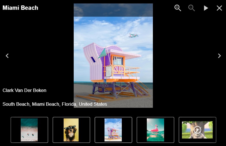
That's it ? As we are not passing any options you should have a working light-box with the default options like the image below:

The light-box with the default options
Custom gallery
If you want to use the light-box in a more traditional way, like if you want to create a gallery in which thumbnails are wrapped in a link that links to a full width image, now you can. Check the "Gallery with links" example page on the CodeSandbox demo.
Simply wrap your images (ideally the thumbnails) in a link with the data-attribute="SRL". As usual, the alt attribute for the images will be used as caption if declared.
import React from "react";
// Import SRLWrapper
import { SRLWrapper } from "simple-react-lightbox";

function MyComponent() {
  return (
    <div className="MyComponent">
      <SRLWrapper>
        <a href="link/to/the/full/width/image.jpg" data-attribute="SRL">
          <img src="src/for/the/thumbnail/image.jpg" alt="Umbrella" />
        </a>
        <a href="link/to/the/full/width/image_two.jpg" data-attribute="SRL">
          <img src="src/for/the/thumbnail/image_two.jpg" alt="Whatever" />
        </a>
      </SRLWrapper>
    </div>
  );
}

export default MyComponent;
Declaring images in an array
This approach is approach is definitely supported although is discouraged. Please see the reason why Simple React Lightbox is different by reading the section above to learn more.
import React from "react";
// Import SRLWrapper
import { SRLWrapper } from "simple-react-lightbox";

const images = [
  {
    src: 'https://www.simple-react-lightbox.dev/docs/gallery/unsplash18.jpg',
    thumbnail:
      'https://www.simple-react-lightbox.dev/docs/gallery/thumbnails/unsplash18.jpg',
    caption: 'Lorem ipsum dolor sit amet',
    width: 1920,
    height: 'auto'
  },
  {
    src: 'https://www.simple-react-lightbox.dev/docs/gallery/unsplash19.jpg',
    thumbnail:
      'https://www.simple-react-lightbox.dev/docs/gallery/thumbnails/unsplash19.jpg',
    caption: 'Consecutur adiscip elit',
    width: 2000,
    height: 'auto'
  },
]

function MyComponent() {
  return (
    <div className="MyComponent">
      <SRLWrapper images={images}>
    </div>
  );
}

export default MyComponent;
Options
I know what you are thinking.
"That's cool and all but the style of the light-box doesn't match the one of my project. That's ok though. I will use your classes and override everything with my custom styles..."
⚠️ WAIT! ⚠️ Despite the fact that I have made sure to define class names for each part of the light-box, I have provided all the options that you need to customize the light-box so that you don't have to add any additional logic. You can customize everything!
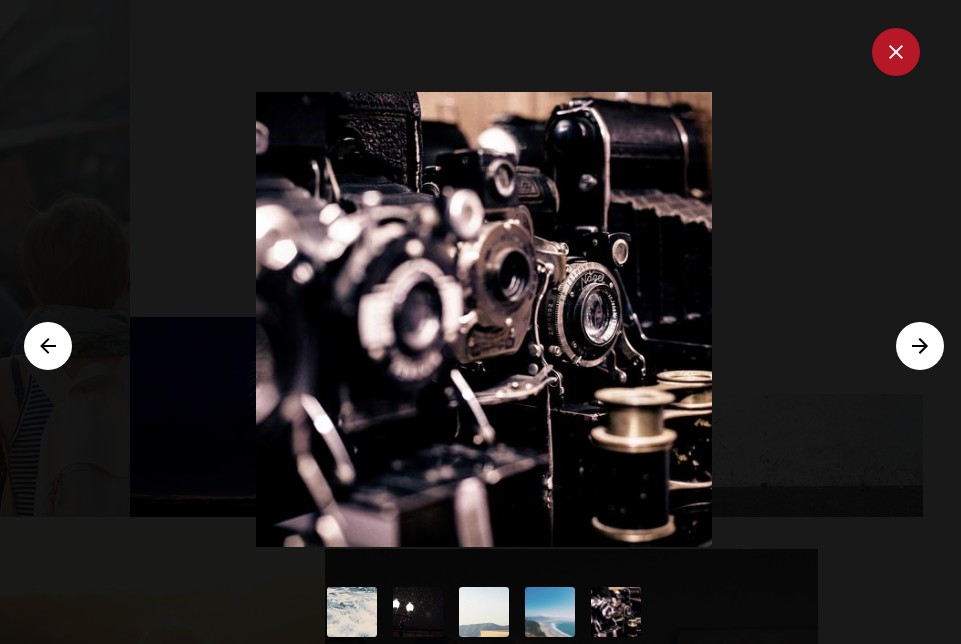
Passing options is very simple. Just pass the options in a prop called options to the <SRLWrapper> component. I will strongly recommend to create a constant with all the options and then pass it to the component. From version 2.8, options are divided in four objects to avoid confusion and to make the code cleaner
The four objects are: settings, caption, buttons, thumbnails.
const options = {
  settings: {},
  caption: {},
  buttons: {},
  thumbnails: {}
}
import React from "react";
import MyComponent from "./components/MyComponent";
// Import SRLWrapper
import {SRLWrapper} from "simple-react-lightbox";

// Create an object with the options that you want to use. The options are divided in 4 main objects. You don't need to define them all.
const options = {
  settings: {
    overlayColor: "rgb(25, 136, 124)",
    autoplaySpeed: 1500,
    transitionSpeed: 900,
  },
  buttons: {
    backgroundColor: "#1b5245",
    iconColor: "rgba(126, 172, 139, 0.8)",
  },
  caption: {
    captionColor: "#a6cfa5",
    captionFontFamily: "Raleway, sans-serif",
    captionFontWeight: "300",
    captionTextTransform: "uppercase",
  }
};

function MyComponent() {
  return (
    <div className="MyComponent">
     // Simply pass the entire object in a prop called "options"
     <SRLWrapper options={options}>
        // Your images here
      </SRLWrapper>
    </div>
  );
}

export default MyComponent;


The light-box with the custom options
Settings options
| Option | Type | Default value | Description |
|---|---|---|---|
autoplaySpeed |
number |
3000 | Controls the auto play change interval. Set it to 0 if you don't want to use the auto play functionality and hide the button. |
hideControlsAfter |
number or boolean |
3000 | Controls how long it will takes for the controls and thumbnails to be hidden. By default all the controls and the thumbnails will be hidden after 3 seconds (3000ms), to create a more immersive experience. This value can't be less then 1000ms. If you want the controls and thumbnails to be always visible set this to FALSE. |
disableKeyboardControls |
boolean |
false |
Disable keyboard controls. |
disableWheelControls |
boolean |
false |
Disable mouse wheel controls. |
disablePanzoom |
boolean |
false |
Disable panzzom controls. |
lightboxTransitionSpeed |
number |
600 | Controls the transition speed of when the light-box is opened. This value is in millisecond. |
lightboxTransitionTimingFunction |
string |
"ease" | Controls the transition timing function of when the light-box is opened. |
overlayColor |
string |
"rgba(0, 0, 0, 0.9)" | Controls the background color of the light-box. |
slideTransitionSpeed |
number |
600 | Controls the transition speed of each image (when changing from an image to another). This value is in millisecond. |
slideTransitionTimingFunction |
string |
"ease" | Controls the transition timing function of each image (when changing from an image to another). |
const options = {
  settings: {
    autoplaySpeed: 3000,
    hideControlsAfter: 3000,
    disableKeyboardControls: false,
    disableWheelControls: false,
    disablePanzoom: false,
    lightboxTransitionSpeed: 600,
    lightboxTransitionTimingFunction: 'ease',
    overlayColor: 'rgba(0, 0, 0, 0.9)',
    slideTransitionSpeed: 600,
    slideTransitionTimingFunction: 'ease'
  },
Buttons options
| Option | Type | Default value | Description |
|---|---|---|---|
backgroundColor |
string |
"rgba(30,30,36,0.8)" | Controls the background color of the buttons. Any CSS Color value is valid. |
iconColor |
string |
"rgba(255, 255, 255, 0.8)" | Controls the color of the icons inside the buttons. Any CSS Color value is valid but there is some magic ? happening in here: if you use an rgba() value and set an opacity (like “0.8” as showed in the default value), when you hover with the mouse on the icon this will create a nice CSS hover effect by automatically changing the opacity to “1”, regardless the colour you choose. |
size |
string |
"40px" | Controls the size of the buttons |
iconPadding |
string |
"5px" | Increases the padding between the icon and the sides of the button. The more padding you add the smaller the icon will look. |
showAutoplayButton |
string |
true |
Show / Hide the autoplay button |
showCloseButton |
string |
true |
Show / Hide the close button |
showDownloadButton |
string |
true |
Show / Hide the download button |
showFullscreenButton |
string |
true |
Show / Hide the fullscreen button |
showNextButton |
string |
true |
Show / Hide the next button |
showPrevButton |
string |
true |
Show / Hide the previous button |
const options = {
  buttons: {
    backgroundColor: 'rgba(30,30,36,0.8)',
    iconColor: 'rgba(255, 255, 255, 0.8)',
    iconPadding: '5px',
    showAutoplayButton: true,
    showCloseButton: true,
    showDownloadButton: true,
    showFullscreenButton: true,
    showNextButton: true,
    showPrevButton: true,
    size: '40px'
  }
Caption options
| Option | Type | Default value | Description |
|---|---|---|---|
showCaption |
boolean |
true |
Show / Hide the caption. |
captionColor |
string |
"#FFFFFF" | Controls the color of the caption. |
captionFontFamily |
string |
"inherit" | Controls the font family of the caption. By default it will inherit the one from the parent element. |
captionFontSize |
string |
"inherit" | Controls the font size of the caption. By default it will inherit the one from the parent element. |
captionFontStyle |
string |
"inherit" | Controls the font style of the caption. By default it will inherit the one from the parent element. |
captionFontWeight |
string |
"inherit" | Controls the font weight of the caption. By default it will inherit the one from the parent element. |
captionTextTransform |
string |
"inherit" | Controls the "text-transform" property of the caption. By default it will inherit the one from the parent element. |
const options = {
  // Please note that "caption" is singular
  caption: {
    showCaption: true,
    captionColor: '#FFFFFF',
    captionFontFamily: 'inherit',
    captionFontSize: 'inherit',
    captionFontStyle: 'inherit',
    captionFontWeight: 'inherit',
    captionTextTransform: 'inherit'
  }
Thumbnails options
| Option | Type | Default value | Description |
|---|---|---|---|
showThumbnails |
boolean |
true |
Show / Hide the thumbails. |
thumbnailsOpacity |
number |
0.4 | Controls the opacity of the thumbnails. |
thumbnailsSize |
array of strings |
['100px', '80px'] |
Controls the size of the thumbnail. First value in the array is width and the second is height. |
const options = {
  // Please note that "caption" is singular
  thumbnails: {
    showThumbnails: true,
    thumbnailsOpacity: 0.4,
    thumbnailsSize: ['100px', '80px']
  }
Callbacks
Callbacks can be used in case you need to get information about the state of the light-box or to access the different slides (images). A good example of this could be if you, for example, wanted to sync a carousel with the light-box so that when you go through the images, your carousel is synced. (Check the example on the demo webiste )
| Callback | Args | Returns | Usage | Description |
|---|---|---|---|---|
onSlideChange |
object |
index: integer, action: string, slides: {previous: {}, current: {}, next: {}} |
(object) => { console.log('object) } |
Use this to detected when a slide changes. Gives back the current slide index, the action take (left, right or selected) and an object with the previous, current and next slide. |
onLightboxOpened |
object |
currentSlide: {...}, opened: true |
(object) => { console.log('object) } |
Use this to detected when the light-box is opened. It returns an object with the current slide and another one with a key of "opened" and a value of "true". |
onLightboxClosed |
object |
currentSlide: {...}, opened: false |
(object) => { console.log('object) } |
Use this to detected when the light-box is closed. It returns an object with the current slide and another one with a key of "opened" value of "false". |
onCountSlides |
total |
totalSlide: integer |
(total) => { console.log('total) } |
Use this to get the total of the slides. You can pass the total as an argument to your callback function and it will give back an integer with the total count of the slides/images on your light-box. |
Yes, callbacks! But how do I use them?
Callbacks are passed with the callbacks prop to the SRLWrapper.
I will strongly recommend to create a constant with all of your callbacks and then pass it to the component with the prop callbacks.
import React from "react";
import MyComponent from "./components/MyComponent";
// Import SRLWrapper
import {SRLWrapper} from "simple-react-lightbox";

// Create an object with the callbacks that you want to use
const callbacks = {
    onSlideChange: object => console.log(object),
    onLightboxOpened: object => console.log(object),
    onLightboxClosed: object => console.log(object),
    onCountSlides: object => console.log(object)
};

function MyComponent() {
  return (
    <div className="MyComponent">
     <SRLWrapper callbacks={callbacks}>
        // Your images here
      </SRLWrapper>
    </div>
  );
}

export default MyComponent;
Hooks
There are two hooks that you can use.
The first one is openLightbox. It opens the light-box and you can pass an argument which is the index of the slide you want to open (starting from 0).If you don't provide any argument to the function the light-box will just open it from the first image.
The second one is closeLightbox and you can use it to close the light-box.
Check the demo to see it in action. In the example below we are creating a reusable React component (a button) that can open the light-box from anywhere in your app. Please note that from version 2.8 you need to destructure the useLightbox() hook to get the function that you need.
import React from 'react'
import { useLightbox } from 'simple-react-lightbox'

/*
You can use the provided hook in case you want
to open the lightbox from a button or anything :)
*/

const Button = props => {
  const { openLightbox } = useLightbox()

  return (
    <button
      onClick={() => openLightbox(props.imageToOpen)}
    >
      Open the lightbox
    </button>
  )
}

export default Button
PanZoom functionality
I added this feature as I think is really cool but is not 100% perfect yet. So in case you have issues with it, just disable it from the options.
Caveats ?
The images will have an id attribute assigned by Simple React Lightbox. Any other id attribute on the image will be removed. If you are using id attribute in the images, I suggest you use a class attribute instead. I don't think id attribute on images are used a lot but if this is the case let me know and I might adjust the code in the future.