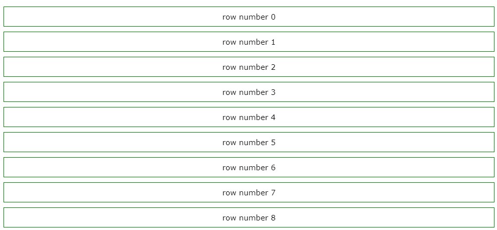
React-StableList
A simple listview component for ReactJS that implements the concept of virtualization for effieciently rendering a huge dataset.
- Maintains a constant number of rendered items
- Does not rely on variables such as an element's dimensions or any of its styled properties (i.e. CSS positioning), eliminating the need for dynamic element measurement and any layout modifcations
Rationale
While there are already rather amazing react components that implement virtualization techniques such as React-Virtualized, React-Virtuoso and a lot more that I have yet to see, I have had difficulty in maintaining a variety of layouts and styles while using the above-mentioned libraries. Thus, React-StableList was developed with responsive design in mind.
Usage
Install the package
npm i react-stablelist
then use the component somewhere in your react app or component
import React from "react";
import { render } from "react-dom";
import StableList from "react-stablelist";

/*
    your component must accept a "className" prop which will be used by
    StableList for index-specific operations
*/
const SpecialComponent = ({className, componentID}) => {
    return <div className={className} id={componentID}>...</div>
}

const App = () => {
   /**
     * @param {string} key a unique string that can be used as a component's "key" prop
     * @param {number} index the index of the element to be rendered relative to the dataset
     * @param {boolean} isFresh determines whether the component has just recently been rendered
     * @param {boolean} isFirstRender determines whether it is the component's first time being rendered
     * @param {any} propData the information that will be passed to the component as its props
    */
    const propProvider = (key, index, isFresh, isFirstRender, propData) => {
        return {
            // ...rest
            componentID: Math.random()
        }
    };

    const listData = [...];

    return (
        <StableList
            data={listData}
            dataKey={Math.random()}
            itemCount={listData.length}
            maxItems={60}
            threshold={20}
            component={SpecialComponent}
            propProvider={propProvider}
        />
    );
}

render(<App/>, document.getElementById("container"));
Component Props
Required Props
- data: An array containing the data to be used when building the components in the list
- dataKey: An identifier that uniquely identifes the current
data. - itemCount: The total number of items in the given data array.
- maxItems: The maximum number of items that can be rendered. (This prop defaults to 60 )
- threshold: The maximum number of items per batch. (This prop defaults to 20 )
- component: The component instance to be used as a list item.
- propProvider: A
functionthat returns an object containing the props to be passed to a list item. - direction: Determines whether the list should start building its list items from the start or the end of the given
data. (This prop defaults to top )
Optional Props
- followNewItems: A boolean that determines whether the list should be scrolled to the bottom when the
itemCountprop's value changes.
Methods
These methods can be accessed by passing a ref to the StableList component.
- updateAtIndex(index): update a previously redered component instance at the given instance.
Styling
Addtional styles can be applied to the component by extending the following classes:
.list-root: The component's parent or root node.scrolling-container: The container of the list items