React-swipe-to-delete-component
A simple React component implement 'swipe to delete' UI-pattern.
Install
React-swipe-to-delete-component is available via npm.
npm install --save react-swipe-to-delete-component
Else you can download the latest builds directly from the "dist" folder above.
Usage
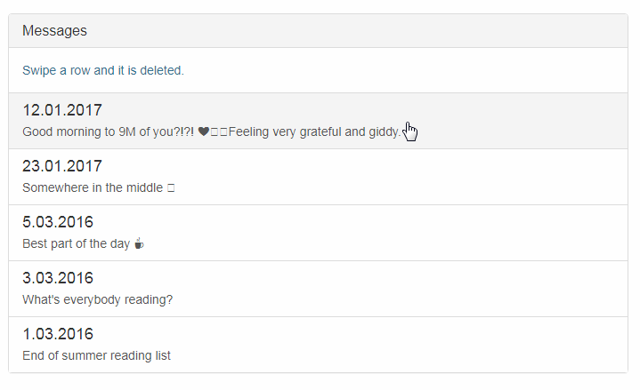
The React-swipe-to-delete-component wrap your a content component. It's become swiped. If it's swiped more certain percent than the swipe-to-delete-component will remove a component.
Example
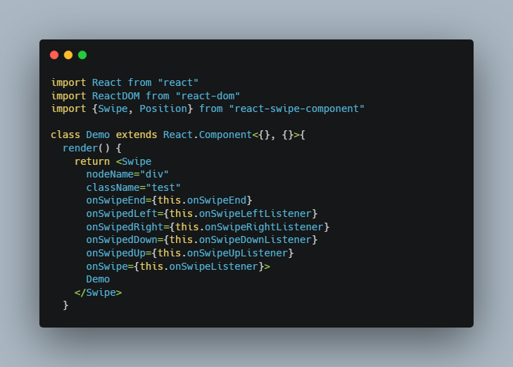
import React from 'react';
import {render} from 'react-dom';
// Import the react-swipe-to-delete-component
import SwipeToDelete from 'react-swipe-to-delete-component';
// CommonJS
// var SwipeToDelete = require('react-swipe-to-delete-component').default;

const data = [
  {id: 1, text: 'Best part of the day ☕', date: '5.03.2016'},
  {id: 2, text: 'What\'s everybody reading?', date: '3.03.2016'},
  {id: 3, text: 'End of summer reading list', date: '1.03.2016'}
];

const list = data.map(item => (
  <SwipeToDelete key={item.id}>
    <a className="list-group-item">
      <h4 className="list-group-item-heading">{item.date}</h4>
      <p className="list-group-item-text">{item.text}</p>
    </a>
  </SwipeToDelete>
));

const app = (
  <div className="list-group">
    {list}
  </div>
);

render(app, document.getElementById('root'));
Props
- tag - This is tag name of a root element. By default, it's "div". Optional.
- classNameTag - This is classes of a root element. Optional.
- background - This is a decoration component under a content component. By default, showed red element with trash icons. Optional.
- deleteSwipe - This is a number. If a content component is swiped more this the number than a swipe-to-delete component will start a delete animation. By default, it's equal "0.5". Optional.
- onDelete - This is a function. If a content component is deleted then It will be called. Optional.
- onCancel - This is a function. If a content component isn't deleted then It will be called. Optional.
- onRight/onLeft - This is a function. If a content component is swiped then these functions is called. Optional.
Styles
You may set up styles in "swipe-to-delete.css" under the comment "Custom styles". The class js-content is content region, js-delete is delete region. Classes js-transition-delete-right and js-transition-delete-left are added on a content component when it's swiped more than "deleteSwipe" options. Class js-transition-cancel is added when a content component swiped less than "deleteSwipe" options. Animations are made by CSS3 transition.