React Scenes
React Scenes is a simple way to create/test your react components inside your app.
Why?
We tried lots of tools to simplify our in-house react component creation process, but somehow nothing feel right. React Scenes is more simple, easy to use and flexible. (plus built-in support for styled-components)
Installation
npm install react-scenes --save
Custom Installation
install cli for react-scenes
npm install react-scenes-cli -g
then on your app root folder
setReactScenes -l "My Scenes"
this will create an entire seperate app with CRA and all dependencies.
setReactScenes -l "My Scenes" --bare
this will only generate template files.
PS: both will install react-scenes from npm.
Usage
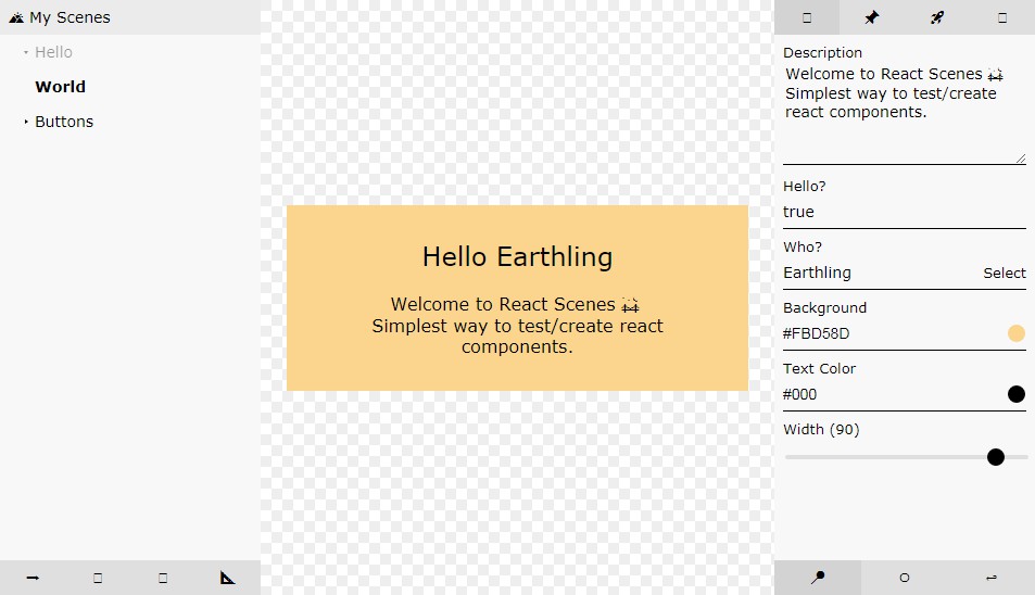
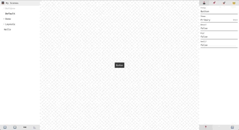
Scenes
Libraries is just a react component that uses Scenes, you can point any route to any library just like normal pages.
import { Scenes } from "react-scenes";
import scenes from "./index";

class Library extends Component {
  render() {
    return (
      <Scenes
        title="? My Scenes"
        config={ {
          panel: {
            position: "right"
          }
        } }
        scenes={Object.keys(scenes).map(key => scenes[key])}
      />
    );
  }
}

export default Library;
title string
Library Title.
scenes array
Scenes.
config object
panel object
Default value of panel position.
panel: {position: : "right"}// left, right, top, bottom
ui boolean
Default value of UI Visibility.
ui: true
sizer boolean
Default value of Viewport Sizer Visibility.
sizer: true
caching boolean
Default value of State Recording.
caching: true
device string|object
Default value or Viewport Device or Size.
device: "iphonex"
Other pre-defined devices: iphonex, iphone8p, iphone8, iphonese,ipadpro, ipadprol, ipad, ipadl, pixel2
PS: "l" for landscape
or
device: {width: 320, height: 320, unit: "px"}
frame object
We use react-frame-component for wrapping your components, you can set its options in here.
frame : {
  initialContent:`<!DOCTYPE html>
  <html>
  <head>
    <style>
      @import url("https://use.typekit.net/xxx.css");
      body {
        font-family: "sofia-pro";
        font-weight: 400;
        margin:0;
        padding:0;
      }

      strong {
        font-weight: 600;
      }
    </style>
  </head>
  <body>
    <div id="frame"></div>
  </body>
  </html>`,
  mountTarget: "#frame"
};
plus on some rare cases you may want to inject parent page's stylesheets so just add below to frame property.
injectGlobalStylesheets: true
and also if you use styled-components add below to frame property to inject component style to iframe.
injectStyledComponentsStylesheets: true
actions array
check for more: custom actions
panels array
check for more: custom panels
devices array
check for more: custom devices
Scene
Example scene
import { controllers } from "react-scenes";

export default {
  title: "Hello",
  target: Bar,
  controllers: [
    {
      key: "title",
      title: "My title",
      controller: controllers.text("hello")
    }
  ],
  events: ["onClick"],
  options: {
    centered: true,
    theme: "light" // light, dark, white, black
  },
  docs: `## Bar
  **Hello World**
  `
};
title string required
Title of your component.
You can also make titles nested like Buttons>Normal.
target React Component or function required
Your Component. You can either give your component directly or you can pass a functions.
target: ({props,state,setState}) => {
  return (
    <div>
      <Button {...props}>{props.title}</Button>
    </div>
)}
controllers array
All the controllers your component need. They will be passed to your component as their props.
events array
Events you want to track.
options object
Two options are available.
themeandcentered(makes component centered in viewport with flexbox).
docs string
Component documentation or notes.
displayName string
Sometimes displayName could be different then what it should be, you can use this if your component name is wrong in Code Panel.
stylesheet string
Use this to pass any css to components iframe.
styleClassNames array
Use this if you import your css into your js file (webpack).
Import your css like,
import style from "./style.css"
style.className = "my-style"
then add all classNames you need to this property.
Built-in Features
Scenes has ;
Actionsfor global manipulationPanelsfor component manipulation
Actions
We provide 4 actions; UI Visibility Toggle, State Recording Toggle, Viewport Sizer, Panel Position Toggle
You can add custom actions into config as actions check for more: custom actions
Toggle UI Visibility ?
Toggles ui elements from scenes. (scene picker, panels etc.)
State Recording ⏸
When state recording is on all controllers data will be cached on local storge for easy testing.
Viewport Sizing ?
You can change viewport to known devices and you can enter custom width and height.
PS: check for more: custom devices
Panel Positioning ➡️
You can change your panel position on the fly or you can set your default panel postion inside your library
config.
Panels
We provide 4 panels;
You can add custom panels into config as panel check for more: custom panels
Every panel can has its own specific actions check for more: custom panel actions
Controllers ?
Conrollers are your main tools to alter your component without direct input.
We provide 10 default controllers; text,textarea,select,boolean,integer,float,range,object,array,color
text
controllers.text("Hello World")
textarea
controllers.textarea("Hello \n World")
select
controllers.select("primary", ["primary", "destructive"])
or you can add as key,value
controllers.select("primary", [
  {key:"Primary, value:"primary"},
  {key:"Positive, value:"positive"}
])
boolean
controllers.boolean(true, true)> if you set second argument it will includenullto controller cycle.
integer
controllers.integer(42)
float
controllers.float(42.1)
range
controllers.range(42.1)
object
controllers.object({foo:"bar"})
array
controllers.array([1,2,3])
color
controllers.color("#000","hex" // hex, rgb, rgba)
Docs ?
Docs are can be component documentation or any other notes. (markdown supported).
Events ?
Track your components events, just add event props to your scenes as an array.
Code ?
This converts your components code to string for easy sharing.
Customize
Custom Actions
We exposed props, state, store, setState so you can access to alter anything you like.
PS: from props you can react setScene and setConfig.
PS2: you can use store to set and get things from local storage.
<Scenes
  ...
  actions={[
    {
      _id: "say-hi",
      icon: ({ props, store }) => {
        return props.config.areWeMet ? "☺️" : "?"
      },
      onClick: ({ props, state, store, setState }) => {
        props.setConfig({ weMet: !props.config.areWeMet });
      }
    }
  ]}
/>
Custom Panels
We exposed props, state, store, setState so you can access to alter anything you like.
PS: from props you can react options, setScene, setOptions and setConfig.
PS2: you can use store to set and get things from local storage.
<Scenes
  ...
  panels={[
    {
        _id: "my-apples",
        component: MyApples,
        active: ({ state }) => state.active == "my-panel",
        icon: "?",
        actions: [
          {
            _id: "toggle-apple-color",
            icon: ({props})=> props.options.apple == "green" ? "?" : "?",
            active: ({ props }) => props.options.apple == "green",
            onClick: ({ props }) => {
              props.setOptions({
                ...props.options,
                centered: props.options.apple == "green" ? "red" : "green"
              });
            }
          }
        ]
    }
  ]}
/>
Custom Controllers
Example: myApp/.../myCustomController.js
import React, { Component } from "react";

export default (initialValue, foo, bar) => {
  return {
    type: "customController",
    initialValue,
    process: val => val,
    input: (value, set, title, state, setState) => {
      return (
        <div className="custom-controller">
          <input
            value={value}
            onChange={e => set(e.target.value)}
            onFocus={e => setState({focused: true})}
            onBlur={e => setState({focused: false})}
          />
          {focused ? "Focused" : "Not Focused"}
        </div>
      )
    }
  }
}
There is 4 props you can use;
-
typestringis just and identifier. -
initialValueanythingis the initial value of the input. -
processfunctioncan be use to alter the input value. -
inputfunctionhasvalue,set,title,state,setStateto update your data and state of your controller.
Usage
Example: someScene.js
import customController from "../myCustomController";

export default {
  title: "Hello",
  target: Bar,
  controllers: [
    {
      key: "data",
      title: "My Data",
      controller: customController("hello", "foo", "bar")
    }
  ]
};
Custom Devices
to add custom device sizes, inject it to Scenes like below.
<Scenes
  ...
  devices={{
    iphonex: {
      title: "iPhone X",
      width: 375,
      height: 812
    },
    iphoneflex: {
      title: "iPhone Flex",
      width: "375px",
      height: "100%",
      unit: ""
    }
  }}
/>