react-web-editor
A Simple WYSIWYG editor for react users
You can make your own editor using our library
?What is React Web Editor
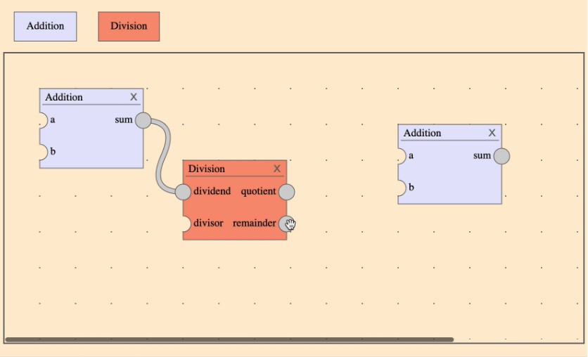
- The React Web editor is a library that provides and hooks of components that can dynamically change ui.
- It supports features like Resizing, Draggable, and Drag and Drop, You can also upload a image dynamically, and styling component's color and text.
- The coordinates tag, which shows where the current components are located, and the guide line, which tells you if the current components are centralized, are built into the block-type components.
- Ultimatly, You can make a editor page which can change web's UI dynamically.
?Core characteristics
-
The react-web-editor is easy to use. It is designed user friendly!
- The core features were created using hook, but it was wrapped with block component to make it easy to use as simple as possible. Therefore, Users who want to use simply can import block components and put your code.
-
The react-web-editor is light and simple.
- The goal was to make react-web-editor simple and light. Therefore, it has minimal dependency except for the essential library.
-
The react-web-editor is react-friendly. You can use hooks for your own component.
-
The react-web-editor has a tools for customizing.
- The style component is supported. It makes you easy to expand for new features.
-
It was built using webpack so that you can fully control configuration management and project extension with custom settings.
?Getting started
installing
npm -i react-web-editor
import
import { StyleEditorBlock, TextEditorBlock, ... } from "react-web-editor;
or you can import as below
import ReactWebEditor from "react-web-editor";
?Version up log
| Version | Log |
|---|---|
| 2.2.0 | Upgrade Ui, Fix Hooks usage |
| 2.1.0 | Upgrade Drag and Drop feature |
| 2.0.0 | Create Editable Board, minor bug update |
| 1.2.0 | Upgrade Text Editor to initialize options |
| 1.1.0 | Upgrade editor to use unit like "rem" |
| ~ 1.0.5 | Use helmet, Update helmet to async |
| ~ 1.0.2 | Upgrade Drag and Drop feature, Solve minor Ui bug |
| 1.0.0 | Add Text Editor |
| 0.1.6 | Upgrade Style editor features |
| ~ 0.1.5 | Solve Next.js Font disappear bug |
?Documents
Block components
These components are designed to be user friendly. Easily control components using no more than props.
Style Editor Block
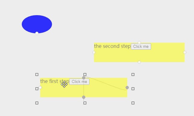
The Style Editor Component(SEC) is a block component which can change size and location of components. Another powerful usage of The SEC is uploading images on the screen or changing a component's background color. By wrapping a component with the SEC and setting the position of the component ‘absolute’, the component becomes editable on an website. This component also can be used without your own component.
Two tabs will appear on the screen when you hover a cursor on the component. The First tab is a uploading image tab, which is help you add an image. The Second tab is a color handler. It changes component's background color.
- Props
    type StyledEditorBlockProps {
      width: number;
      height: number;
      top: number;
      left: number;
      parentStyle?: ParentStyle; // It defines area where component can't escape. If you don't define it, then your component can move in all screen.
      unit: string;
      initialColor?: string; // default: transparent
      initialImage?: string; // default: none
    }

    type ParentStyle {
      width: number;
      height: number;
    }
- Usage
    import { StyleEditorBlock } from "react-web-editor"
    ...
    return (
      <StyleEditorBlock
        width={200}
        height={300}
        left={left}
        top={top}
        parentStyle={{ width: 600, height: 800 }}
        unit={"px"}
      >
        <YourOwnComponent color={color} /> // It is just a option.
      </StyleEditorBlock>
    );
Text Editor Block
The Text Editor Component(TEC) is a block component. This component has a simple rich text editor features. TEC has two functions. It enables you to type and change the style of it using the settings window. Two tabs will appear on the screen when you hover a cursor on the component. It helps you change a location of components. The second tab is the Settings window handler. The window will appear on the screen when you click the second tab.- Props
    type TextEditorBlockProps {
      width: number;
      height: number;
      top: number;
      left: number;
      parentStyle?: ParentStyle; // It defines area where component can't escape. If you don't define it, then your component can move in all screen.
      unit: string;
      // Initial- props are options just for first rendering.
      initialFontSize?: number; // default: 0.22
      initialFontColor?: string; // default: "black"
      initialFontStyle?: InitialFontStyle; // default: ""
      initialText?: string; // default: ""
      initialFontName?: string; // default: ""
    }

    type ParentStyle {
      width: number;
      height: number;
    }

    type InitialFontStyle = "twin-color-text" | "box-text" | "down-side-text" | "out-line-text" | "bubble-shadow-text";

    type InitialFontName = "andada-pro" | "bebas-nenu" | "montecarlo" | "roboto" | "stix-two-text" | "style-script";
- Usage
    import { TextEditorBlock } from "react-web-editor"

    ...

    return (
      <TextEditorBlock
        width={200}
        height={300}
        left={left}
        top={top}
        parentStyle={{ width: 600, height: 800 }}
        unit={"px"}
      />
    );
Drag and Drop Table
The Drag and Drop Table(DNDT) component makes all child components draggable within the DNDT area. You can use the DNDT by wrapping your components that you desire to be draggable.- Props
    type DragAndDropTableProps {
      color?: string;
      isVertical: boolean;
    }
- Usage
    import { DragAndDropTable } from "react-web-editor"

    ...

    return (
      <DragAndDropTable
        color={"pink"}
        isVertical={true}
      >
        <YourOwnComponent src={cat} />
        <YourOwnComponent src={flower} />
        <YourOwnComponent src={bee} />
        // These components can drag and drop in the DragAndDropTable component.
      </DragAndDropTable>
    );
Hooks
Our library structured with "hooks" friendly. Use the hook when you need a single feature from hooks or when you want to make a custom component. With the React-Web-Editor you can generate editor pages and your own library. These need a more precise usage. So If you want to use our library's features simply, We recommend using block components.useDraggable
- props
  type useDraggableProps {
    left: number;
    top: number;
    width: number;
    height: number;
    dragBoardOption?: DragBoardOption;
    unit: string;
    onDrag: Dispatcher<ComponentStyle>; // It is a setState. Its state is Componentstyle.
  }

  type Dispatcher<S> = React.Dispatch<React.SetStateAction<S>>;

  type ComponentStyle {
    left: number;
    top: number;
    width: number;
    height: number;
  }

  type DragBoardOption {
    width: number;
    height: number;
  }
  // It's like a parentStyle.
- usage
  import { useState } from "react";
  import { useDraggable } from "react-web-editor";

  const [componentStyle, setComponentStyle] = useState({
    width: 20,
    height: 40,
    top: 40,
    left: 40,
  });
  // this state can be used for your own component.
  const {
    handleDragEnd, // onMouseUp handler
    handleDragStart, // onMouseDown handler
  } = useDraggable({
    ...componentStyle,
    onDrag: setComponentStyle,
    unit: "px",
  });
- returns
| return | usage |
|---|---|
| handleDragStart | onMouseDown handler |
| handleDragEnd | onMouseUp handler |
This component can be used with DraggableHandler, and EditorBlockWrapper.
useResize
It returns Resize handlers. It can be used with "ResizeHandlerWrapper", The helper component to resize.
- props
  type useResizeProps {
    left: number;
    top: number;
    width: number;
    height: number;
    resizeBoardOption?: ResizeBoardOption;
    unit: string;
    onResize: Dispatcher<ComponentStyle>; // It is a setState. Its state is Componentstyle.
  }

  type Dispatcher<S> = React.Dispatch<React.SetStateAction<S>>;

  type ComponentStyle {
    left: number;
    top: number;
    width: number;
    height: number;
  }

  type ResizeBoardOption {
    width: number;
    height: number;
  }
  // It's like a parentStyle.
- usage
  import { useState } from "react";
  import { useResize, ResizeHandlerWrapper } from "react-web-editor";

  const [componentStyle, setComponentStyle] = useState({
    width: 20,
    height: 40,
    top: 40,
    left: 40,
  });

  const { handleMouseDown } = useDraggable({
    ...componentStyle,
    onResize: setComponentStyle,
    unit: "px",
  });
- returns
| return | usage |
|---|---|
| handleMouseDown | onMouseDown handler |
This component can be used with ResizeHandlerWrapper and EditorBlockWrapper.
useImage
The UseImage hook helps upload and display images on the screen.
- props
type UseImageProps {
  initialImage?: string;
}
- usage
import { useImage } from "react-web-editor";
...
const { imageSrc, handleImageChange } = useImage({ initialImage });
- returns
| return | usage |
|---|---|
| imageSrc | string |
| handleFileChange | onChangeHandler of InputElement |
useColor
The UseColor hook returns color change handler.
- props
type UseColorProps {
  initialColor?: string;
}
- usage
import { useColor } from "react-web-editor";
...
const { color, handleColorChange } = useColor({ initialColor });
- returns
| return | usage |
|---|---|
| color | string |
| handleColorChange | onChangeHandler of InputElement |
Helper Components
These components help you customize and generate your own component. You can make your own library using this feature. It lets you easily handle hooks and editor components.
Editable Board
The Editable Board component is a helper component. If you put a block component (like StyleEditorBlock, or TextEditorBlock) to this component's children and define parentStyle, the children components will bound in the Editable board area.- Props
    type EditableBoardProps {
      width: number;
      height: number;
      backgroundColor: string;
      left?: number;
      top?: number;
      unit: string;
    }
- Usage
    import { EditableBoard, StyleEditorBlock } from "react-web-editor"

    ...
    const boardWidth = 500;
    const boardHeight = 500;
    const boardStyleUnit = "px";

    return (
      <EditableBoard
        width={boardWidth}
        height={boardHeight}
        backgroundColor={boardStyleUnit}
        color={"pink"}
        left={20}
        top={20}
      >
        <StyleEditorBlock
          ...
          parentStyle={{
            width: boardWidth,
            height: boardHeight,
          }}
          unit={"px"}
        />
      </EditableBoard>
    );
EditorBlockWrapper
The Editor Block Wrapper is a style component. The size and location of the component are received in props. It changes style dynamically with these props.
It can be used with useResize and useDraggable
- props
type EditorBlockWrapperProps {
  width: number;
  height: number;
  left: number;
  top: number;
}
- Usage Example
import { useState } from "react";
import { EditorBlockWrapper, useDraggable } from "react-web-editor";

const [componentStyle, setComponentStyle] = useState({
  width: 20,
  height: 40,
  top: 40,
  left: 40,
});
// this state can be used for your own component.
const {
  handleDragEnd, // onMouseUp handler
  handleDragStart, // onMouseDown handler
} = useDraggable({
  ...componentStyle,
  onDrag: setComponentStyle,
  unit: "px",
});

return (
  <EditorBlockWrapper
    width={componentStyle.width}
    height={componentStyle.height}
    top={componentStyle.top}
    left={componentStyle.left}
    onMouseDown={handleDragStart}
    onMouseUp={handleDragEnd}
  >
    <YourOwnComponent style={{ position: "absolute" }}>
  </EditorBlcokWrapper> // Now, This component dynamically change location.
);
ResizeHandlerWrapper
This component is specialized for the useResize hook. It generates vertices in the four directions of the component.
- Usage Example
import { useState } from "react";
import { EditorBlockWrapper, ResizeHandlerWrapper, useResize } from "react-web-editor";

const [componentStyle, setComponentStyle] = useState({
  width: 20,
  height: 40,
  top: 40,
  left: 40,
});
// this state can be used for your own component.
const { handleMouseDown } = useDraggable({
  ...componentStyle,
  onResize: setComponentStyle,
  unit: "px",
});

return (
  <EditorBlockWrapper
    width={componentStyle.width}
    height={componentStyle.height}
    top={componentStyle.top}
    left={componentStyle.left}
  >
    <ResizeHandlersWrapper>
      {DIRECTIIONS.map((item) => (
        <div key={item} className={item} onMouseDown={handleMouseDown} />
      ))}
    </ResizeHandlersWrapper>
  </EditorBlcokWrapper> // Now, This component can change size.
);