puck
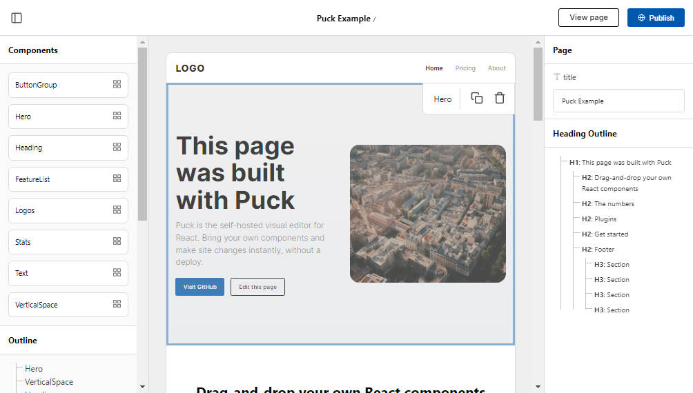
The self-hosted, drag and drop editor for React.
- ?️ Drag and drop: Visual editing for your existing React component library
- ? Integrations: Load your content from a 3rd party headless CMS
- ✍️ Inline editing: Author content directly via puck for convenience
- ⭐️ No vendor lock-in: Self-host or integrate with your existing application
Example
Render the editor:
// Editor.jsx
import { Puck } from "@measured/puck";

// Create puck component config
const config = {
  components: {
    HeadingBlock: {
      fields: {
        children: {
          type: "text",
        },
      },
      render: ({ children }) => {
        return <h1>{children}</h1>;
      },
    },
  },
};

// Describe the initial data
const initialData = {};

// Save the data to your database
const save = (data) => {};

// Render Puck editor
export function Editor() {
  return <Puck config={config} data={initialData} onPublish={save} />;
}
Render the page:
// Page.jsx
import { Render } from "@measured/puck";

export function Page() {
  return <Render config={config} data={data} />;
}
Installation
Install the package
npm i @measured/puck --save
Or generate a puck application using a recipe
npx create-puck-app my-app
Recipes
Puck is a React component that can be easily integrated into your existing application. We also provide helpful recipes for common use cases:
- next: Next.js app example
Plugins
Puck can be configured to work with plugins. Plugins can extend the functionality to support novel functionality.
Official plugins
heading-analyzer: Analyze the heading outline of your page and be warned when you’re not respecting WCAG 2 accessiblity standards.
Developing a plugin
The plugin API follows a React paradigm. Each plugin passed to the Puck editor can provide three functions:
renderRoot(Component): Render the root node of the preview contentrenderRootFields(Component): Render the root fieldsrenderFields(Component): Render the fields for the currently selected component
Each render function receives the children prop, which you must render, and the data prop, which can be used to read the data model.
Example
Here’s a basic plugin that renders a “My plugin” heading in the root field area:
const myPlugin = {
  renderRootFields: (props) => (
    <div>
      {props.children}

      <h2>My plugin</h2>
    </div>
  ),
};
Reference
<Puck>
The <Puck> component renders the Puck editor.
- config (
Config): Puck component configuration - data (
Data): Initial data to render - onChange (
(Data) => void[optional]): Callback that triggers when the user makes a change - onPublish (
(Data) => void[optional]): Callback that triggers when the user hits the “Publish” button - renderHeader (
Component[optional]): Render function for overriding the Puck header component - renderHeaderActions (
Component[optional]): Render function for overriding the Puck header actions. Use a fragment. - headerTitle (
string[optional]): Set the title shown in the header title - headerPath (
string[optional]): Set a path to show after the header title - plugins (
Plugin[][optional]): Array of plugins that can be used to enhance Puck
<Render>
The <Render> component renders user-facing UI using Puck data.
- config (
Config): Puck component configuration - data (
Data): Data to render
Config
The Config object describes which components Puck should render, how they should render and which inputs are available to them.
- root (
object)- fields (
object):- title (
Field): Title of the content, typically used for the page title. - [fieldName] (
Field): User defined fields, used to describe the input data stored in therootkey.
- title (
- render (
Component): Render a React component at the root of your component tree. Useful for defining context providers.
- fields (
- components (
object): Definitions for each of the components you want to show in the visual editor- [componentName] (
object)- fields (
Field): The Field objects describing the input data stored against this component. - render (
Component): Render function for your React component. Receives props as defined in fields. - defaultProps (
object[optional]): Default props to pass to your component. Will show in fields.
- fields (
- [componentName] (
Field
A Field represents a user input field shown in the Puck interface.
- type (
text|textarea|number|select|radio|external|array): The input type to render - label (
text[optional]): A label for the input. Will use the key if not provided. - arrayFields (
object): Object describing sub-fields for items in anarrayinput- [fieldName] (
Field): The Field objects describing the input data for each item
- [fieldName] (
- getItemSummary (
(object, number) => string[optional]): Function to get the name of each item when using thearrayorexternalfield types - defaultItemProps (
object[optional]): Default props to pass to each new item added, when using aarrayfield type - options (
object[]): array of items to render for select or radio inputs- label (
string) - value (
string|number|boolean)
- label (
- adaptor (
Adaptor): Content adaptor if using theexternalinput type - adaptorParams (
object): Paramaters passed to the adaptor
Data
The Data object stores the puck state.
- root (
object):- title (string): Title of the content, typically used for the page title
- [prop] (string): User defined data from
rootfields
- content (
object[]):- type (string): Component name
- props (object):
- [prop] (string): User defined data from component fields
Adaptor
An Adaptor can be used to load content from an external content repository, like Strapi.js.
- name (
string): The human-readable name of the adaptor - fetchList (
(adaptorParams: object) => object): Fetch a list of content and return an array
NB Using an adaptor on the reserved field name
_datawill spread the resulting data over your object, and lock the overridden fields.
Plugin
Plugins that can be used to enhance Puck.
- renderRoot (
Component): Render the root node of the preview content - renderRootFields (
Component): Render the root fields - renderFields (
Component): Render the fields for the currently selected component
Hire the Puck team
Puck is developed and maintained by Measured, a small group of industry veterans with decades of experience helping companies solve hard UI problems. We offer consultancy and development services for scale-ups, SMEs and enterprises.
If you need support integrating Puck or creating a beautiful component library, please reach out via our website.
License
MIT © Measured Co.


