React Grid Draw UI
A sophisticated canvas-based drawing and grid-creation React component library.
Why is this useful?
This package was born out of needing to copy dynamically generated web content into
the clipboard for pasting while maintaining the table structure within the clipboard.
Very useful for pasting into Excel or other table-centric applications.
This package will allow any react application to very easily integrate the ability to draw grids on top of the DOM
structure nested within the wrapper component the package provides.
The package does not provide you with the ability to copy the data directly, but could be added in the future.
The reason being is that I didn't want this package to become a multi-functional package and rather to just focus
on a single responsibility. However, the public hook provided will allow you to extract the grid data - specifically, it returns
an array of 2D arrays (grids), where each index represents the drawing order of the grids. With each 2D array, you can
implement you own copy-to-clipboard functionality with relative ease if that is a goal.
Prerequisites
- React version >= 16.8 (For hooks)
Features Include:
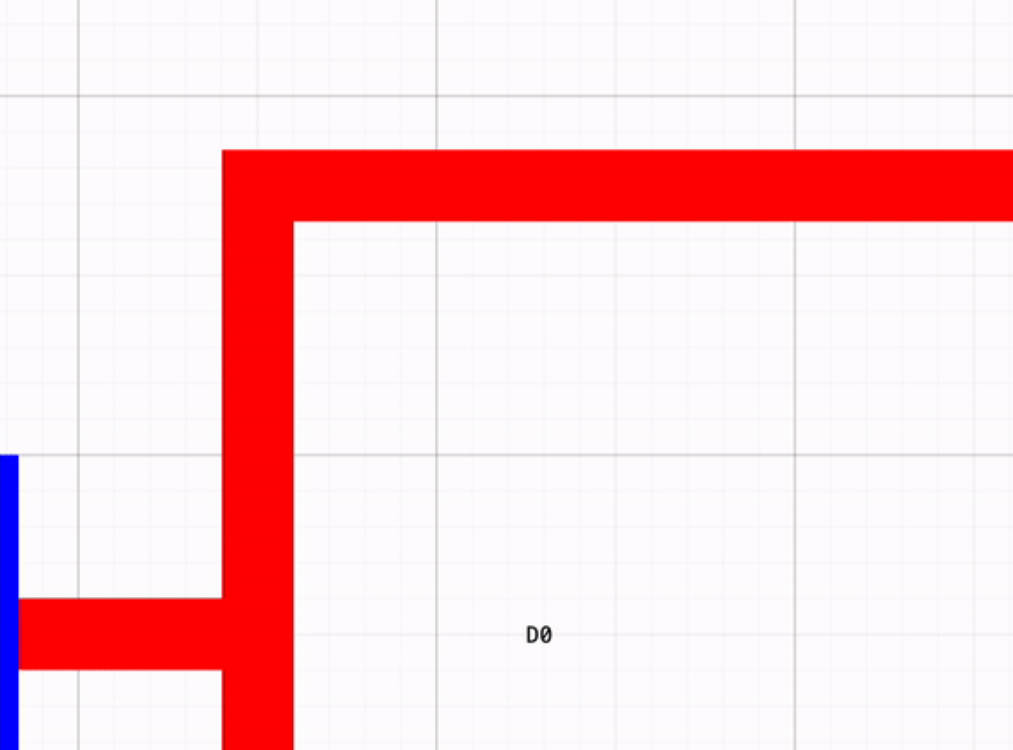
- Drawing a box on a given react page using simple mouse drag and clicks.
- Selecting points along the border of the box to indicate columns/rows for a particular grid.
- Adjustable grid colour, box line width, circle-hover-on-border size, circle-border-shift distance,
border-box mouse tolerance via props - More to be added. - Multiple Grid Creation - You can draw multiple grids and retrieve data from those multiple grids with a function call.
- Simplicity - Simply just wrap any div with the
<ReactGridDrawUI>component, and it should work out of the box. - File support - This library supports both jsx and tsx.
Installing and usage
Install react-grid-draw-ui from npm with the following command.
npm install react-grid-draw-ui
Then use it in your app:
import React, {FunctionComponent} from "react";
import {ReactGridDrawUI, useGridData} from "react-grid-draw-ui";
const App = () => {
const [getGridData, removeLastGrid, removeLastDrawnGridLine] = useGridData();
return (
<div>
<div className={"title"}>
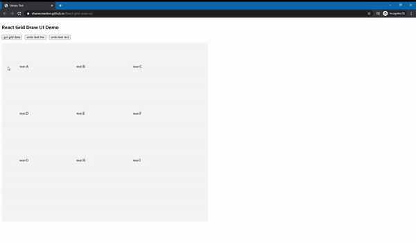
<h2> React Grid Draw UI NPM Library Demo </h2>
</div>
<ReactGridDrawUI>
<div id={"container"}>
<div>
<div className={"test-container"}>
<p> test-A </p>
</div>
<div className={"test-container1"}>
<p> test-B </p>
</div>
<div className={"test-container1"}>
<p> test-C </p>
</div>
</div>
</div>
</ReactGridDrawUI>
<button onClick={() => console.log(getGridData())}> Get Grid Data </button>
<button onClick={() => removeLastGrid()}> Remove last drawn grid </button>
<button onClick={() => removeLastDrawnGridLine()}> Remove last drawn grid line </button>
</div>
)
};
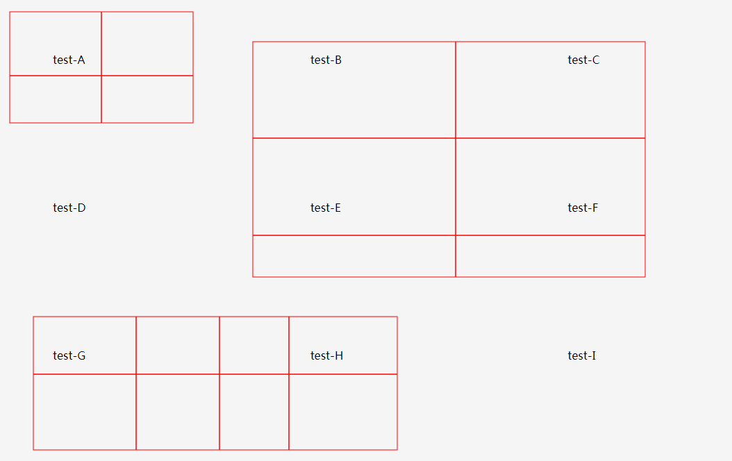
Example Demo:
Note A: Currently it is required for the div wrapped by <ReactGridDrawUI> to contain an id attribute. This can be any ID.
It must have a value as per how the tool currently works. You will see an error indicative of this in the console if you did not set the ID attribute.
Follow the example above for clarity.
Additionally, whatever width you specify this inner div, the canvas will encompass that element's width. Using the example above, the drawing canvas will be
equivalent to the width of the div with ID container. The example above has the width of the inner div set to 100% with
flex display set with two columns - visible in the github repo demo directory.
Props
You can control the following props by providing values for them. If you don't, react-grid-draw-ui will manage and default them for you.
lineClickTolerance- Specifies how far away from the border of the grid can the user click to place a grid line.selectCircleSize- Specifies the size of the circle that appears on-hover of the border of a particular grid.circleLineShiftSize- Specifies the rigidity of the mouse line-detection on the border - lower values will appear smoother,
higher values will appear more rigid.contextLineWidth- Specifies the size of the grid lines and on-hover grid lines.lineColour- Specifies the colour of the drawn grids.
Example: <ReactGridDrawUI lineColour={"#ff0000"} contextLineWidth={3}> etc...
Default prop values
lineClickTolerance: 15selectCircleSize: 3circleLineShiftSize: 10contextLineWidth: 1lineColour: "red" (Note: You can specify string literals or hex values here)
Public Facing library functions
react-grid-draw-ui exposes 2 elements publicly:
<ReactGridDrawUI>- The Wrapper component showed in the example above.useGridData()- A custom hook for getting grid data or using the function suite we provide - see example above.