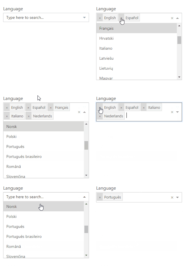
React-TaxonomyPicker
A Taxonomy Picker control built with TypeScript for React based on React-Select. Initially built for use in Office 365 / SharePoint.
Features
- Retrieve Terms from a Term Set by Term Set GUID.
- Support for large Term Set using Async mode
- Configurable via termSetCountMaxSwapToAsync property
- Use SP.Taxonomy.js
- Use Promise (polyfill it if needed IE)
Features not supported
- Add new Terms (Open TermSets)
Scenarios supported
- SharePoint Web Part using Script Editor or Content Editor Web Part
- SharePoint Framework Web Part (SPFx)
- ES6 project consumer sample
- TypeScript project consumer sample
- SPFx project consumer sample
Scenarios not supported
- SharePoint Provider-hosted app
- Other environment in which we are not allowed to use JSOM
- Add new terms to the Taxonomy Store (specific for get terms by now)
Installation
Steps to use react-taxonomypicker in your React project
1.Install from NPM
npm install --save react-taxonomypicker
2. Import and use in your application
import TaxonomyPicker from "react-taxonomypicker";
// Include its styles in you build process as well
import "react-taxonomypicker/dist/React.TaxonomyPicker.css";
3. Usage
Mock / Local mode
Don't configure termSetGuid and load the options from defaultOptions object.
<TaxonomyPicker
  name="Language"
  displayName="Language"
  defaultOptions={[
    { label: "English", value: "f50249b6-310d-43b6-aaa6-f0cb46d851bf" },
    { label: "Spanish", value: "237ca323-1ed8-4199-a49b-a9f7ce4256bf" },
    { label: "German", value: "44024c7e-f738-4755-90e1-15866327c806" },
    { label: "Italian", value: "65f67491-bdca-491a-84fa-f6fd913f40fa" },
  ]}
  multi
  showPath
/>
SharePoint environment mode
Configure termSetGuid with the desired term set
<TaxonomyPicker
  name="Language"
  displayName="Language"
  termSetGuid="26ebf149-101a-4996-9df2-8179a537350d"
  termSetName="Language"
  termSetCountMaxSwapToAsync={100}
  multi
  showPath
/>
Done
- Expose as a Module / Global / UMD library
- Upload to npm
- Create ES6 sample application for usage
- Create TypeScript sample application for usage
- Create SPFx webpart sample for usage
- Create types and include them with the npm package
- onPickerChange event handler exposed
- react-select properties exposed (extends them)
- termSetCountMaxSwapToAsync property exposed to choose between Sync / Async modes
- defaultOptions array exposed to enable input mock data when no termSetGuid configured
- Create and Expose properties for custom styles
TODOs
- Create types to allow people include with @types


