react-tooltip
A tooltip is a box of information that labels a UI element that is hovered over.
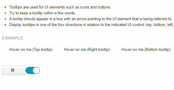
- Tooltips are used for UI elements such as icons and buttons.
- Try to keep a tooltip within a few words.
- A tooltip should appear in a box with an arrow pointing to the UI element that is being referred to.
- Display tooltips in one of the four directions in relation to the indicated UI control: top, bottom, left, or right.
Installation
- Install the latest version of react and react-tooltip:
npm install --save react @trendmicro/react-tooltip
- At this point you can import
@trendmicro/react-tooltipand its styles in your application as follows:
import { Tooltip, Infotip } from '@trendmicro/react-tooltip';

// Be sure to include styles at some point, probably during your bootstraping
import '@trendmicro/react-tooltip/dist/react-tooltip.css';
Usage
// Right tooltip
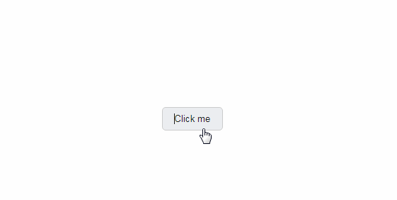
<Tooltip content="Config settings">
<button>Settings</button>
</Tooltip>
// Right tooltip with a function content
<Tooltip
content={() => {
return (<span style={{ whiteSpace: 'nowrap' }}>{'Right tooltip'}</span>);
}}
>
<sapn>Hover on me</span>
</Tooltip>
// Top tooltip
<Tooltip placement="top" content="Top tooltip"><sapn>Hover on me</span></Tooltip>
// Infotip
<Infotip content="This is a simple example for infotip.">
    <span className="icon icon-info-sign" />
</Infotip >

<Infotip placement="rightTop" content="This is a simple example for infotip.">
    <span className="icon icon-info-sign" />
</Infotip >

<Infotip
    tooltipStyle={{ wordWrap: 'break-word' }}
    content="Pneumonoultramicroscopicsilicovolcanoconiosis is the longest word. Start01234567890123456789012345678901234567890123456789012345678901234567890123456789End Start0123456789012345678901234567890123456789012345678901234567890123456789012345678901234567890123456789012345678901234567890123456789012345678901234567890123456789End"
>
    <span>Hover on me (infotip with long article)</span>
</Infotip>
API
Properties for Tooltip
| Name | Type | Default | Description |
|---|---|---|---|
| placement | string | 'right' | One of: 'top', 'right', 'bottom' and 'left'. Tooltip will display at placement if possible, otherwise tooltip adjust it's location automatically. |
| enterDelay | number | 0 | The delay length (in ms) before the tooltip appears. |
| leaveDelay | number | 100 | The delay length (in ms) before the tooltip disappears. |
| hideOnClick | boolean | false | Hide tooltip when target been clicked. |
| disabled | boolean | false | Disable tooltip. |
| tooltipClassName | string | The className apply to tooltip itself. You can use it to override style if need. | |
| tooltipStyle | object | The style apply to tooltip itself. You can use it to override style if need. | |
| content | node or function | The tooltip content. Required. |
Properties for Infotip
| Name | Type | Default | Description |
|---|---|---|---|
| placement | string | 'rightBottom' | One of: 'rightTop', 'rightBottom', 'leftTop', and 'leftBottom'. Tooltip will display at placement if possible, otherwise tooltip adjust it's location automatically. |
| enterDelay | number | 0 | The delay length (in ms) before the infotip appears. |
| leaveDelay | number | 100 | The delay length (in ms) before the infotip disappears. |
| hideOnClick | boolean | false | Hide infotip when target been clicked. |
| disabled | boolean | false | Disable infotip. |
| tooltipClassName | string | The className apply to infotip itself. You can use it to override style if need. | |
| tooltipStyle | object | The style apply to infotip itself. You can use it to override style if need. | |
| content | node or function | The infotip content. Required. |