Material Components for the web
Material Components for the web (MDC Web) helps developers execute Material Design.
Developed by a core team of engineers and UX designers at Google, these components enable a reliable development workflow to build beautiful and functional web projects.
Material Components for the web is the successor to Material Design Lite, and has 3 high-level goals:
- Production-ready components consumable in an a-la-carte fashion
- Best-in-class performance and adherence to the Material Design guidelines
- Seamless integration with other JS frameworks and libraries
- Preact Material Components
- RMWC: React Material Web Components
- Angular MDC
- Blox Material: Angular Integration Library.
- Vue MDC Adapter: MDC Web Integration for Vue.js (using foundation/adapters.)
- Material Components Vue: MDC Web Integration for Vue.js (using vanilla components)
- More coming soon! Feel free to submit a pull request adding your library to this list, so long as you meet our criteria.
MDC Web strives to seamlessly incorporate into a wider range of usage contexts, from simple static websites to complex, JavaScript-heavy applications to hybrid client/server rendering systems. In short, whether you're already heavily invested in another framework or not, it should be easy to incorporate Material Components into your site in a lightweight, idiomatic fashion.
Quick start
Note: This guide assumes you have Node.js and npm installed locally.
Include CSS for a component
Note: This guide assumes you have webpack configured to compile Sass into CSS. See the getting started guide for pointers on how to configure webpack.
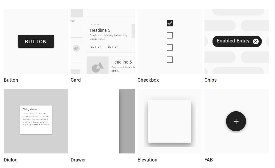
To include the Sass files for the Material Design button, install the Node dependency:
npm install @material/button
Then import the Sass files for @material/button into your application. You can also use Sass mixins to customize the button: