react-div-100vh
Div100vh React component and use100vh React hook.
This is a workaround for iOS Safari and other mobile browsers.
The problem
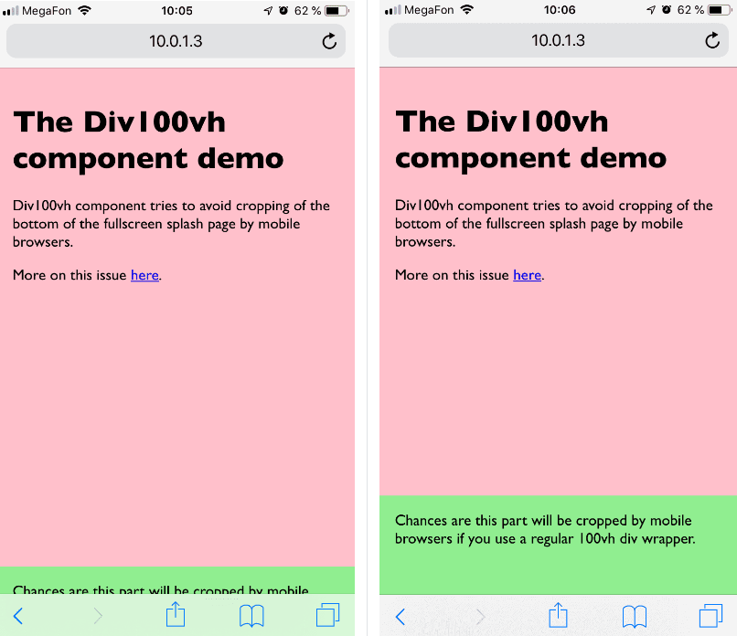
At the top of the page, mobile browsers cover bottom of 100vh page with "browser chrome" (that's the name for browser navigation/context buttons, don't confuse with the browser from Google), effectively cropping it. If you have something important at the bottom of your splash screen, chances are it will not be visible/available until user scrolls.
<div style={{height: '100vh'}}> |
<Div100vh> |
|---|---|
 |
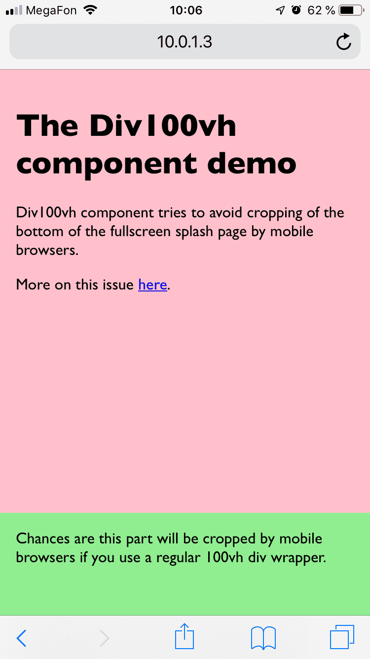 |
The solution
Div100vh React component is the default export:
import Div100vh from 'react-div-100vh'

const MyFullHeightComponent = () => (
  <Div100vh>
    <marquee>Look ma, no crop!</marquee>
  </Div100vh>
)
For more advanced use cases (for instance, if you need 50% of the real height, and not 100%), there is a named export use100vh. This React hook provides an accurate vertical height in pixels. The return type is a number in a browser and null in Node environment. You may need to check if it's not null if you're doing SSR, otherwise manipulate the value as you wish and concatenate the result with px:
import { use100vh } from 'react-div-100vh'

const MyHalfHeightExampleComponent = ({ children }) => {
  const height = use100vh()
  const halfHeight = height ? height / 2 : '50vh'
  return <div style={{ height: halfHeight }}>{children}</div>
}
Under the hood use100vh uses getRealHeight function which is exported as well, so feel free to use it, even without React. Currently it returns document.documentElement?.clientHeight || window.innerHeight.
