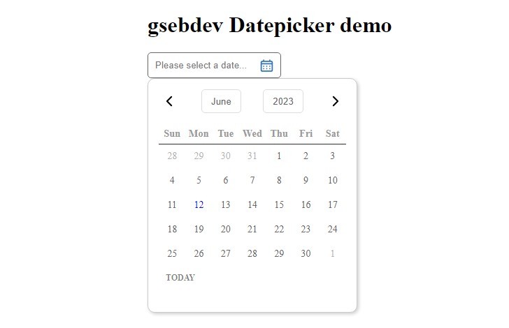
react-advance-jalaali-datepicker
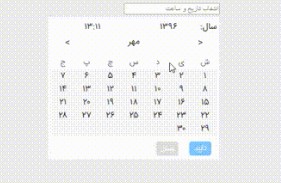
It contains 3 types of jalaali (persian) date pickers, which are range (from, to) date and time pickerو range date picker, date picker and date and time picker.
Instalation
Use npm i react-advance-jalaali-datepicker in order to install the module. Yes that's it. There is no extera font or css file to include. It's designed simple to prevent any issue during customization. Customize it in any way you want.
Usage
In order to use this module, import the packege into your react component and use the module as below. The belowing example is the code that is used in the sample usage video below.

	import React from "react";
	import {DatePicker, DateTimePicker, DateRangePicker, DateTimeRangePicker} from "react-advance-jalaali-datepicker";
    export class Home extends React.component {
		change(unix, formatted){
		    console.log(unix) // returns timestamp of the selected value, for example.
            console.log(formatted) // returns the selected value in the format you've entered, forexample, "تاریخ: 1396/02/24 ساعت: 18:30".
		}
		DatePickerInput(props) {
			return <input className="popo" {...props} ></input>;
		}
		render() {
		    return (
		      <div className="datePicker">
				<DatePicker
					inputComponent={this.DatePickerInput}
					placeholder="انتخاب تاریخ"
					format="jYYYY/jMM/jDD"
					onChange={this.change}
					id="datePicker"
					preSelected="1396/05/15"
					/>
				<DateTimePicker
					placeholder="انتخاب تاریخ و ساعت"
					format="تاریخ: jYYYY/jMM/jDD ساعت: HH:mm"
					id="dateTimePicker"
					onChange={this.changeTimeDate}
					preSelected="تاریخ: 1396/02/24 ساعت: 18:30"
					/>
				<DateRangePicker
					placeholderStart="تاریخ شروع"
					placeholderEnd="تاریخ پایان"
					format="jYYYY/jMM/jDD"
					onChangeStart={this.change}
					onChangeEnd={this.changeTimeDate}
					idStart="rangePickerStart"
					idEnd="rangePickerEnd"
					/>
				<DateTimeRangePicker
					placeholderStart="تاریخ و ساعت شروع"
					placeholderEnd="تاریخ و ساعت پایان"
					format="تاریخ: jYYYY/jMM/jDD ساعت: HH:mm"
					onChangeStart={this.change}
					onChangeEnd={this.changeTimeDate}
					idStart="rangePickerStart"
					idEnd="rangePickerEnd" />
		      </div>
			)
		}
	}
component types:
| name | Description |
|---|---|
| DatePicker | shows a box allowing you pick just a date |
| DateTimePicker | shows a box allowing you pick just a date and time |
| DateRangePicker | shows a box twice, allowing you pick two dates. The first box allows you to pick the beginnig date and second one lets you pick end date |
| DateTimeRangePicker | shows a box twice, allowing you pick two dates and time. The first box allows you to pick the beginnig date and time and second one lets you pick end date and time |
Options
Each type has its' own options.
"DatePicker" and "DateTimePicker":
| Name | type | Description |
|---|---|---|
| placeholder | string | Placeholder of the datepicker input |
| format | string | Format of showing date in the input and styled output. Accepts moment-jalali formats (required) |
| onChange | function | On change call of the input (required) |
| id | string | Adds id attribute to the input elment |
| preSelected | string | Previously selected date, it should be formatted exactly the same as the format option |
| customClass | string | To add "className" to the datepicker |
| inputTextAlign | string | Texte align of the date input. default "right" |
| containerClass | string | To add "className" to the datepicker input container |
| monthTitleEnable | boolean | To add a title before month controller row |
| inputComponent | JSX element | To add customized input field to your datepicker |
| cancelOnBackgroundClick | boolean | To add background, which closes the datepicker on click event. It's customizable wi class name "JDBackground" |
DateRangePicker:
| Name | type | Description |
|---|---|---|
| placeholderStart, placeholderEnd | string | Placeholder of the datepickers inputs |
| format | string | Format of showing date in the input. Applies on both inputs. Accepts moment-jalali formats (required) |
| onChangeStart, onChangeEnd | function | On change call of inputs |
| idStart, idEnd | string | Add id attributes to the input elments |
| customClassStart, customClassEnd | string | To add class name to start and end dattepickers |
| inputTextAlign | string | Texte align of the date input. default "right" |
| containerClass | string | To add "className" to the datepicker input container |
| monthTitleEnable | boolean | to add a title before month controller row |
| inputComponent | JSX element | To add customized input field to your datepicker |
| preSelectedStart | string | Previously selected date, it should be formatted exactly the same as the format option |
| cancelOnBackgroundClick | boolean | To add background, which closes the datepicker on click event. It's customizable wi class name "JDBackground" |
Highlight specific date
Add format of the date. Add preSelected date with the mentioned format. The day will get "selected" calss.
Today is containing "current-date" calss name.
